Comparing TSNE on gene expression matrix and top principal components

What data types are you visualizing?
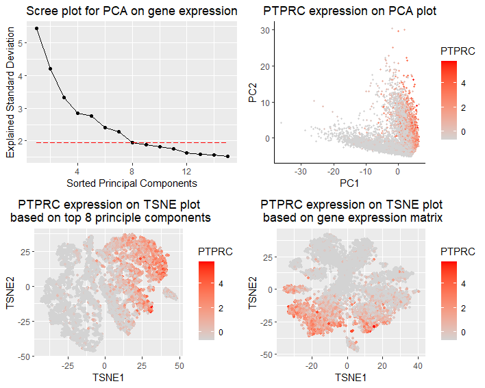
I am visualizing the qualitative expression data of PTPRC,the most dominant gene in PCA, with respect to different TSNE reductions upon gene expression or PCs. The gene expression matrix is normalized by gene standard deviations, and discards cells without any gene expression. In panel 1(top left), I am visualizing the qualitative data of standard deviations of top principle components from PCA analysis (scree plot).PTPRC explains the most standard deviation in PC1. In panel 2(top right), I am visualizing the qualitative data of PTPRC expression with respect to first two PCs. In panel 3(bottom left), I am visualizing the qualitative data of PTPRC expression with respect to TSNE reduction based on top 8 PCs (explained 28.4% of total variance). In panel 4(bottom right), I am visualizing the qualitative data of PTPRC expression with respect to TSNE reduction based on gene expression.
What data encodings are you using to visualize these data types?
In panel 1, I am using the geometric primitive of points to represent top principal components, and using the geometric primitive of lines to show the trend of descending standard deviation. To encode the qualitative data of PC’s standard deviation, I am using the visual channel of positions along y axis. To encode the sorted order of top PCs, I am using the visual channel of positions along x axis. To encode the choice of cutoff value for including top 8 PCs in downstream analysis, I am using the visual channel of a horizontal red dashed line to separate the included and not-included PCs. In panel 2, I am using the geometric primitive of points to represent each individual cells. To encode the spatial distribution of cells in top 2 PCs, I am using the visual channel of positions along x and y axis. To encode the qualitative data of PTPRC expression, I am using the visual channel of saturation of red. In panel 3, I am using the geometric primitive of points to represent each individual cells. To encode the spatial distribution of cells in two TSNE axes based on top 8 PCs, I am using the visual channel of positions along x and y axis. To encode the qualitative data of PTPRC expression, I am using the visual channel of saturation of red. In panel 4, I am using the geometric primitive of points to represent each individual cells. To encode the spatial distribution of cells in two TSNE axes based on gene expression, I am using the visual channel of positions along x and y axis. To encode the qualitative data of PTPRC expression, I am using the visual channel of saturation of red.
What type of data visualization is this? What about the data are you trying to make salient through this data visualization?
My data visualization seeks to make more salient the difference of performing TSNE reduction based on gene expression or top PCs. In this multi-panel visualization, the panel 1 presents PCA results and justifies the choice of including top 8 PCs in downstream tSNE reduction. Panel 2 presents the choice of PTPCR in downstream TSNE comparisons, as it is the gene that contributes the most in driving PC1. Panel 3 and 4 present a side-by-side comparison of PTPCR expression in different TSNE approaches.
What Gestalt principles or knowledge about perceptiveness of visual encodings are you using to accomplish this?
I am using the Gestalt principle of proximity to arrange two TSNE plots panel side by side for better visual comparison. I am using the Gestalt principle of continuity to show the descending trend of standard deviations of top PCs to show reasonable cutoff value.
Takeaways from the question investigated
Comparing panel 3 and panel 4, I could observe clusterings of PTPCR expression in both TSNE plots, though clustering is very differnt in two plots. Only including top 8 PCs could preserve cell similarity with respect to PTPCR expression. However, it is hard to say which approach is better just from this visualization. If I could label cell identity with marker genes, it might be more intuitive to compare if the clustering matches with cell types in two plots.
Code modified from in-class notes.
Code
library(Rtsne)
library(ggplot2)
library(gridExtra)
set.seed(0) ## for reproducibility

data <- read.csv('genomic-data-visualization-2023/data/charmander.csv.gz', row.names = 1)
## pull out gene expression
gexp <- data[,4:ncol(data)]

##filter out cell without any gene expressed
totgenes <- rowSums(gexp)
good.cells <- names(totgenes)[totgenes > 0]
mat <- gexp[good.cells,]

## normalize the gene expression column by standard deviation
genemat <- scale(mat)

#######--------tSNE on gene expression matrix directly
geneemb <- Rtsne(genemat, check_duplicates = FALSE)

## ggplot
genedf <- data.frame(geneemb$Y, PTPRC=genemat[,'PTPRC'], LUM=genemat[,'LUM'])
p4 <- ggplot(genedf, aes(x = X1, y = X2, col=PTPRC)) + geom_point(size = 1) +
  scale_color_gradient(low = 'lightgrey', high='red') +
  xlab("TSNE1") +
  ylab("TSNE2") +
  ggtitle("PTPRC expression on TSNE plot\n based on gene expression matrix") +
  theme(plot.title = element_text(hjust = 0.5))

#######--------tSNE on PCs
pcs <- prcomp(genemat)
## scree plot
screedf <- data.frame(PCs = 1:15, std = pcs$sdev[1:15])
p1 <- ggplot(data = screedf,aes(x = PCs, y = std)) +
  geom_point() +
  geom_line() +
  geom_line(y = 1.948716,linetype = 'longdash', col = 'red')+
  xlab("Sorted Principal Components") +
  ylab("Explained Standard Deviation") +
  ggtitle("Scree plot for PCA on gene expression") +
  theme(plot.title = element_text(hjust = 0.5))

## look at loadings of PCs
head(sort(pcs$rotation[,1], decreasing=TRUE))  #PTPRC is highest with 0.0714
head(sort(pcs$rotation[,2], decreasing=TRUE))  #LUM is highest with 0.1743533

## make a data visualization to explore our first two PCs
PCdf <- data.frame(pcs$x[,1:2], PTPRC = genemat[,'PTPRC'], LUM = genemat[,'LUM'] )
p2 <- ggplot(data = PCdf, aes(x = PC1, y = PC2, col=PTPRC)) +
  geom_point(size = 0.8) +
  theme_classic() +
  scale_color_gradient(low = 'lightgrey', high='red') +
  xlab("PC1") +
  ylab("PC2") +
  ggtitle("PTPRC expression on PCA plot") +
  theme(plot.title = element_text(hjust = 0.5))

ggplot(data = PCdf, aes(x = PC1, y = PC2, col=LUM)) +
  geom_point(size = 0.8) +
  theme_classic() +
  scale_color_gradient(low = 'lightgrey', high='red') + ggtitle('LUM')

# now perform tSNE on PCs, from the scree plot,choose the first 8 PCs
PCmat <- pcs$x[,1:8]
PCemb <- Rtsne(PCmat, check_duplicates = FALSE)

## ggplot
PCdf <- data.frame(PCemb$Y, PTPRC=genemat[,'PTPRC'], LUM=genemat[,'LUM'])
p3 <- ggplot(PCdf, aes(x = X1, y = X2, col=PTPRC)) + geom_point(size = 1) +
  scale_color_gradient(low = 'lightgrey', high='red') +
  xlab("TSNE1") +
  ylab("TSNE2") +
  ggtitle("PTPRC expression on TSNE plot\n based on top 8 principle components") +
  theme(plot.title = element_text(hjust = 0.5))

grid.arrange(p1, p2, p3, p4, ncol=2)