Effect of data transformation on linear dimensionality reduction

What data types are you visualizing?
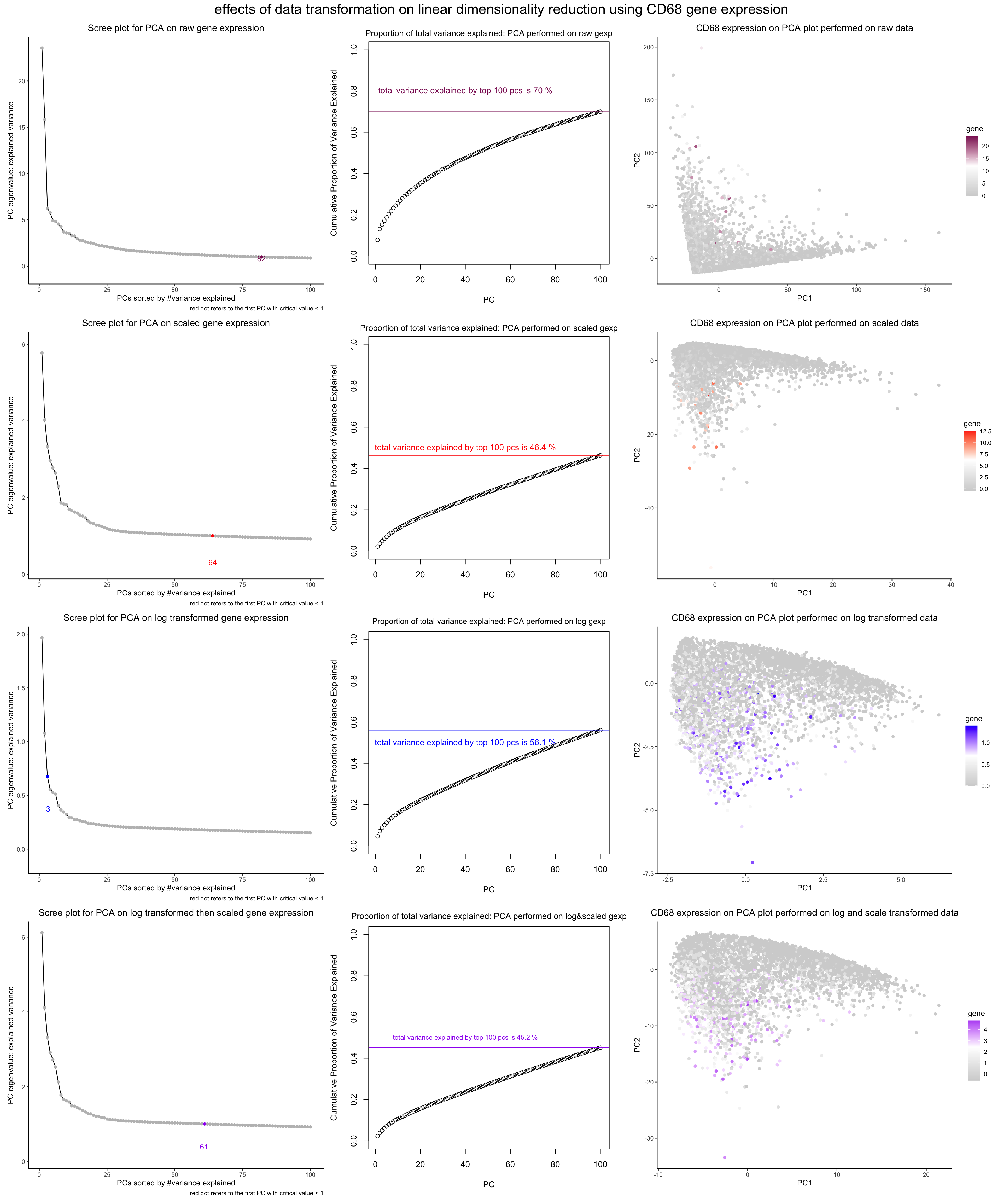
In general, I am visualizing the quantitative data of the expression of CD68 gene undergoing through different data transformation. The gene is randomly picked for demonstration purposes.
(1) on the first column, I am visualizing the quantitative data of the eigenvalues of each pC (i.e., the amount of variance they explain in the current PCA gene expression) against quantitative (ordinal) data of the PC number (as PCs are automatically ranked by the signifiance).
I also plotted the quantitative data of the first PC with an eigenvalue smaller than 1.
(2) on the second column, I am visualizing the quantitative data of the cumulative sum of proportion of total variance explained against the quantitative (ordinal) data of the PC number. I also plotted the quantitative data of the total variance explained by top 100 PCs and the value of the sum.
(3) on the third column, I am visualizing the quantitative data of CD68 expression against the first two PCs (the most significant one) in the current experiment.
For each row, I am conducting a different experiment: the first row - the data is in its original form. the second row - the data undergo scaling (so that each gene expression has a variance of 1) the third row - the data undergo log transformation (so that they appear more Gaussian-like) the fourth row - the data undergo first log and then scaling trnasformation
What data encodings are you using to visualize these data types?
In the first column, I am using the geometric primitive of points to visualize each principal component, and the geometric primitive of line to visualize the descending variance explained by each PC. I am using the geometric primitive of dot, visual channel of color, and associated text description to visualize the first PC in each experiment with an eigenvalue smaller than 1. A side note is that to make the meaning of the colored dot clear, I am using the adding a text description along the x axis.
In the second column, I am using the geometric primitive of dots to visualiz each PC and a not visible line to visualize the ascending trend of the cumulative proportion of total variance explained. I am using the geometric primitive of line, visual channel of color, and associated text to visualize the total variance explained.
In both the first and the second column, to visualize the sorted order of PCs, I am using the visual channel of positions along the x axis. To visualize the amount of variance explained or the cumulative sum of total variance explaied, I am using the visual channel of positions along the y axis.
In the third column, I am using the geometric primitive of dots to visualize each individual cell, and the visual channel of saturation to visualize the amount of gene expresion.lightgrey color refers to non expression whereas full saturation refers to maximum expression. To encode the distribution of the cells along the two PCs, I am using the visual channel of positions along the x and y axis.
What type of data visualization is this? What about the data are you trying to make salient through this data visualization?
This is an exploratory data visualization. I am trying to make salient the impact of different data transformation methods and their effects on PCA analysis (both on the total amount of variance explained by the top 100 PCs and the number of the first PC with an eigenvalue smaller than 1) The first PC with an eigen value smaller than 1 is per the elbow rule, the critical index indicating how many PCs the user should keep in PCA (https://en.wikipedia.org/wiki/Elbow_method_(clustering)). Especially, I hope to make more salient the effect on the PCA visualization of the CD68 gene expression downstream.
What Gestalt principles or knowledge about perceptiveness of visual encodings are you using to accomplish this?
I am using the gestalt principle of proximity by grouping a same batch of experiment along the same row, and a same topic of data visualization along the same column. In addition, to make more salient which graphs belong to the same experiment, I am using the gestalt principle of similarity by using a same hue / saturation. To make more salient the trend in the PCs (in terms of decreasing variance explained, especially), I am using the gestalt principle of continuity by linking the dots representing each PC together.
Additional comments
-
Note: after doing log and scale transformation separately using
log_scale_gexp <- log10(scaled_gexp+1), I received an error message saying NaN is generated. After inspecting the dataframe usingwhich(is.na(log_scale_gexp), arr.ind=TRUE)(reference:https://stackoverflow.com/questions/19895596/locate-index-of-rows-in-a-dataframe-that-have-the-value-of-na), I located that only column #230, the gene “POLR2J3” causes the issue, though I do not know how to interpret this result. However, when I did it the other way usinglog_scale_gexp <- scale(logged_gexp+1), I did not receive the error message. I hence proceed with the latter implementation. -
I struggle to find a nice visualization without compromising many details. Should be more fun to see what the results would look like on tSNE.
-
It seems weird that the PC applied on raw data is in reverse direction compared to data undergoing transformations.
Code
---
title: "hw-2"
output: html_document
date: "2023-02-06"
---

References:

* Great thanks to Wendy for illuminating the importance of elbow point in PCA

1. Trying to understand more about scree plot and the cut off on #PCs to use
https://statisticsglobe.com/scree-plot-pca

2. figure out how to find the minimum value above a threshold for a value object https://stackoverflow.com/questions/29388334/find-position-of-first-value-greater-than-x-in-a-vector

3. figure out how to highlight a particular point
https://stackoverflow.com/questions/32780047/highlight-few-points-in-plot

4. figure out how to plot the text not overlapping with the graph, dodge vertically
https://stackoverflow.com/questions/52338137/vertical-equivalent-of-position-dodge-for-geom-point-on-categorical-scale

5. figure out how to show only selected text
https://stackoverflow.com/questions/39682307/show-only-one-text-value-in-ggplot2

6. Figure out how to plot amount of variance explained (abandoned)
https://rstudio-pubs-static.s3.amazonaws.com/443642_a2d0590500274bbbb18ef7e81934ff8a.html

7. play around with plotting the extra line on the total variance explained graph (abandoned)
https://www.janbasktraining.com/community/data-science/how-to-change-font-size-r

8. plot the horizontal line (abandoned)
https://www.geeksforgeeks.org/adding-straight-lines-to-a-plot-in-r-programming-abline-function/

9. figure out how to suppress a legend
https://stackoverflow.com/questions/14604435/turning-off-some-legends-in-a-ggplot

10. Because the legend is too bulky, figure out how to add a simple text to describe what the red dot instead
https://stackoverflow.com/questions/57052117/how-to-add-notes-to-a-ggplot

10. the only thing I have triked that works for saving a baseR plot into an object
https://stackoverflow.com/questions/14124373/combine-base-and-ggplot-graphics-in-r-figure-window/

11. gridExtra does not really work - figure out how to use patchwork (the only thing I've tried that works)
https://patchwork.data-imaginist.com/articles/guides/annotation.html

1. Should I normalize and/or transform the gene expression data (e.g. log and/or scale) prior to dimensionality reduction?

2. Should I perform non-linear dimensionality reduction on genes or PCs?

3. If I perform non-linear dimensionality reduction on PCs, how many PCs should I use?

4. What genes (or other cell features such as area or total genes detected) are driving my reduced dimensional components?


* Notice that my few assumptions for this data visualization
```{r setup, include=FALSE}
knitr::opts_chunk$set(echo = TRUE)
library(ggplot2) library(gridExtra) library(dplyr) library(Rtsne) library(cowplot) library(patchwork)
data <- read.csv(“~/Desktop/GitHub_Repo/genomic-data-visualization-notes/project/bulbasaur.csv”,row.names = 1)
set.seed(0) # for reproducibility
1
2
3
4
5
6
7
8
9


```{r prepare data}
# prepeare gene exp
gexp <- data[,4:ncol(data)]

# screen for valid cells (with at least one gene expressing)
data <- data[(rowSums(gexp)>0),]
gexp <- data[,4:ncol(data)]
```{r PCA on raw data}
raw_pcs <- prcomp(gexp)
get the first index at which the eigenvalue of the PC < 1, per Kaiser’s rule
raw_kaiser_index <- min(which(raw_pcs$sdev < 1))
scree plot
raw_pcs_sdev <- tibble(x = c(1:length(raw_pcs$sdev)), y = raw_pcs$sdev)
p1_1 <- ggplot(raw_pcs_sdev[1:100,], aes(x, y)) + geom_line() + geom_point(aes(col = (x == raw_kaiser_index))) + scale_color_manual(values = c(‘grey’,’maroon4’),name = “first PC with critical value < 1”, guide = “none”) + geom_text(position = position_jitter(width = 0, height = 2), aes(label = ifelse(x == raw_kaiser_index, x, “”)), col = “maroon4”) + labs(title = “Scree plot for PCA on raw gene expression”, caption = “red dot refers to the first PC with critical value < 1”) + ylab(“PC eigenvalue: explained variance”) + xlab(“PCs sorted by #variance explained”) + theme_classic() + theme(plot.title = element_text(hjust = 0.5))
plot(cumsum(raw_pcs$sdev[1:100]/sum(raw_pcs$sdev)), xlab = “PC”, ylab = “Cumulative Proportion of Variance Explained”, ylim = c(0,1), ) abline(h = sum(raw_pcs$sdev[1:100]/sum(raw_pcs$sdev)), col = “maroon4”) text(40, 0.8, paste(“total variance explained by top 100 pcs is”,100*round(sum(raw_pcs$sdev[1:100])/sum(raw_pcs$sdev),3),”%”), col = “maroon4”) title(main = “Proportion of total variance explained: PCA performed on raw gexp”, font.main = 1, cex = 0.83) par(mar=c(1,1,1,1))
p1_2 <-recordPlot() p1_2 <- as_grob(p1_2)
p1_1 p1_2
1
2
3
4
5
6
7
8
9
10
11
12
13
14
15
16
17
18
19
20
21
22
23
24
25
26
27
28
29
30
31
32
33
34
35
36
37
38
39
40
41
42
43
44
45

``` {r PCA on scaled only data}

# here, devitates for the first caveat:  scaling transformation
# all genes will be forced into variance 1
# and contribute equally to a pc
scaled_gexp <- scale(gexp)

# perform pca on normalized gexp
scaled_pcs <- prcomp(scaled_gexp)

# get the first index at which the eigenvalue of the PC < 1, per Kaiser's rule
scaled_kaiser_index <- min(which(scaled_pcs$sdev < 1))

# scree plot

scaled_pcs_sdev <- tibble(x = c(1:length(scaled_pcs$sdev)), y = scaled_pcs$sdev)

p2_1 <- ggplot(scaled_pcs_sdev[1:100,], aes(x, y)) + geom_line() +
    geom_point(aes(col = (x == scaled_kaiser_index))) +
    scale_color_manual(values = c('grey','red'),name = "first PC with critical value < 1",
                       guide = "none") +
    geom_text(position = position_jitter(width = 0, height = 0.8), aes(label = ifelse(x == scaled_kaiser_index, x, "")), col = "red") +
    labs(title = "Scree plot for PCA on scaled gene expression",
          caption = "red dot refers to the first PC with critical value < 1") +
    ylab("PC eigenvalue: explained variance") +
    xlab("PCs sorted by #variance explained") +
    theme_classic() +
    theme(plot.title = element_text(hjust = 0.5))

plot(cumsum(scaled_pcs$sdev[1:100]/sum(scaled_pcs$sdev)), xlab = "PC",
     ylab = "Cumulative Proportion of Variance Explained",
     ylim = c(0,1));
    abline(h = sum(scaled_pcs$sdev[1:100]/sum(scaled_pcs$sdev)), col = "red");
    text(40, 0.5, paste("total variance explained by top 100 pcs is",100*round(sum(scaled_pcs$sdev[1:100])/sum(scaled_pcs$sdev),3),"%"), col = "red");
    title(main = "Proportion of total variance explained: PCA performed on scaled gexp",
      font.main = 1,
      cex = 0.83)
par(mar=c(1,1,1,1))

p2_2 <-recordPlot()
p2_2 <- as_grob(p2_2)

p2_1
p2_2
``` {r PCs on logged only data}
here, devitates for the first caveat: log transformation
when computing distances, supposedly make the data from skewed to more Gaussian
if after log, not Gaussian, may go back to see what happened:)
logged_gexp <- log10(gexp+1)
perform pca on normalized gexp
logged_pcs <- prcomp(logged_gexp)
get the first index at which the eigenvalue of the PC < 1, per Kaiser’s rule
logged_kaiser_index <- min(which(logged_pcs$sdev < 1))
scree plot
logged_pcs_sdev <- tibble(x = c(1:length(logged_pcs$sdev)), y = logged_pcs$sdev)
p3_1 <- ggplot(logged_pcs_sdev[1:100,], aes(x, y)) + geom_line() + geom_point(aes(col = (x == logged_kaiser_index))) + scale_color_manual(values = c(‘grey’,’blue’),name = “first PC with critical value < 1”, guide = “none”) + geom_text(position = position_jitter(width = 0.3, height = 0.3), aes(label = ifelse(x == logged_kaiser_index, x, “”)), col = “blue”) + labs(title = “Scree plot for PCA on log transformed gene expression”, caption = “red dot refers to the first PC with critical value < 1”) + ylab(“PC eigenvalue: explained variance”) + xlab(“PCs sorted by #variance explained”) + theme_classic() + theme(plot.title = element_text(hjust = 0.5))
plot(cumsum(logged_pcs$sdev[1:100]/sum(logged_pcs$sdev)), xlab = “PC”, ylab = “Cumulative Proportion of Variance Explained”, ylim = c(0,1), type = ‘b’) abline(h = sum(logged_pcs$sdev[1:100]/sum(logged_pcs$sdev)), col = “blue”) text(40, 0.5, paste(“total variance explained by top 100 pcs is”,100*round(sum(logged_pcs$sdev[1:100])/sum(logged_pcs$sdev),3),”%”), col = “blue”) title(main = “Proportion of total variance explained: PCA performed on log gexp”, font.main = 1, cex.main = 0.95) par(mar=c(1,1,1,1))
p3_2 <-recordPlot() p3_2 <- as_grob(p3_2)
p3_1 p3_2
1
2
3
4
5
6
7
8
9
10
11
12
13
14
15
16
17
18
19
20
21
22
23
24
25
26
27
28
29
30
31
32
33
34
35
36
37
38
39
40
41
42
43
44
45
46
47
48
49
```{r PCs on logged and scaled data}


# here, devitates for the first caveat: log transformation
# when computing distances, supposedly make the data from skewed to more Gaussian
# if after log, not Gaussian, may go back to see what happened:)

log_scale_gexp <- scale(logged_gexp+1)

# hist(log_scale_gexp)

# perform pca on normalized gexp
log_scale_pcs <- prcomp(log_scale_gexp)

# get the first index at which the eigenvalue of the PC < 1, per Kaiser's rule
log_scale_kaiser_index <- min(which(log_scale_pcs$sdev < 1))

# scree plot

log_scale_pcs_sdev <- tibble(x = c(1:length(log_scale_pcs$sdev)), y = log_scale_pcs$sdev)

p4_1 <- ggplot(log_scale_pcs_sdev[1:100,], aes(x, y)) + geom_line() +
    geom_point(aes(col = (x == log_scale_kaiser_index))) +
    scale_color_manual(values = c('grey','purple'),name = "first PC with critical value < 1", guide = "none") +
    geom_text(position = position_jitter(width = 0.3, height = 0.9),
              aes(label = ifelse(x == log_scale_kaiser_index, x, "")), col = "purple") +
    labs(title = "Scree plot for PCA on log transformed then scaled gene expression",
          caption = "red dot refers to the first PC with critical value < 1") +
    ylab("PC eigenvalue: explained variance") +
    xlab("PCs sorted by #variance explained") +
    theme_classic() +
    theme(plot.title = element_text(hjust = 0.5))


p4_2 <- plot(cumsum(log_scale_pcs$sdev[1:100]/sum(log_scale_pcs$sdev)), xlab = "PC",
     ylab = "Cumulative Proportion of Variance Explained",
     ylim = c(0,1), type = 'b')
abline(h = sum(log_scale_pcs$sdev[1:100]/sum(log_scale_pcs$sdev)), col = "purple")
text(40, 0.5, paste("total variance explained by top 100 pcs is",100*round(sum(log_scale_pcs$sdev[1:100])/sum(log_scale_pcs$sdev),3),"%"), col = "purple",cex = 0.8)
title(main = "Proportion of total variance explained: PCA performed on log&scaled gexp",
      font.main = 1,
      cex.main = 1)
par(mar=c(1,1,1,1))

p4_2 <- recordPlot()
p4_2 <- as_grob(p4_2)

p4_1
p4_2
```{r PCA - raw dt}
raw_df <- data.frame(raw_pcs$x[,1:2], gene = gexp[,’CD68’])
p1_3 <- ggplot(data = raw_df, aes(x = PC1, y = PC2, col=gene)) + geom_point() + theme_classic() + scale_colour_gradient2( low = “lightgrey”, mid = “white”, high =”maroon4”, midpoint = max(gexp[,’CD68’])/2) + ggtitle (“CD68 expression on PCA plot performed on raw data”) + theme(plot.title = element_text(hjust = 0.5))
p1_3
1
2
3
4
5
6
7
8
9
10
11
12
13
14
15
16
17
18

```{r PCA - scaled gexp}

# linear dimensionality reduction for CD68 gene on scale transformed gexp
scaled_df <- data.frame(scaled_pcs$x[,1:2], gene =scaled_gexp[,'CD68'])

p2_3 <- ggplot(data = scaled_df, aes(x = PC1, y = PC2, col=gene)) +
  geom_point() +
  theme_classic() +
  scale_colour_gradient2(
    low = "lightgrey",
    mid = "white",
    high ="red",
    midpoint = max(scaled_gexp[,'CD68'])/2) +
    ggtitle ("CD68 expression on PCA plot performed on scaled data") +
    theme(plot.title = element_text(hjust = 0.5))

p2_3
```{r PCA - logged gexp}
linear dimensionality reduction for CD68 gene on scale transformed gexp
logged_df <- data.frame(logged_pcs$x[,1:2], gene =logged_gexp[,’CD68’])
p3_3 <- ggplot(data = logged_df, aes(x = PC1, y = PC2, col=gene)) + geom_point() + theme_classic() + scale_colour_gradient2( low = “lightgrey”, mid = “white”, high =”blue”, midpoint = max(logged_gexp[,’CD68’])/2) + ggtitle (“CD68 expression on PCA plot performed on log transformed data”) + theme(plot.title = element_text(hjust = 0.5))
p3_3
1
2
3
4
5
6
7
8
9
10
11
12
13
14
15
16
17
18
19
20
21
22


``

```{r PCA - log-scale gexp}

# linear dimensionality reduction for CD68 gene on scale transformed gexp
log_scale_df <- data.frame(log_scale_pcs$x[,1:2], gene =log_scale_gexp[,'CD68'])

p4_3 <- ggplot(data = log_scale_df, aes(x = PC1, y = PC2, col=gene)) +
  geom_point() +
  theme_classic() +
  scale_colour_gradient2(
    low = "lightgrey",
    mid = "white",
    high ="purple",
    midpoint = max(log_scale_gexp[,'CD68'])/2) +
    ggtitle ("CD68 expression on PCA plot performed on log and scale transformed data") +
    theme(plot.title = element_text(hjust = 0.5))

p4_3
I here do not digress from to pursue question 2, still play around with question 1!
```{r puzzle pieces together!, fig.height = 12,fig.width=10}
grid.arrange(p1_1,p1_2,p1_3,p2_1,p2_2,p2_3,p3_1,p3_2,p3_3,p4_1,p4_2,p4_3,nrow= 4, par(mar=c(1,1,1,1)))
p1_1 + p1_2 + p1_3 + p2_1 + p2_2 + p2_3 + p3_1 + p3_2 + p3_3 + p4_1 + p4_2 + p4_3 + plot_layout(ncol = 3) + plot_annotation(title = “effects of data transformation on linear dimensionality reduction using CD68 gene expression”, theme = theme(plot.title = element_text(hjust = 0.5,size = 20)))
1