Prevalence of Genes in MERFISH by Order of Magnitude

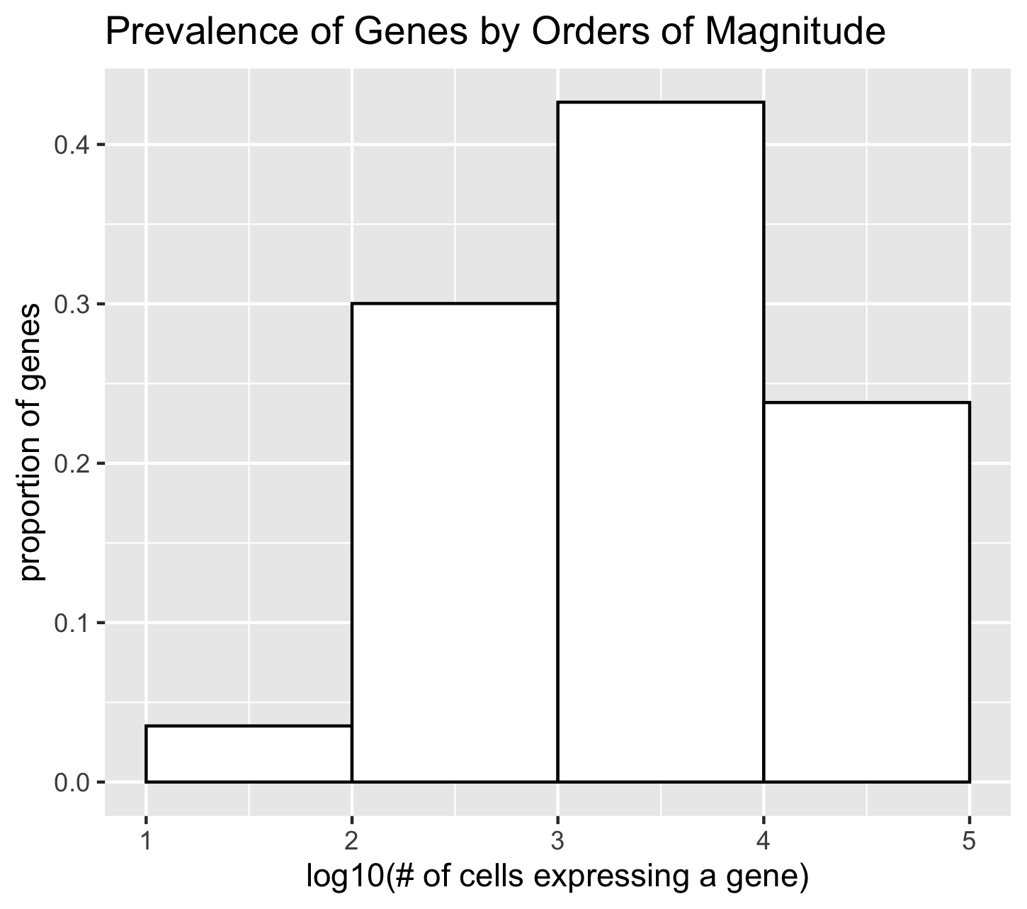
I am visualizing the genes in the MERFISH dataset proportioned by the number of cells expressing each gene, which is quantitative data.
To encode this data I am using the geometric primitive of area.
I am using the visual channel of position on the x axis to encode the log10 transformation of the number of cells expressing of a gene. Each position represent the range of one order of magnitude. The first position is 10 to 10^2 cells expressing gene. The second position is 10^2 to 10^3 cells expressing the gene. And so on.
I am using the visual channel of position on the y axis to encode the proportion of genes that fall into each order of magnitude.
What I want to make salient with this visualization is if I pick a gene from the MERFISH list at random, what is the chance that it will be expressed in a certain magnitude of cells.
I used the Gesalt principle of enclosure to help distinguish the four bins of magnitude. Each bin is outlined in black rather than having the bins share the same color with no outline.
This visualization was developed as an exploratory visualization. It was inspired by picking the gene ‘Mc2r’ at random to practice data visualization, but realizing it was expressed in very few cells in the tissue sample (89 of 42519).
I wanted to explore the data to find out how many more genes have very low prevalence throughout the tissue. I learned that about 5% of the genes are expressed in less than 100 cells.
References:
- https://stackoverflow.com/questions/41486027/how-to-align-the-bars-of-a-histogram-with-the-x-axis
- https://stackoverflow.com/questions/11766856/normalizing-y-axis-in-histograms-in-r-ggplot-to-proportion
#What I want to make salient with this visualization is:
#what is the chance that if I pick a gene at random, it will be expressed in many cells?

#Load MERFISH data
data <- read.csv('~/Dropbox/JHU/Courses/genomic-data-visualization/data/MERFISH_Slice2Replicate2_halfcortex.csv.gz')

#make matrix of gene expression data without position
gexp <- data[, 4:ncol(data)]
rownames(gexp) <- data[,1]

# for each gene, count how many cells express that gene
cellexp <- colSums(gexp != 0)

# Make histogram of prevalence of genes
# to make more salient visualization,
# plot x-axis in log10 to use orders of magnitude
# plot y-axis in proportion
library(ggplot2)
df <- data.frame(cellexp)
ggplot(data = df, mapping = aes(x=log10(cellexp))) +
  geom_histogram(mapping = aes(y=stat(count/sum(count))),
                 binwidth = 1, bins = 4, boundary=0, closed="right",
                 color="black", fill="white") +
  labs(title="Prevalence of Genes by Orders of Magnitude", x="log10(# of cells expressing a gene)", y = "proportion of genes")

#save as png
ggsave("gene_prevalence.png")