Comparison of Dimensionality Reduction Methods for Representation of Clustered Data

What data are you visualizing
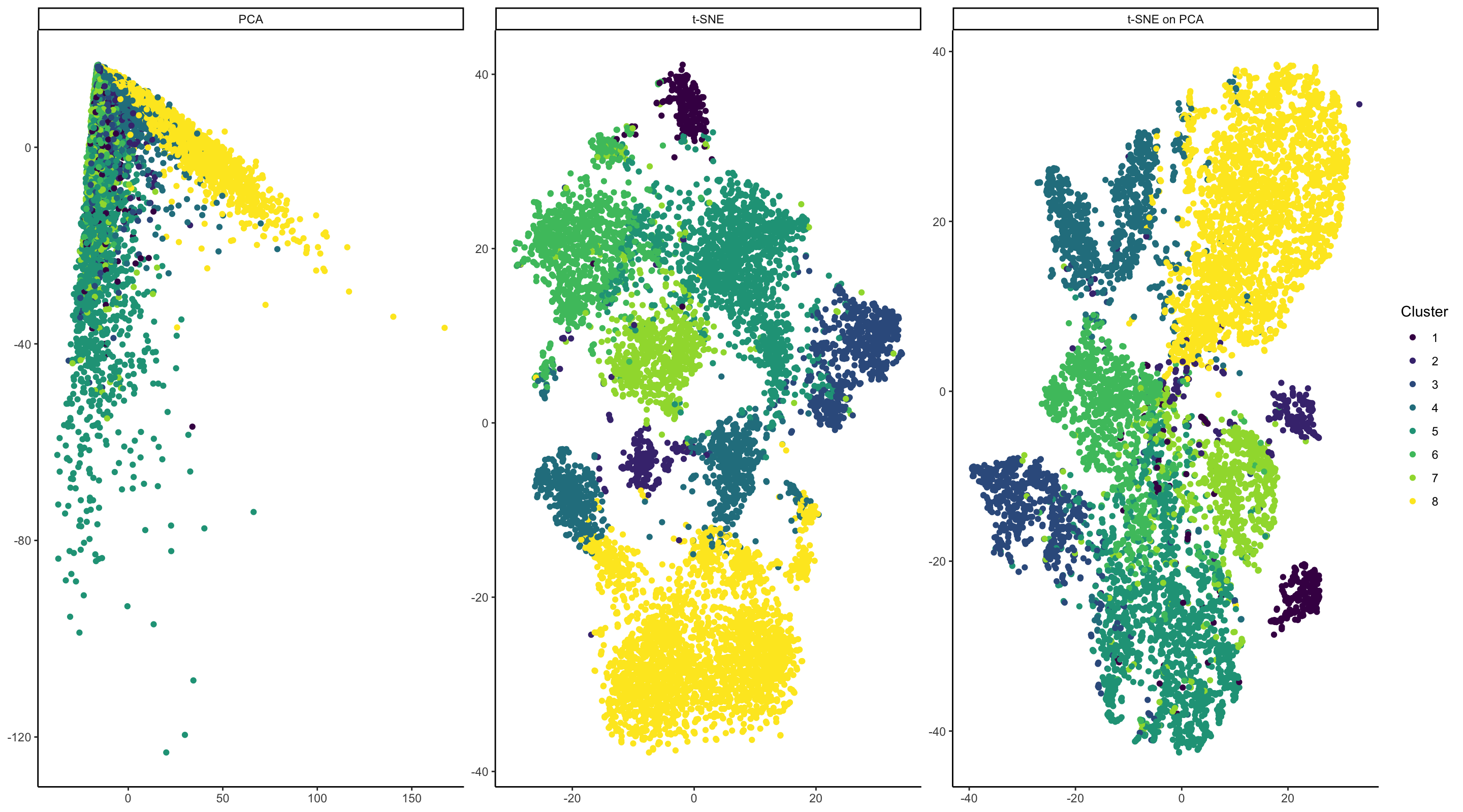
In my visualizations, I am visualizing a mixture of a quantitative and categorical data. I have taken raw expression data from the Squirtle dataset and have normalized the data by median gene expression. I have also log scaled the data. I then clustered it using k-means clustering to separate data by putative cell type. In my plots, I aim to see which dimensionality reduction approaches best visually separate out the different cell types. Cluster info is categorical as the order of k-means clusters is arbitrary. In the leftmost plot, I am also plotting quantitative data of PC1 and PC2 from PCA run on the normalized expression data. In the middle plot, I am also plotting the quantitative data of t-SNE coordinates run on the same dataset. In the rightmost plot, I am plotting the quantitative data of t-SNE coordinates, with the t-SNE algorithm run on the PCA data depicted in the left plot.
What data encodings (geometric primitives and visual channels) are you using to visualize these data types?
Individual cells are represented by the visual primitives of points. The magnitude of PC1/PC2 and the t-SNE coordinates are represented by the visual channel of position. In all plots, cluster info is represented by the visual channel of color.
What type of data visualization is this? What about the data are you trying to make salient through this data visualization?
This visualization is a set of three scatter plots. The data contains multiple different cell types; I am trying to demonstrate that of three dimensionality reduction approaches, some are more effective than others at visually separating out the different cell types. To my eye, this visualization shows that PCA is not particularly effective at separating multiple cell types, beyond broadly showing that cluster 8 separates from the other cells along PC1. The other clusters are, to me, indistinguishable. In contrast, t-SNE performed on both the normalized expression data and on the PCA output are really effective at distinguishing multiple cell type clusters. My visualization shows that both approaches are viable representations of this data.
What Gestalt principles or knowledge about perceptiveness of visual encodings are you using to accomplish this?
Throughout the visualization, I make use of the Gestalt principle of Similarity and Proximity. Regarding Similarity: cells that are have similar gene expression patterns are likely to fall into the same clusters and will therefore be colored identically. Therefore, I am using hue similarity to denote the similarity of cell clusters. For representing hue, I have chosen the viridis color scale - it is scale designed for data with 5-10 discrete categories and is colorblind-friendly.
By using PCA and t-SNE on the cells, I am employing the Gestalt principle of Proximity. These algorithms will position cells that are more similar to each other closer on the 2D plane.
library(Rtsne)
library(ggplot2)
library(tidyverse)

# Data import and manipulation
data <- read.csv('~/genomic_data_viz/squirtle.csv.gz', row.names = 1)

# Pull out gene expression
gexp <- data[, 4:ncol(data)]

# Remove empty row
totGenes <- rowSums(gexp)
good.cells <- names(totGenes)[totGenes > 0]

gexp_filtered <- gexp[good.cells,]

# Normalize by gene expression
mat <- gexp[good.cells,]/totGenes[good.cells]
mat <- mat * median(totGenes)

# Log scale
mat <- log(mat + 1)
mat <- mat * median(totGenes)

# K-means Clustering

# Finding optimal k
within_ss_list <- c()
for (i in 1:15){
  k <- kmeans(mat, centers=i)
  within_ss_list <- c(within_ss_list, k$tot.withinss)
}

pltDF <- data.frame(k = 1:15, withinSS <- within_ss_list)
ggplot(pltDF, aes(x = k, y = within_ss_list)) +
  geom_point() +
  theme_classic() +
  scale_x_continuous(breaks=seq(1,15,1),labels=seq(1,15,1))

k <- kmeans(mat, centers=8)

# PCA and Tsne
pc <- prcomp(gexp_filtered)
emb <- Rtsne(mat)
emb_pca <- Rtsne(pc$x)

# Data manipulation
pc_plot <- as.data.frame(cbind(pc$x[, c("PC1", "PC2")], cluster_method = "PCA", cluster = k$cluster))
pc_plot$cell_name <- row.names(pc_plot)
colnames(pc_plot) <- c("X", "Y", "cluster_method", "Cluster", "cell_name")

emb_plot <- as.data.frame(cbind(emb$Y,cluster_method = "t-SNE", cluster = k$cluster))
emb_plot$cell_name <- row.names(emb_plot)
colnames(emb_plot) <- c("X", "Y", "cluster_method", "Cluster", "cell_name")

emb_pca_plot <- as.data.frame(cbind(emb_pca$Y, cluster_method = "t-SNE on PCA", cluster = k$cluster))
emb_pca_plot$cell_name <- row.names(emb_pca_plot)
colnames(emb_pca_plot) <- c("X", "Y", "cluster_method", "Cluster", "cell_name")

plt_all <- rbind(pc_plot, emb_plot)
plt_all <- rbind(plt_all, emb_pca_plot)

plt_all$X <- as.numeric(plt_all$X)
plt_all$Y <- as.numeric(plt_all$Y)
plt_all$cluster <- as.factor(plt_all$cluster)

##Plotting
ggplot(data = plt_all, aes(x = X, y = Y, color = Cluster)) +
  geom_point() +
  facet_wrap(~cluster_method, scales = "free") +
  theme_classic() +
  scale_color_viridis_d() +
  theme(axis.title.x = element_blank(), axis.title.y = element_blank())
External Sources:
Consulted for information about changing column names: https://www.geeksforgeeks.org/change-column-name-of-a-given-dataframe-in-r/
Read about free scale for facet_wrap() here: https://stackoverflow.com/questions/18046051/setting-individual-axis-limits-with-facet-wrap-and-scales-free-in-ggplot2