Homework 3

Homework 3
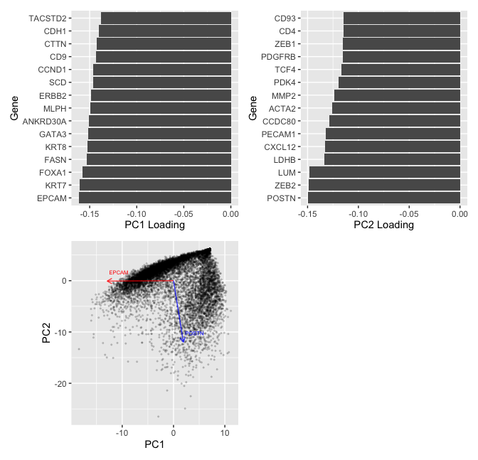
Question: What genes (or other cell features such as area or total genes detected) are driving my reduced dimensional components?
In my visualization, I aim to make salient the contribution of genes in constructing the first two principal components. To do so, I first log transform the spatial transcriptomics data, comprising of the gene expression levels for 313 genes. The PCA is ran on the centered, scaled log-transformed data.
To create the visualizations, I first select the top 15 genes that have the highest absolute value of loadings of first and second principle component (PC) separately. The bar plots are then to made to visualize the loading values for those selected genes. According to the visualization, genes EPCAM and POSTN have the hightest absolute loading values for the first two principal components separating, each contributing approximately -0.15 in contructing the PCs. For this visualization, I am using the geometric primitive of lines to encode the level of loadings for the PCs. I am also using the visual channel of position along the negative x-axis.
In my last plot, I visualize the cells based on their location on the first two PCs. What is more, I plot the PC1 and PC2 loadings (scaled by a factor of 80 to make the direction more visible) for EPCAM and POSTN. In this visualiztion, I am using the geometric primitive of points to encode the position of each cell on the first two PCs. What is more, I am using the geometric primitive of line to indicate the (PC1, PC2) loading of two genes, which I use the visual channel of color to distinguish. I am also using the Gestalt prinple of continuity to convey the information that EPCAM mainly drives the 1st PC along which the near-horizontal cluster of data points lies, and POSTN mainly drives the 2nd PC along which the near-vertical cluster of data points lies.
##Reference: https://www.rayshader.com/reference/plot_gg.html
library(ggplot2)
library(ggforce)
data <- read.csv("pikachu.csv.gz", row.names = 1)
gexp <- data[, 4:ncol(data)]
mat <- log10(gexp+1)
pcs <- prcomp(mat,center = TRUE, scale. = TRUE)

top_gene_pc1 = names(sort(abs(pcs$rotation[,1]), decreasing=TRUE)[1:15])
top_gene_pc2 = names(sort(abs(pcs$rotation[,2]), decreasing=TRUE)[1:15])
score <- data.frame(pcs$x[,1:2])
gene_of_interest = c(top_gene_pc1[1],top_gene_pc2[1])

#plot1
df = data.frame(pcs$rotation[,1:2])
df$gene = rownames(df)
df$gene <- factor(df$gene, levels = df$gene[order(df$PC1)])
plt1 = ggplot(data = df[top_gene_pc1,],aes(x =gene, y =PC1)) + geom_bar(stat = "identity") + coord_flip() + labs(x = "Gene", y = "PC1 Loading")
plt1
#plot2
df$gene = rownames(df)
df$gene <- factor(df$gene, levels = df$gene[order(df$PC2)])
plt2 = ggplot(data = df[top_gene_pc2,],aes(x =gene, y =PC2)) + geom_bar(stat = "identity") + coord_flip()+ labs(x = "Gene", y = "PC2 Loading")
plt2
#plot3
df = df * 80
plt_load = ggplot() +coord_equal() + geom_point(data = score , aes(x = PC1, y = PC2),size = 0.4, alpha = 0.15)
plt_load = plt_load+geom_segment(data=df[gene_of_interest,], aes(x=0, y=0, xend=PC1, yend=PC2), arrow=arrow(length=unit(0.2,"cm")), alpha=0.75, color=c("red","blue"))
plt_load = plt_load+geom_text(data=df[gene_of_interest,], aes(x=PC1, y=PC2, label = rownames(df[gene_of_interest,])), size = 2, vjust=-1.8,hjust = -.1, color=c("red","blue"))
plt_load
library(patchwork)
plt1 + plt2 +plt_load + guide_area()
#Reference: https://stackoverflow.com/questions/6578355/plotting-pca-biplot-with-ggplot2
#Reference: https://stackoverflow.com/questions/38131596/ggplot2-geom-bar-how-to-keep-order-of-data-frame