RNA Velocity Analysis (In Situ) - Tutorial and Tips
Introduction
RNA velocity, the time derivative of the gene expression state, can be used to predict the future transcriptional state of cells. RNA velocity analysis, particularly in combination with single-cell trajectory analyses, can provide us with insights into the transcriptional dynamics of cells in development and evolution. In this tutorial, I use data from our latest publication Xia, Fan, Emanuel et al (2019) to illustrate an example of RNA velocity analysis in situ and provide tips for doing RNA velocity analysis for your own single-cell transcriptomics data.
Suggested reading and resources
- Background: Zeisel et al. (2011)
- RNA velocity paper: La Manno et al. (2018)
- RNA velocity theory: Supplementary Note 1 of La Manno et al (2018)
- RNA velocity limitations: Supplementary Note 2 of La Manno et al (2018)
- RNA velocity review: Svensson and Pachter (2018)
- RNA velocity in situ paper: Xia, Fan, Emanuel et al (2019)
- RNA velocity software documentation: http://velocyto.org/
Getting Started
We will first read in the single-cell expression count matrices available as Supplementary Table 12 of Xia, Fan, Emanuel et al (2019). Here, each row is a gene (or blank) assayed by MERFISH, and each column is a cell. Analogous data can be used from single-cell RNA-seq data. Here, cell names include both the batch identifier following by the cell identifier.
## Read in single-cell expression data
cell_gexp = as.matrix(read.csv("pnas201912459_s12_pv0i72.csv", row.names=1))
print(cell_gexp[1:5,1:5])
##        B1_cell1 B1_cell2 B1_cell3 B1_cell4 B1_cell5
## A1CF          0        0        1        1        0
## A2M           4        2        1        1        1
## A2ML1         0        0        0        0        0
## A4GALT        6        3        4        2        3
## AACS         36       28       14       11       10
## Parse out batch info
batch <- sapply(colnames(cell_gexp), function(x) strsplit(x, '_')[[1]][1])
batch <- factor(batch)
print(table(batch))
## batch
##  B1  B2  B3
## 645 400 323
In this MERFISH library, 9,050 genes that were labeled with the non-overlapping encoding probe strategy (rows 2 to 9,051) and the 1,000 genes were labeled with the overlapping encoding probe strategy (rows 9,280 to 10,279). The remaining are used as blank controls. Here, we will omit blank controls and use all 10050 genes for downstream analyses.
genes <- rownames(cell_gexp)
bad.genes <- genes[grepl('Blank', genes)]
good.genes <- setdiff(genes, bad.genes)
print(length(bad.genes))
## [1] 2853
print(length(good.genes))
## [1] 10050
Single-cell clustering analysis
Single-cell transcriptomic analysis enables the identification of novel cell types and cell states in a systematic and quantitative manner. To illustrate this, we will perform single-cell clustering analysis to identify cell populations based on the gene expression profiles of individual cells. Briefly, we will subset the data to one batch, perform CPM and variance normalization, identify over-dispersed genes, and applied principal components (PC) analysis to identify 30 PCs that capture the greatest variance, apply graph-based Louvain clustering in high-dimensional PC space to identify cell clusters, and finally project into 2D using tSNE for visualization. It will be left as an exercise to the reader to perform a single analysis with the appropriate batch corrections.
## Remove blanks
cd <- cell_gexp[good.genes,]

## Restrict to one batch in this tutorial
subcells <- names(batch)[batch=='B1']
cd <- cd[, subcells]
dim(cd)
## [1] 10050 645
library(MUDAN)
## CPM normalize
mat <- MUDAN::normalizeCounts(cd)
## Variance normalize and log transform
matnorm <- MUDAN::normalizeVariance(mat, details=TRUE)
## [1] "Calculating variance fit ..."
## [1] "Using gam with k=5..."
## [1] "1828 overdispersed genes ... "
## Restrict to overdispersed genes
m <- log10(matnorm$mat[matnorm$ods,]+1)
## Fast PCA, return 100 PCs
library(irlba)
pcs <- irlba::prcomp_irlba(t(as.matrix(m)), n=100)
rownames(pcs$x) <- colnames(m)
## Elbow plot to help choose number of PCs
#plot(pcs$sdev, type="l")
nPCs <- 30
#abline(v=nPCs, col='red')

## Use first 30 PCs for 2D tSNE
set.seed(0)
library(Rtsne)
emb <- Rtsne::Rtsne(pcs$x[,1:30],
    is_distance=FALSE,
                   perplexity=100,
                   num_threads=1,
                   verbose=FALSE)$Y
rownames(emb) <- colnames(m)
#plot(emb)
## Construct graph using KNN
library(RANN)
knn.info = RANN::nn2(pcs$x[,1:30], k=50)
knn = knn.info$nn.idx
adj = matrix(0, ncol(mat), ncol(mat))
rownames(adj) = colnames(adj) = colnames(mat)
for(i in seq_len(ncol(mat))){
  adj[i,colnames(mat)[knn[i,]]] = 1
}
## Louvain clustering
library(igraph)
g = igraph::graph.adjacency(adj, mode='undirected')
g = simplify(g)
km = igraph::cluster_louvain(g)
com = km$membership
names(com) = km$names

## Rotate tSNE embedding as needed
## for reasons that will become evident later
emb.test <- emb
f = -pi*0.25 # adjust as needed
x = emb.test[,1]
y = emb.test[,2]
emb.test[,1] = x*cos(f) - y*sin(f)
emb.test[,2] = y*cos(f) + x*sin(f)
#emb.test[,2] = -emb.test[,2] # flip as needed

## Plot results
MUDAN::plotEmbedding(emb.test,
                     groups=com,
                     mark.clusters=TRUE,
                     show.legend=TRUE,
                     xlab='tSNE-1', ylab='tSNE-2',
                     main='tSNE',
                     verbose=FALSE)
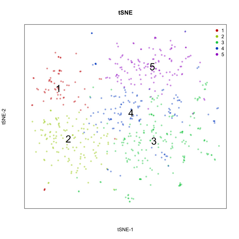
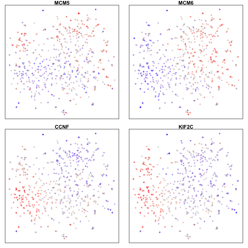
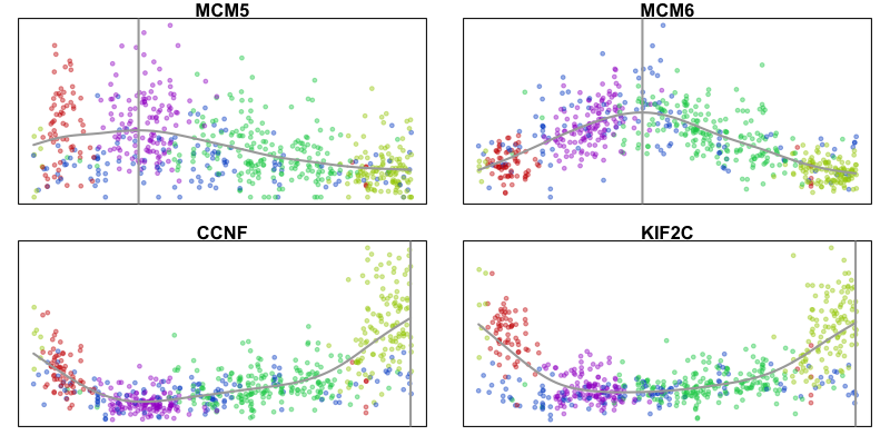
Here, we identify 5 transcriptionally distinct populations of cells. Given that our measurements were performed on a single cell type (cultured U2-OS cells), these clusters are likely to represent distinct cell states at different stages of the cell cycle. We can visualize expression of known cell-cycle markers to confirm this hypothesis. MCM5 and MCM6 are G1/S markers, while CCNF and KIF2C are G2/M markers.
par(mfrow=c(2,2), mar=rep(1,4))
gs = c('MCM5','MCM6','CCNF','KIF2C')
invisible(lapply(gs, function(g){
  gexp = scale(m[g,])[,1]
  gexp[gexp > 2] <- 2
  gexp[gexp < -2] <- -2
  MUDAN::plotEmbedding(emb.test,
                       main=g,
                       col=gexp,
                       verbose=FALSE)
}))
RNA velocity analysis
In the original implementation by La Manno et al (2019), RNA velocity leveraged the relative ratio between intronic (unspliced) and exonic (spliced) mRNAs in scRNA-seq data to infer the rate of change in transcript abundance in order to estimate the future transcriptional state for a cell. The underlying assumption in this model is that genes are initially transcribed in an unspliced manner and then spliced, such that observed intronic reads can be interpreted as corresponding to nascently transcribed mRNAs.
In the in situ analogue, Xia, Fan, Emanuel et al (2019) reasoned that RNA velocity could be inferred by distinguishing between nuclear and cytoplasmic mRNAs, leveraging the spatial information of transcripts obtained in MERFISH and other spatially-resolved transcriptomic imaging measurements. The underlying assumption in this analogue is therefore that transcription occurs within the nucleus followed by export into the cytoplasm. Therefore, in the in situ analogue, we can substitute the intronic gene expression with the nuclear gene expression matrix (nmat) and the exonic gene expression matrix with the cytoplasmic gene expression matrix (emat) and take advantage of existing implementations of RNA velocity analysis through the velocyto software package.
library(velocyto.R)

## Read in nuclear expression data
## Supplementary Table 14 in Xia, Fan, Emanuel et al (2019)
nuc_gexp = as.matrix(read.csv("pnas201912459_s14_pv0i72.csv", row.names=1))
print(nuc_gexp[1:5,1:5])
##        B1_cell1 B1_cell2 B1_cell3 B1_cell4 B1_cell5
## A1CF          0        0        0        1        0
## A2M           1        1        0        0        0
## A2ML1         0        0        0        0        0
## A4GALT        0        1        1        1        0
## AACS          3        8        3        1        2
## Derive cytoplasmic expression
cyto_gexp = cell_gexp - nuc_gexp

## Keep cluster labels from previously
cluster.label = factor(com)
cell.colors = MUDAN:::fac2col(cluster.label)

## Limit to same batch of cells as previously
emat0 <- cyto_gexp[, subcells]
nmat0 <- nuc_gexp[, subcells]
Note that noncoding RNAs may be retained within the nucleus for other functional reasons such that the assumptions for RNA velocity in situ analysis are not applicable. Therefore, we can limit analysis to only protein-coding genes. However, we will see later that the RNA Velocity analysis process can also filter out genes that are not useful.
## mRNA only
library(biomaRt)
# mart <- useMart(biomart = "ensembl", dataset = "hsapiens_gene_ensembl") # latest version was crashing Rmd build
mart <- useMart(biomart = "ENSEMBL_MART_ENSEMBL", dataset = 'hsapiens_gene_ensembl', host = "jul2015.archive.ensembl.org")
results <- getBM(attributes=c('hgnc_symbol', "transcript_biotype"),
                filters = 'hgnc_symbol',
                values = rownames(cd),
                mart = mart)
head(results)
##   hgnc_symbol      transcript_biotype
## 1        A1CF          protein_coding
## 2        A1CF    processed_transcript
## 3         A2M    processed_transcript
## 4         A2M         retained_intron
## 5         A2M          protein_coding
## 6         A2M nonsense_mediated_decay
table(results$transcript_biotype)
##
##                          antisense                            lincRNA
##                                 39                                 80
##                           LRG_gene                       macro_lncRNA
##                                298                                  1
##                           misc_RNA                     non_stop_decay
##                                  3                                 35
##            nonsense_mediated_decay             polymorphic_pseudogene
##                               3300                                  6
##               processed_pseudogene               processed_transcript
##                                255                               5674
##                     protein_coding                         pseudogene
##                               9432                                  6
##                    retained_intron                     sense_intronic
##                               4871                                  2
##                  sense_overlapping                                TEC
##                                  1                                 47
##                          TR_V_gene   transcribed_processed_pseudogene
##                                  1                                 43
##     transcribed_unitary_pseudogene transcribed_unprocessed_pseudogene
##                                  1                                105
##  translated_unprocessed_pseudogene                 unitary_pseudogene
##                                  1                                 27
##             unprocessed_pseudogene
##                                 36
mrnas <- results$hgnc_symbol[results$transcript_biotype == 'protein_coding']
mrnas <- intersect(good.genes,
                   unique(mrnas))
length(mrnas)
## [1] 9432
emat <- emat0[mrnas,]
nmat <- nmat0[mrnas,]
RNA velocity modeling depends on a number of parameters. Accurate
evaluation of RNA velocity requires the estimation of a gene-specific
steady-state coefficient (e.g. the expected ratio of nuclear to
cytoplasmic expression levels when the cell is in steady-state) for each
gene included in the model. Intuitively, for cells actively upregulating
a gene, we anticipate a relative increase in nuclear expression in these
cells compared to cells at steady-state. Likewise, for cells actively
downregulating a gene, we ancitipate a relative reduction in nuclear
expression in these cells compared to cells in steady-state. The
estimation of these gene-specific steady-state coefficients can be
performed using regression on cells found in the extreme quantiles of
expression for that gene. Here, we estimate the gene-specific
steady-state coefficient using regression on cells in the extreme upper
and lower 5% quantiles of expression using fit.quantile = 0.05. Note,
for scRNA-seq data, alternative non-regression-based estimation of these
gene-specific steady-state coefficients based on structural parameters
of the genes, such as the number of expressed exons, internal priming
sites, or intronic length is also available.
However, not every gene will have useful velocity information and thus
be useful in predicting changes in future transcriptional states of
cells. We can filter genes based on our prior knowledge about
suitability of model assumptions as mentioned previously, such as for
non-coding genes. Or we can filter in a more data-driven manner.
Generally, we expect nuclear expression to be generally positively
correlated with cytoplasmic expression across a population of cells.
Negative correlation, that is higher nuclear expression is associated
with lower cytoplasmic expression, could be indicative of nuclear
retention. In scRNA-seq data, poor correlation could also be indicative
of differentially regulated extraneous transcripts within intronic
regions. Here, we will require a minimum correlation between nuclear and
cytoplasmic expression levels and a positive slope using
min.nmat.emat.correlation = 0.2 and min.nmat.emat.slope = 0.2. It
will be left as an exercise to the reader to try different parameters.
## RNA velocity model without pooling
rvel.cd.unpooled <- gene.relative.velocity.estimates(emat, nmat,
                                           fit.quantile = 0.05,
                                           min.nmat.emat.correlation = 0.2,
                                           min.nmat.emat.slope = 0.2,
                                           kCells = 1)
## fitting gamma coefficients ... done. succesfful fit for 9432 genes
## filtered out 7659 out of 9432 genes due to low nmat-emat correlation
## filtered out 171 out of 1773 genes due to low nmat-emat slope
## calculating RNA velocity shift ... done
## calculating extrapolated cell state ... done
Estimation of the gene-specific steady-state coefficient can be further improved by pooling of transcript counts across similar cells via cell kNN pooling. For cell kNN pooling, a k-nearest neighbor graph (here k=10) can be constructed based on Euclidean distance in the space of the top 30 principal components. Note that alternative cell-cell similarity metrics may be used where appropriate.
## RNA velocity model with pooling
rvel.cd.pooled <- gene.relative.velocity.estimates(emat, nmat,
                                           fit.quantile = 0.05,
                                           min.nmat.emat.correlation = 0.2,
                                           min.nmat.emat.slope = 0.2,
                                           kCells = 10,
                                           cell.dist = as.dist(1-cor(t(pcs$x[,1:30]))))
## calculating cell knn ... done
## calculating convolved matrices ... done
## fitting gamma coefficients ... done. succesfful fit for 9432 genes
## filtered out 4802 out of 9432 genes due to low nmat-emat correlation
## filtered out 263 out of 4630 genes due to low nmat-emat slope
## calculating RNA velocity shift ... done
## calculating extrapolated cell state ... done
Note that noncoding RNAs including MALAT1 would have been filtered out
by the min.nmat.emat.correlation and min.nmat.emat.slope parameters,
as they generally exhibit either poor correlation between nuclear and
cytoplasmic expression levels and/or low or negative slopes. However,
both RNA velocity models still include a large number of genes.
## Correlation
cor(nmat0['MALAT1',], emat0['MALAT1',], method = "spearman")
## [1] 0.1638377
## Slope
coef(lm(emat0['MALAT1',]~nmat0['MALAT1',]+0))
## nmat0["MALAT1", ]
##        0.02873651
## Number of gene-specific steady-state coefficients estimated
length(rvel.cd.unpooled$gamma)
## [1] 1602
length(rvel.cd.pooled$gamma)
## [1] 4367
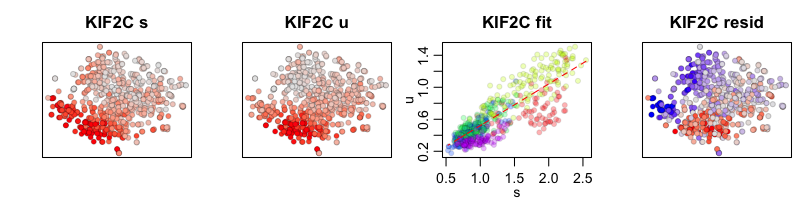
To compare our two RNA velocity models, with and without cell kNN pooling, we can look at the phase plots for a cell-cycle gene, KIF2C. The first plot shows our tSNE embedding colored by the cytoplasmic (or spliced in scRNA-seq) expression level of KIF2C. The second plot shows our tSNE embedding colored by the nuclear (or unspliced in scRNA-seq) expression level for KIF2C. The third plot is a phase diagram that plots the cytoplasmic versus the nuclear expression levels. The diagonal line represents our expected ratio of nuclear to cytoplasmic expression levels when the cell is in steady-state (e.g. the slope is our derived gene-specific steady-state coefficient for KIF2C). And the final fourth plot shows our tSNE embedding colored by the residual expression of KIF2C where red indicates upregulation and blue indicates downregulation of KIF2C.
gene.relative.velocity.estimates(emat, nmat,
                                 old.fit = rvel.cd.unpooled,
                                 show.gene = 'KIF2C',
                                 cell.emb = emb.test,
                                 cell.colors = cell.colors,
                                 verbose=FALSE)
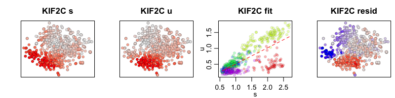
In the RNA velocity model with cell kNN pooling, expression levels for each cell are convolved with its 10 nearest neighbors. The results may look smoother but should show the same trends.
gene.relative.velocity.estimates(emat, nmat,
                                 old.fit = rvel.cd.pooled,
                                 show.gene = 'KIF2C',
                                 cell.emb = emb.test,
                                 cell.colors = cell.colors,
                                 verbose=FALSE)
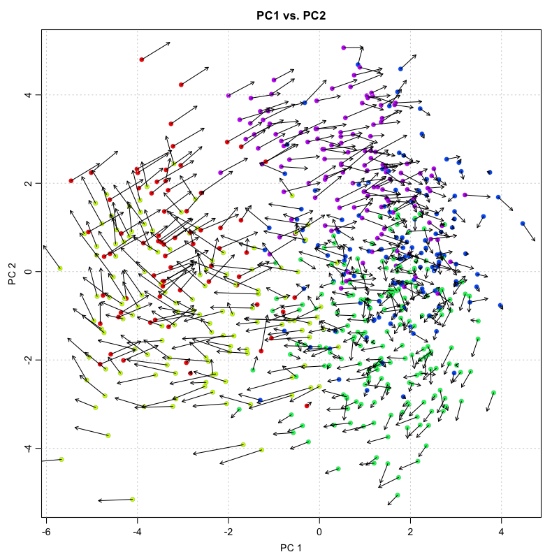
We thus can use our RNA velocity model to project the future transcriptional state for each cell based on all the genes in our model. We can then visualize this as a velocity arrow for each cell from its observed current state to its projected future state on linear reduced dimensionality representations such as PCA.
print(dim(rvel.cd.pooled$current)) ## current gene by cell info
## [1] 4367 645
print(dim(rvel.cd.pooled$projected)) ## projected gene by cell based on RNA velocity modeling
## [1] 4367 645
## plot onto PCA
pca.velocity.plot(rvel.cd.pooled,
                  nPcs=2,
                  plot.cols=1,
                  cell.colors=cell.colors,
                  pc.multipliers=c(1,-1) ## adjust as needed to orient pcs
                  )
## log ... pca ... pc multipliers ... delta norm ... done
Visualization of individual cell velocity arrows can be quite messy for
large numbers of cells. As such, RNA velocity can be visualized as a
vector field showing local group velocity evaluated on a regular grid.
The grid density can be adjusted depending on the visual scale of the
figure using the grid.n parameter.
pca.velocity.plot(rvel.cd.pooled,
                  nPcs=2,
                  plot.cols=1,
                  cell.colors=cell.colors,
                  pc.multipliers=c(1,-1), ## adjust as needed to orient pcs
                  show.grid.flow = TRUE,
                  grid.n=20 ## adjust as needed
                  )
## log ... pca ... pc multipliers ... delta norm ... done
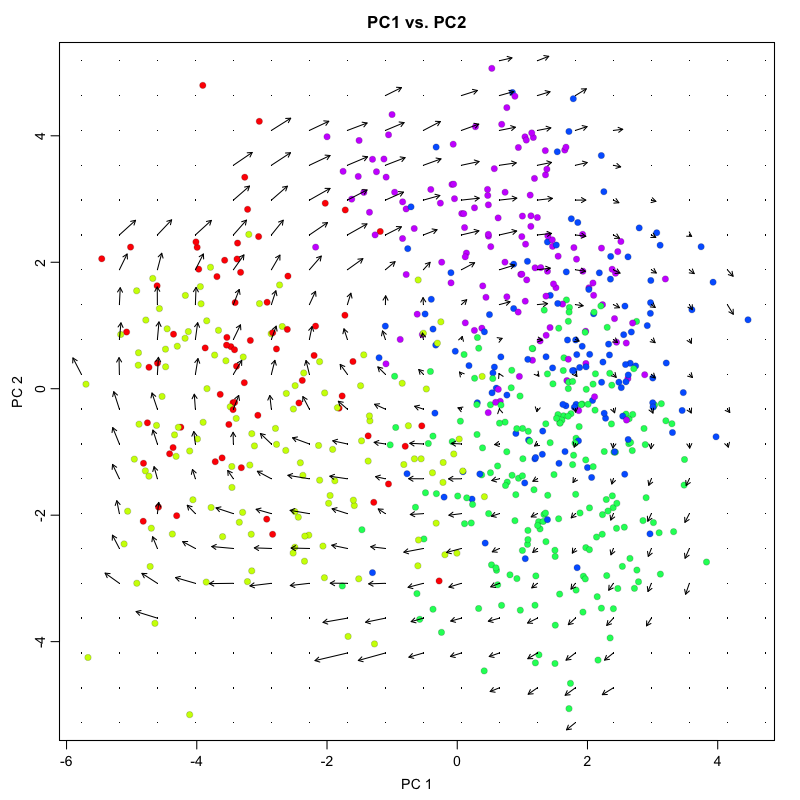
## grid.sd= 0.4012699
For non-linear, non-parametric embeddings such as tSNE, an alternative
approach is used to place the velocity arrow in the direction in which
expression difference is best correlated with the estimated velocity
vector. This is done by looking at a neighborhood around each cell,
examining the expression state (nuclear and cytoplasmic expression)
differences with different cells in the neighborhood, and drawing a
velocity arrow in the direction of the expected cell shfit after
accounting for cell density. We use a neighborhood size here of n=100.
The scale of the arrows used can be adjusted depending on the visual
scale of the figure using the arrow.scale parameter.
However, because tSNE is inherently stochastic and may produce different
embeddings every run, checking for concordance between PCA and tSNE is
strongly recommended. For example, the directional flow of the velocity
arrows between cell clusters should be consistent in the PCA and tSNE
representations. Likewise, the neighborhood-based approach for placing
velocity arrows can be quite sensitive to the n parameter with
unintuitive effects, particularly for extremely large or small choices
of n. So comparing with PCA and checking a range of parameters will be
helpful for evaluating stability.
show.velocity.on.embedding.cor(emb.test,
                               rvel.cd.pooled,
                               n=100,
                               cell.colors=cell.colors,
                               show.grid.flow=TRUE,
                               grid.n=20, ## adjust as needed
                               arrow.scale=3 ## adjust as needed
                               )
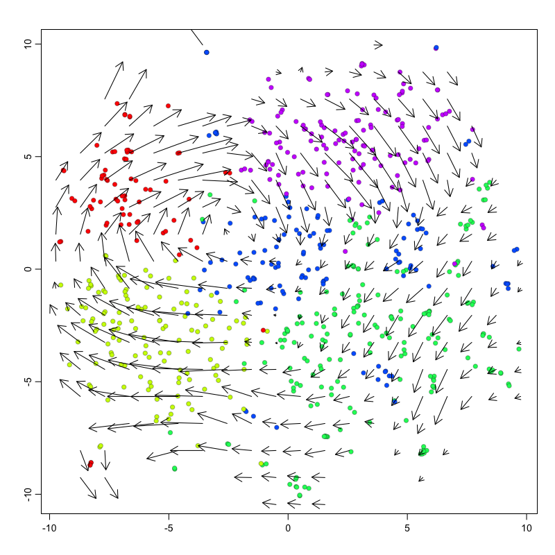
## delta projections ... log knn ... transition probs ... done
## calculating arrows ... grid estimates ... grid.sd= 0.7897987  min.arrow.size= 0.01579597  max.grid.arrow.length= 0.1249018  done
Pseudotime trajectory analysis
In this example, we observe a cyclical trajectory informed by the RNA velocity arrows. We can interpret the cell ordering along the circle as the pseudotime. Principal curve, minimum spanning tree, and other trajectory inference approaches can also be applied, particularly for more complex, branching trajectories. Examination of gene expression of known cell-cycle markers across pseudotime can further validate our pseudotime ordering.
xi = median(emb.test[,1])
yi = median(emb.test[,2])
pseudotime = -atan2(emb.test[,2]-yi, emb.test[,1]-xi)/pi*180 ## along circle
pseudotime = pseudotime - min(pseudotime) ## shift to positive

par(mfrow=c(2,2), mar=rep(1,4))
invisible(lapply(gs, function(g){
  gexp = mat[g,]
  fit = lm(gexp ~ pseudotime)

  ## fit smooth curve
  lo = smooth.spline(x=pseudotime, y=gexp, spar=1)
  plo = predict(lo, x=seq(min(pseudotime), max(pseudotime), by=1))
  mode_plo = plo$x[which.max(plo$y)] ## maximum point

  MUDAN::plotEmbedding(cbind(pseudotime, gexp),
                       groups=com,
                       main=g,
                       xlab='pseudotime', ylab='expression magnitude',
                       verbose=FALSE)
  points(plo, type="l", col='darkgrey', lwd=2)
  abline(v=mode_plo, col='darkgrey', lwd=2)
}))
We can also visualize the velocity arrows in this embedding as a sanity check to show that the direction of the velocity arrows is as expected.
g <- 'KIF2C'
gexp.emb <- cbind(scale(pseudotime)[,1], scale(mat[g,])[,1])
show.velocity.on.embedding.cor(gexp.emb,
                               rvel.cd.pooled,
                               n=100,
                               cell.colors=cell.colors,
                               show.grid.flow=TRUE,
                               grid.n=20, ## adjust as needed
                               arrow.scale=1 ## adjust as needed
)
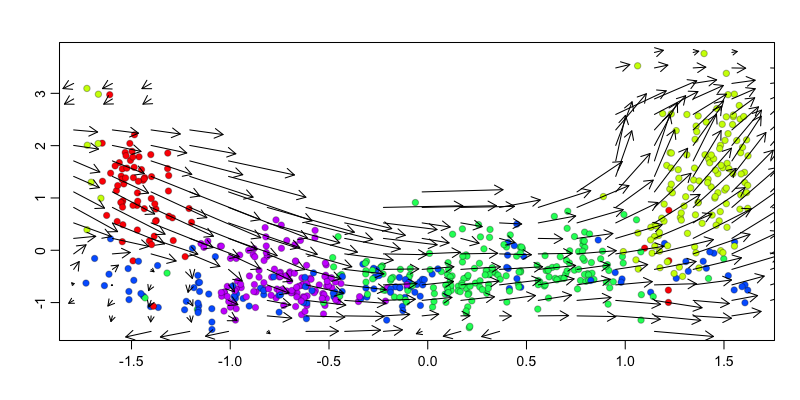
## delta projections ... log knn ... transition probs ... done
## calculating arrows ... grid estimates ... grid.sd= 0.1776234  min.arrow.size= 0.003552468  max.grid.arrow.length= 0.09682692  done
Try it out for yourself!
- Repeat this analysis using a different batch of cells or even all cells with batch correction
- Try out different embedding approaches like UMAP
- Use more stringent gene filtering or restrict RNA velocity modeling to a specific set of genes such as known cell-cycle genes
- Download a publically available scRNA-seq dataset and run RNA velocity analysis yourself from the start
Recent Posts
- AI-guided data visualization of gas prices in different geographical locations across the US over time on 04 May 2026
- The Mentorship Index on 01 March 2026
- Vibe coding with SEraster and STcompare to compare spatial transcriptomics technologies on 22 February 2026
- RNA velocity in situ infers gene expression dynamics using spatial transcriptomics data on 13 October 2025
- Analyzing ICE Arrest Data - Part 2 on 27 September 2025