Multi-sample Integrative Analysis of Spatial Transcriptomics Data using Sketching and Harmony in Seurat
I often write up code tutorials as a way for me to take notes on what I’ve been learning. But they also serve a secondary purpose as training material for students in my lab. In particular, they provide a structured way for new lab members to get up to speed with specific types of analyses.
In this code tutorial, I will demonstrate a multi-sample integrative analysis of two VisiumHD spatial transcriptomics datasets. VisiumHD data is quite large so to make this analysis tractable, we’ll use geometric sketching to downsample the data in a way that preserves spatial and transcriptional structure. When working across multiple samples, batch effects are also a concern so we’ll walk through how to correct for batch effects using Harmony in order to enable visual comparisons of the spatial organization of shared transcriptionally distinct cell-types and tissue structures across our samples.
I generally expect new lab members such as PhD rotation students to walk through tutorials like this one and then apply what they’ve learned to their own data to jump start their rotation projects. I am therefore assuming some familiarity with coding, spatial transcriptomics, and molecular biology and will generally offer minimal explanations because I expect PhD rotation students to have the maturity to ask if they don’t understand why certain steps are done. But if you’re also just getting started with this type of multi-sample integrative spatial transcriptomics analysis, feel free to follow along.
Read in the data
I will demonstrate this on two VisiumHD datasets availabel through the 10x Genomics website - one of a whole mouse kidney, and one of a cortical section of a human kidney. Students following along are welcome to download these datasets to recapitulate the results and/or try it out on their own data.
I am applying what I learned from following this code tutorial on orchestrating VisiumHD analysis using Seurat. For the purposes of this blog post and as proof of concept, I will focus on the 16um resolution data. Note that this means our analysis involves pixels that are generally bigger than a single cell. Students are encouraged to interpret results in the context of this coarse pixel resolution and recommended to explore other resolutions.
library(Seurat)
library(ggplot2)
library(patchwork)
library(dplyr)
sample <- 'visium-hd-cytassist-gene-expression-libraries-of-mouse-kidney/outs/'
object1 <- Load10X_Spatial(data.dir = sample, bin.size = c(16))
dim(object1)
## [1] 19059 126114
sample <- 'visium-hd-cytassist-gene-expression-libraries-human-kidney-ffpe/outs/'
object2 <- Load10X_Spatial(data.dir = sample, bin.size = c(16))
dim(object2)
## [1] 18085 166813
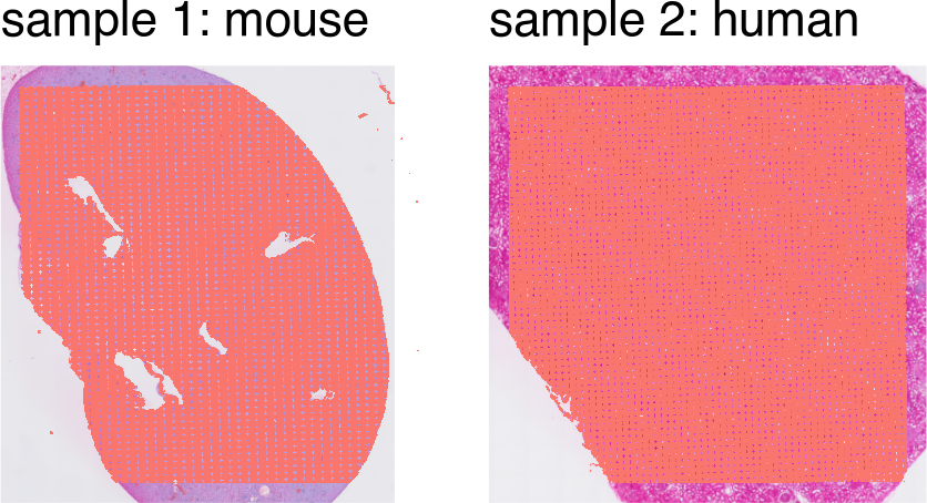
Note these are some pretty large datasets with over 100,000 pixels each!
SpatialPlot(object1) + theme(legend.position = "none") + ggtitle('sample 1: mouse') |
  SpatialPlot(object2) + theme(legend.position = "none") + ggtitle('sample 2: human')
Identify shared features
An integrative analysis requires me to have shared features across these
datasets. In this context, the features are genes. However, one
dataset is mouse and one is human. Therefore, we need to figure out some
way to match mouse genes with human genes. This is an interesting
bioinformatics challenge in itself. But for the purposes of this blog
post and as proof of concept, I will simply map the mouse gene names to
human gene names using NCBI’s
homologene, for which a
nice R wrapper is available through the homologene
package.
# map mouse gene names to human gene names
library(homologene)
mouse_genes <- rownames(object1)
ortholog_table <- homologene(mouse_genes, inTax = 10090, outTax = 9606)
head(ortholog_table)
##    10090   9606 10090_ID 9606_ID
## 1   Xkr4   XKR4   497097  114786
## 2    Rp1    RP1    19888    6101
## 3  Sox17  SOX17    20671   64321
## 4 Lypla1 LYPLA1    18777   10434
## 5  Tcea1  TCEA1    21399    6917
## 6  Rgs20  RGS20    58175    8601
Note that there are some mouse genes that map to multiple human genes and vice versa. For the purposes of this blog post and as proof of concept, I will simply ignore these complicated orthologous relationships and just take the first gene that matches. Again, students doing this analysis “for real” will want to explore different solutions.
# update gene names
new_gene_names <- ortholog_table$`9606`[match(rownames(object1), ortholog_table$`10090`)]
print(length(new_gene_names))
## [1] 19059
print(length(unique(new_gene_names)))
## [1] 15256
# for now deal with multi-mapping (temp solution)
rownames(object1) <- make.unique(new_gene_names)
# just keep first gene
genes.have <- unique(intersect(rownames(object1), rownames(object2)))
print(length(genes.have))
## [1] 14732
# restrict to shared genes
print(dim(object1))
## [1] 19059 126114
print(dim(object2))
## [1] 18085 166813
object1 <- object1[genes.have,]
object2 <- object2[genes.have,]
print(dim(object1))
## [1] 14732 126114
print(dim(object2))
## [1] 14732 166813
So now we’ve subsetted both datasets to 14,732 shared genes, all labeled as the human gene symbol.
Merge the datasets
Now we’re ready to combine these datasets! I applied what I learned from this code tutorial on merging Seurat objects.
# combine datasets
object1$dataset <- "mouse"
object2$dataset <- "human"
object <- merge(object1, y = object2, add.cell.ids = c("mouse", "human"), project = "MergedProject")
Assays(object)
## [1] "Spatial.016um"
DefaultAssay(object) <- "Spatial.016um"
table(object@meta.data$dataset)
##
##  human  mouse
## 166813 126114
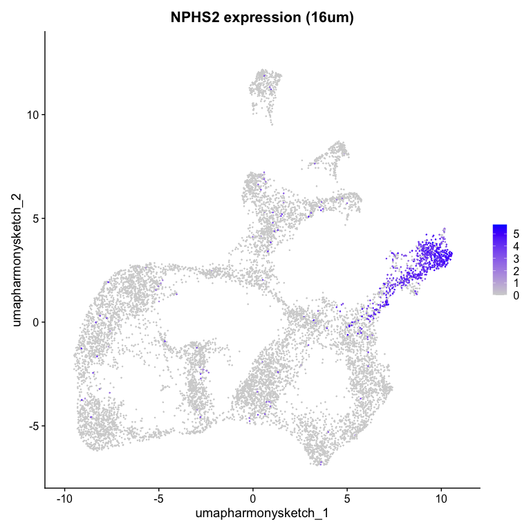
Let’s visualize a gene (note we are using the human gene names now) and see how it looks across our mouse and human tissue. NPHS2 is the gene for podocin, a crucial protein in the glomerular filtration barrier.
# normalize bins
object <- NormalizeData(object)
# visualize a gene
g <- 'NPHS2'
g %in% rownames(object1)
## [1] TRUE
g %in% rownames(object2)
## [1] TRUE
SpatialFeaturePlot(object, features = g,
                   pt.size.factor = 5) + ggtitle(paste0(g, " expression (16um)"))
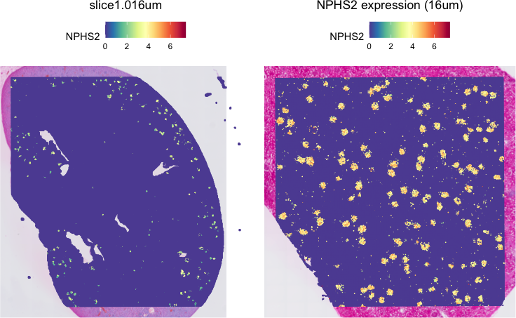
Indeed, we see this gene as highly expressed in little tufts sprinkled across the tissue that are presumably the glomeruli. Note the physical scale difference between mouse and human glomeruli! Neat!
Downsample using sketching
Again, these VisiumHD datasets are quite large. To avoid memory issues while running this on my laptop, I will apply what I learned from this tutorial to apply geometric sketching to downsample the data.
# sketch
object <- FindVariableFeatures(object)
object <- ScaleData(object)
dim(object1@assays$Spatial.016um)
## [1] 14732 126114
dim(object2@assays$Spatial.016um)
## [1] 14732 166813
object <- SketchData(
  object = object,
  ncells = 5000, ## per dataset
  method = "LeverageScore",
  sketched.assay = "sketch"
)
Now, I can perform dimensionality reduction and clustering on the downsampled data to identify transcriptionally distinct pixels that may represent cell-types or tissue structures.
# switch analysis to sketched cells
DefaultAssay(object) <- "sketch"
dim(object@assays$sketch)
## [1] 14732 10000
# perform clustering workflow
object <- FindVariableFeatures(object)
object <- ScaleData(object)
object <- RunPCA(object, assay = "sketch", reduction.name = "pca.sketch")
object <- FindNeighbors(object, assay = "sketch", reduction = "pca.sketch", dims = 1:10)
object <- FindClusters(object, cluster.name = "seurat_cluster.sketched", resolution = 0.5)
## Modularity Optimizer version 1.3.0 by Ludo Waltman and Nees Jan van Eck
##
## Number of nodes: 10000
## Number of edges: 334446
##
## Running Louvain algorithm...
## Maximum modularity in 10 random starts: 0.9214
## Number of communities: 14
## Elapsed time: 0 seconds
object <- RunUMAP(object, reduction = "pca.sketch", reduction.name = "umap.sketch", return.model = T, dims = 1:10)
We can visualize the downsampled data as a UMAP colored by the downsampled graph-based cluster annotations and original dataset annotations.
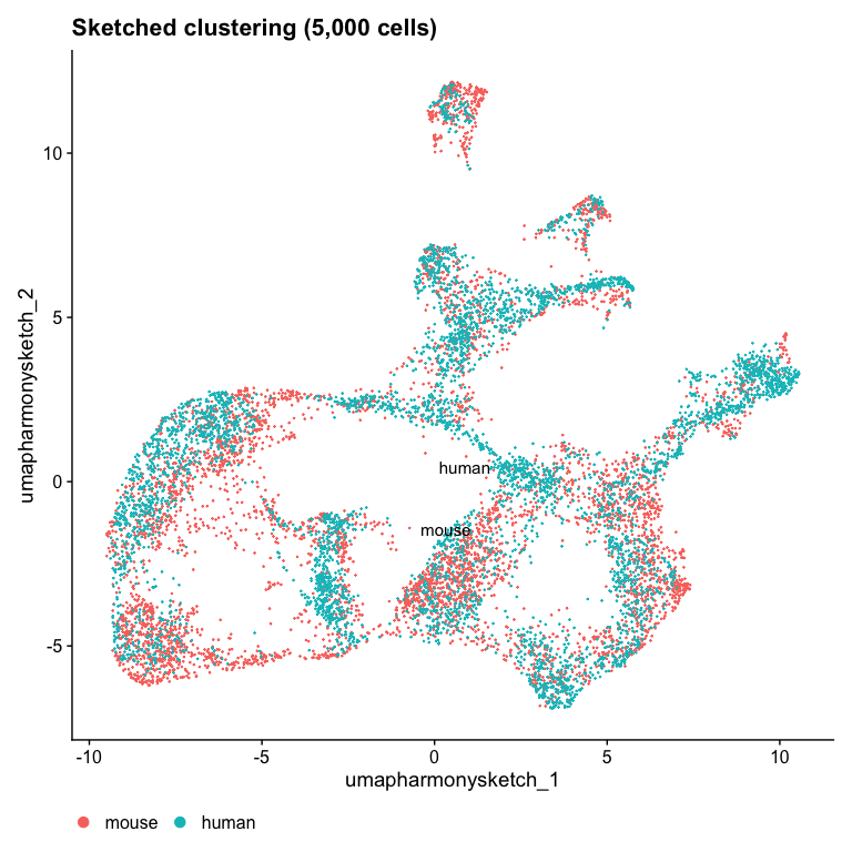
Idents(object) <- "dataset"
DimPlot(object, reduction = "umap.sketch", label = TRUE) + ggtitle("Sketched clustering (5,000 cells)") + theme(legend.position = "bottom")
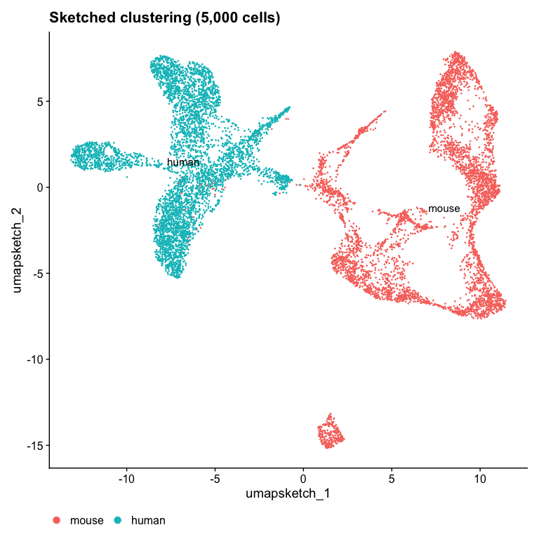
Note that the two datasets are completely separated in the UMAP space!
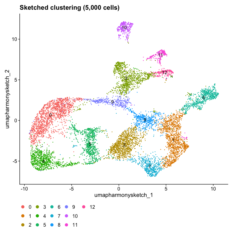
Idents(object) <- "seurat_cluster.sketched"
DimPlot(object, reduction = "umap.sketch", label = TRUE) + ggtitle("Sketched clustering (5,000 cells)") + theme(legend.position = "bottom")
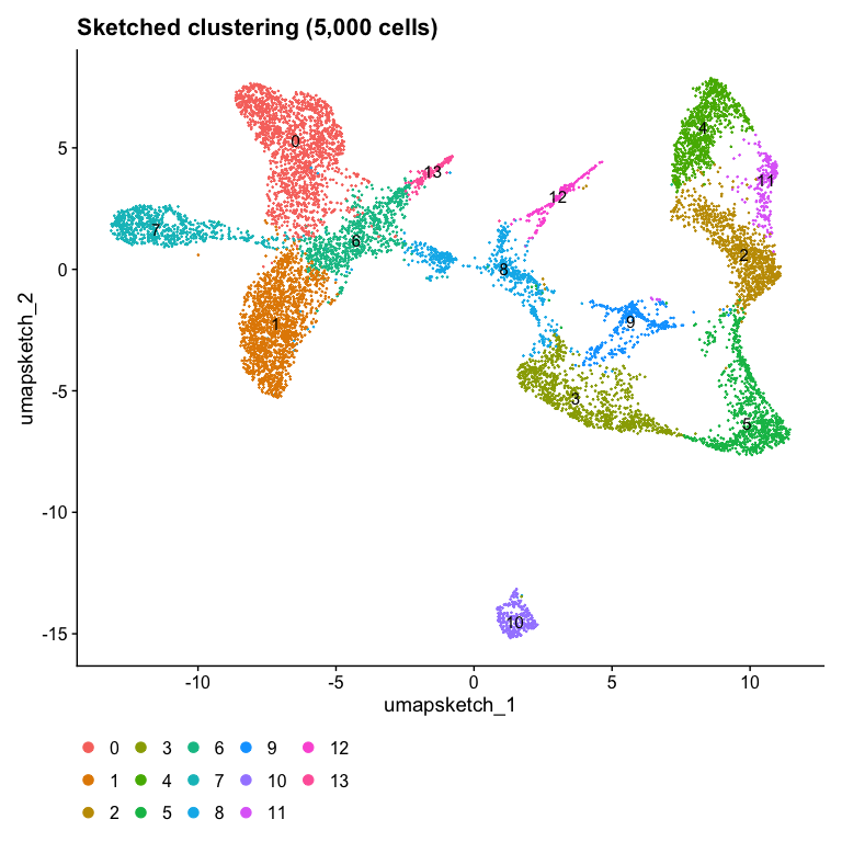
And the cluster annotations are unique to each dataset. This makes it very hard to identify and compare shared cell-types across the datasets.
Batch correction with Harmony
So we will apply Harmony to project these pixels into a shared embedding in which pixels group by cell-type and tissue structure rather than dataset-specific conditions. I will apply what I learned from this tutorial on using Harmony for batch correction. Note I am applying Harmony to the downsampled sketched data.
library(harmony)

# run harmony
object <- RunHarmony(
  object = object,
  group.by.vars = "dataset",
  assay.use = "sketch",
  reduction = "pca.sketch",
  reduction.save = "harmony.sketch",
  theta = 8
)

# Use Harmony embeddings from sketched data for clustering and UMAP
object <- FindNeighbors(object, reduction = "harmony.sketch", dims = 1:10)
object <- FindClusters(object, resolution = 0.5, cluster.name = "seurat_cluster.harmony.sketched")
## Modularity Optimizer version 1.3.0 by Ludo Waltman and Nees Jan van Eck
##
## Number of nodes: 10000
## Number of edges: 350925
##
## Running Louvain algorithm...
## Maximum modularity in 10 random starts: 0.9187
## Number of communities: 13
## Elapsed time: 0 seconds
object <- RunUMAP(object, reduction = "harmony.sketch", reduction.name = "umap.harmony.sketch", dims = 1:10)
We can again visualize the downsampled data as a harmonized UMAP colored by the downsampled graph-based cluster annotations from the harmonized principal components and original dataset annotations.
# plot
DefaultAssay(object) <- "sketch"
Idents(object) <- "seurat_cluster.harmony.sketched"
DimPlot(object, reduction = "umap.harmony.sketch", label = TRUE) + ggtitle("Sketched clustering (5,000 cells)") + theme(legend.position = "bottom")
Idents(object) <- "dataset"
DimPlot(object, reduction = "umap.harmony.sketch", label = TRUE) + ggtitle("Sketched clustering (5,000 cells)") + theme(legend.position = "bottom")
Now we see much better mixing across the two datasets! I wonder which
cluster expresses NPHS2?
g <- 'NPHS2'
FeaturePlot(object, reduction = "umap.harmony.sketch", features = g) + ggtitle(paste0(g, " expression (16um)"))
Looks like custer 6 highly expresses NPHS2.
Project back to full dataset
Remember that we’ve only derived harmonized cluster annotations on the sketched subset of pixels. We will need to project these annotations back onto the full dataset.
# project to full
object <- ProjectData(
  object = object,
  assay = "Spatial.016um",
  full.reduction = "full.pca.sketch",
  sketched.assay = "sketch",
  sketched.reduction = "harmony.sketch",
  umap.model = "umap.sketch",
  dims = 1:10,
  refdata = list(seurat_cluster.harmony.projected = "seurat_cluster.harmony.sketched")
)
Visualize cell-type spatial patterns
Now we can finally visualize the cluster annotations on the whole tissue to appreciate their spatial organization.
# plot
Idents(object) <- "seurat_cluster.harmony.projected"
SpatialDimPlot(object, label = FALSE, pt.size.factor = 5)
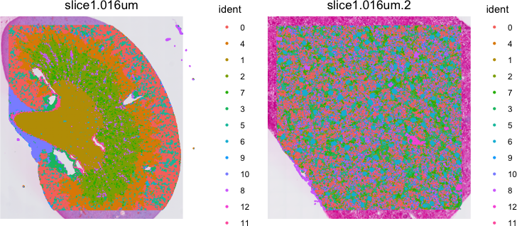
It can be difficult to visualize so many clusters simultaneously. So I prefer visualizing just one at a time. Let’s take a look at cluster 6.
Idents(object) <- "seurat_cluster.harmony.projected"
cells <- CellsByIdentities(object, idents = c(6))
SpatialDimPlot(object,
  cells.highlight = cells[setdiff(names(cells), "NA")],
  cols.highlight = c("#FFFF00", "grey50", "#FFFF00", "grey50"),
  pt.size.factor = 5
)
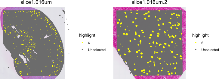
By combining sketching and Harmony batch correction, we’ve been able to identify shared transcriptional clusters across two VisiumHD spatial transcriptomics datasets that we can confirm to visually mark spatially similar tissue structures such as glomeruli. Given these cluster annotations, now we can perform differential gene expression analysis, cell-type colocalization analyses, and more. It will be left up as an exercise to the students to explore these downstream analyses independently.
Try it out for yourself!
Some questions to inspire your independent self-guided learning:
- What happens if you use 8um pixels instead of 16um? 2um?
- What happens if you use a different approach for identifying shared features between human and mouse such as limiting to 1-1 orthologs?
- Apply what you’ve learned to a case-control comparison setting
Recent Posts
- The Mentorship Index on 01 March 2026
- Vibe coding with SEraster and STcompare to compare spatial transcriptomics technologies on 22 February 2026
- RNA velocity in situ infers gene expression dynamics using spatial transcriptomics data on 13 October 2025
- Analyzing ICE Arrest Data - Part 2 on 27 September 2025
- Analyzing ICE Detention Data from 2021 to 2025 on 10 July 2025