Vibe coding with SEraster and STcompare to compare spatial transcriptomics technologies
Introduction
In this blog post, I demonstrate how I vibe code to apply our lab’s tool STcompare to compare two mouse kidney datasets from this paper “Multimodal spatial transcriptomic characterization of mouse kidney injury and repair” from Humphreys lab.
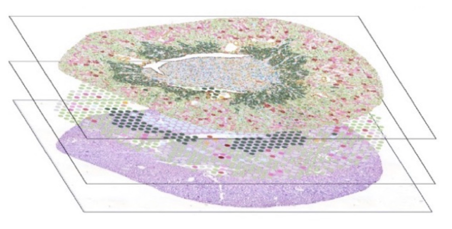
I will focus on two serial section of control mouse kidneys generated using different spatial transcriptomics technologies: Visium and Xenium. These datasets were already beautifully aligned so that I would hypothesize any genes detected at each spatial location by one technology should also be detected with a comparable spatial pattern and perhaps even magnitude by the other technology given the high anatomical similarity across tissue sections for the kidney.
I walk through how I iterate between vibe coding, inspecting results, critically thinking, manually editing the code based on my understanding of logic errors in the vibed code, and finally drawing conclusions and building on the vibed code to communicate findings via data visualization.
I’ve already downloaded and cleaned up these datasets to create csv.gz files that are a bit easier to read into R as part of my Genomic Data Visualizations class so feel free to download and follow along.
Vibe coding
I am using the Claude Opus 4.6 from Anthropic. I git cloned the STcompare repo, downloaded the spatial transcriptomics datasets, and then prompted Claude with the following:
The current directory contains an R package called STcompare. STcompare takes a Spatial Experiments object and performs rasterization preprocessing to aggregate information into spatially contiguous square or hexagonal bins and then performs comparative analyses at matched pixels. See tutorials in the vignettes/ folder for more usage details.
Write an R script that reads the file “~/Desktop/genomic-data-visualization-2026/data/Xenium-IRI-ShamR_matrix.csv.gz” where each row is a cell and the first two columns are x,y spatial positions and the rest are gene expression magnitudes.
Likewise, also read in the dataset ‘~/Desktop/genomic-data-visualization-2026/data/Visium-IRI-ShamR_matrix.csv.gz’ where each row is a cell and the first two columns are x,y spatial positions and the rest are gene expression magnitudes.
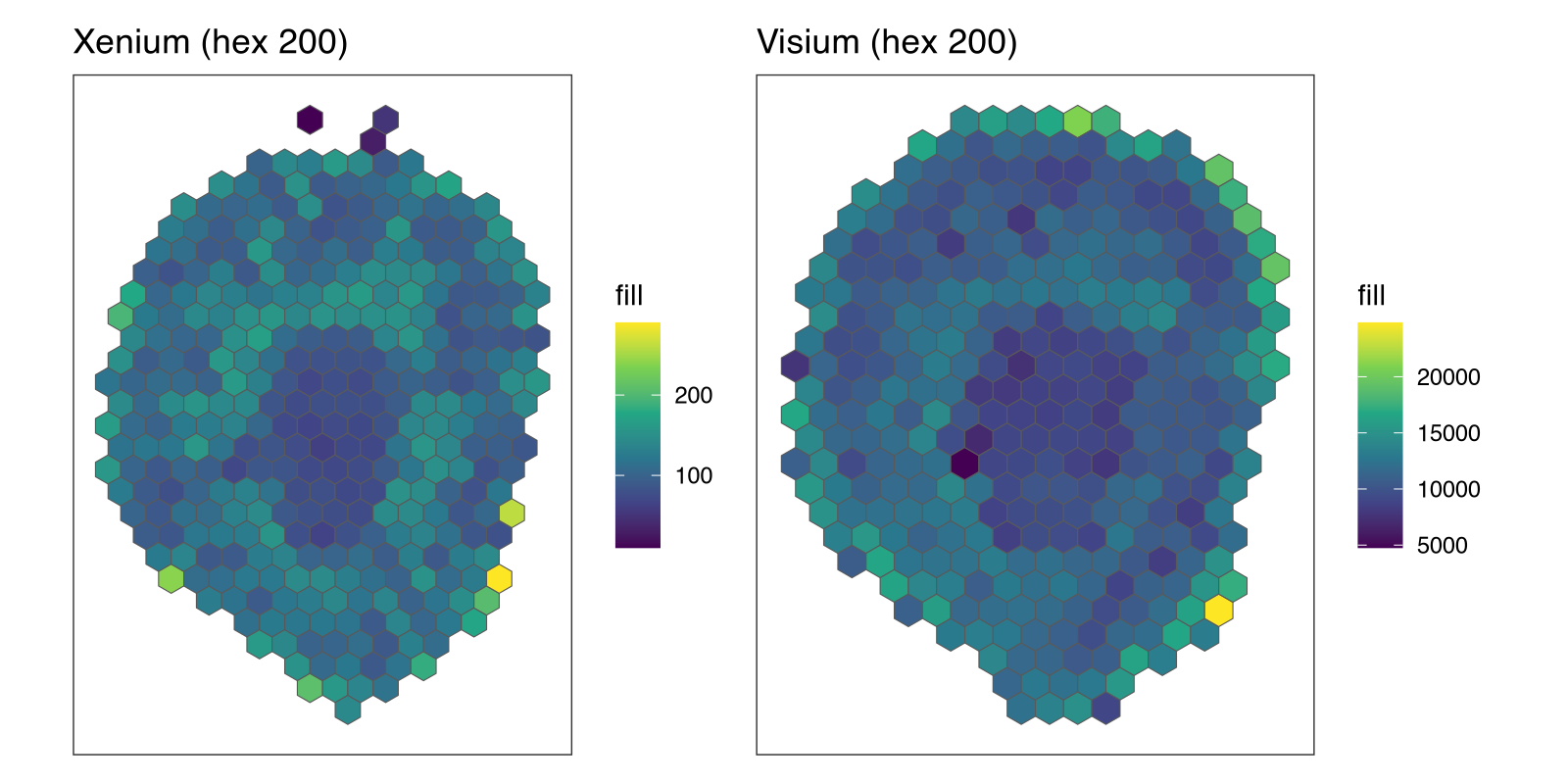
The two datasets have already been aligned to the same coordinate space. Use STcompare to rasterize these two datasets together using hexagonal bins of size 200 so they are on the same spatial coordinate system. Create a visualization of the rasterized outputs side by side using the patchwork library.
library(STcompare)
library(SpatialExperiment)
library(SEraster)
library(ggplot2)
library(patchwork)

## ── Read data ───────────────────────────────────────────────────────────────

xenium <- read.csv("~/Desktop/genomic-data-visualization-2026/data/Xenium-IRI-ShamR_matrix.csv.gz", row.names=1)
visium <- read.csv("~/Desktop/genomic-data-visualization-2026/data/Visium-IRI-ShamR_matrix.csv.gz", row.names=1)

## ── Build SpatialExperiment objects ─────────────────────────────────────────

make_spe <- function(df) {
  pos  <- as.matrix(df[, c(1, 2)])
  colnames(pos) <- c("x", "y")
  gexp <- as(t(df[, 3:ncol(df)]), "dgCMatrix")

  SpatialExperiment(
    assays      = list(counts = gexp),
    spatialCoords = pos
  )
}

spe_xenium <- make_spe(xenium)
spe_visium <- make_spe(visium)

## ── Rasterize together (hex bins, size 200) ─────────────────────────────────

spe_list <- list(Xenium = spe_xenium, Visium = spe_visium)

rast <- SEraster::rasterizeGeneExpression(
  spe_list,
  resolution = 200,
  fun        = "mean",
  square     = FALSE
)

## ── Visualize rasterized outputs side by side ───────────────────────────────

p1 <- SEraster::plotRaster(rast$Xenium, plotTitle = "Xenium (hex 200)")
p2 <- SEraster::plotRaster(rast$Visium, plotTitle = "Visium (hex 200)")

p1 + p2
Claude correctly read in the data, created SpatialExperiment objects, and realized it needs to use the dependency SEraster to create hexagonal bins. This is of course all laid out in the associated tutorial and documentation files, which Claude had access to. Now let’s actually do some quantitative comparisons.
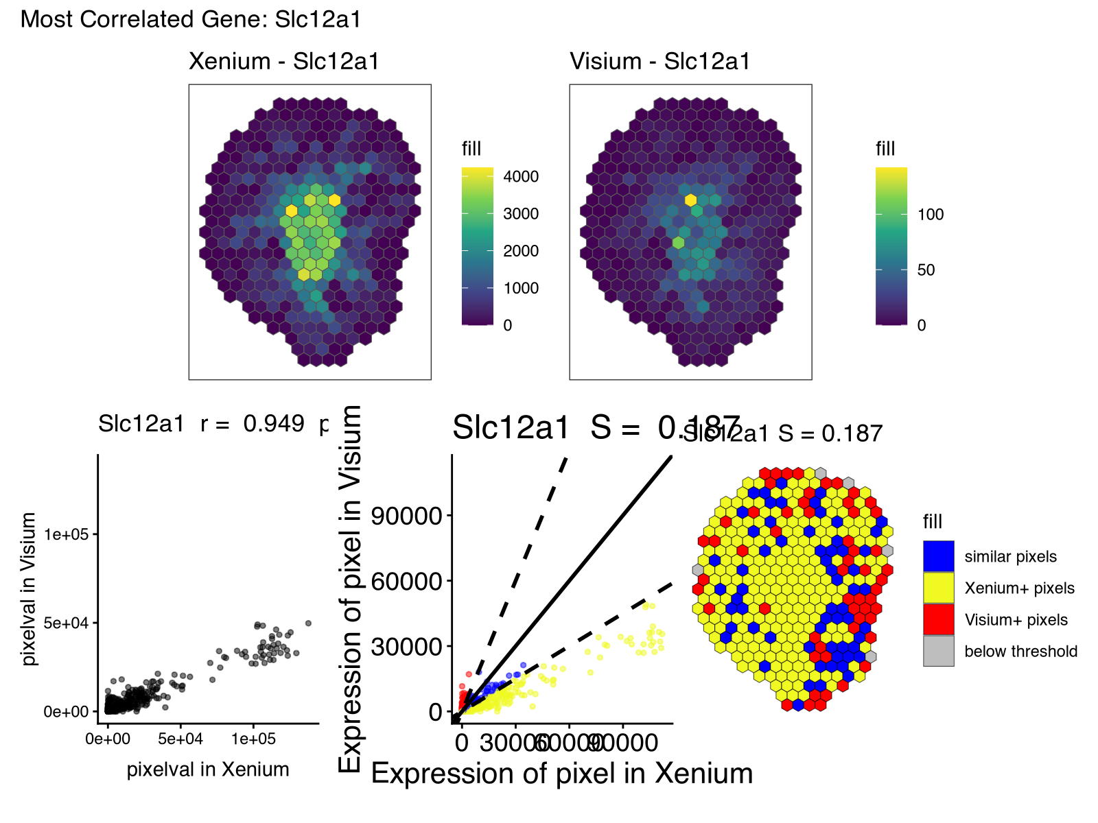
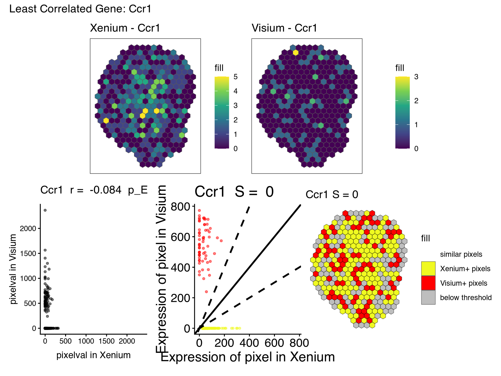
Now use STcompare to evaluate the spatial correlation and spatial fold change for all shared genes. Identify shared genes by intersecting the rownames in both datasets. Organize and print all results as a table.
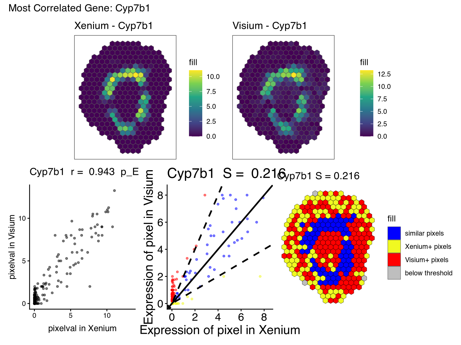
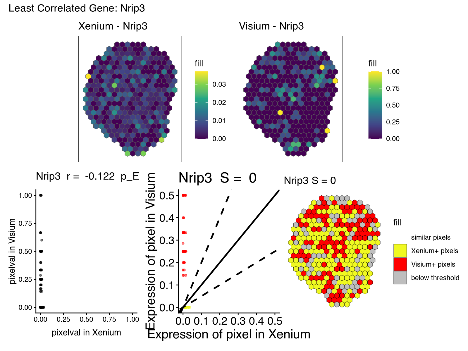
For the top most highly spatially correlated and least spatially correlated gene, visualize the spatial correlation and fold change following the getting-started-with-STcompare.md tutorial.
## ── Spatial correlation for all shared genes ────────────────────────────────

shared_genes <- intersect(rownames(rast$Xenium), rownames(rast$Visium))

rastList <- list(Xenium = rast$Xenium[shared_genes,], Visium = rast$Visium[shared_genes,])

sc <- spatialCorrelationGeneExp(rastList, nThreads = 1)

## ── Spatial fold change (similarity) for all shared genes ───────────────────

ss <- spatialSimilarity(rastList)

## ── Combined results table ──────────────────────────────────────────────────

results <- data.frame(
  gene              = rownames(sc),
  correlationCoef   = sc$correlationCoef,
  pValueNaive       = sc$pValueNaive,
  pValuePermuteX    = sc$pValuePermuteX,
  pValuePermuteY    = sc$pValuePermuteY,
  percentSimilarity = ss$similarityTable$percentSimilarity[
    match(rownames(sc), ss$similarityTable$gene)
  ]
)
results <- results[order(results$correlationCoef, decreasing = TRUE), ]

cat("\n══ Spatial Correlation & Fold-Change Results ══\n\n")
print(head(results), row.names = FALSE)
print(tail(results), row.names = FALSE)

## ── Identify most and least correlated genes ────────────────────────────────

gene_most  <- results$gene[which.max(results$correlationCoef)]
gene_least <- results$gene[which.min(results$correlationCoef)]

cat("\nMost spatially correlated gene: ", gene_most,
    " (r = ", round(results$correlationCoef[which.max(results$correlationCoef)], 3), ")\n")
cat("Least spatially correlated gene:", gene_least,
    " (r = ", round(results$correlationCoef[which.min(results$correlationCoef)], 3), ")\n")

## ── Visualize most correlated gene ──────────────────────────────────────────

shared_pixels <- intersect(colnames(rast$Xenium), colnames(rast$Visium))
corr_most  <- plotCorrelationGeneExp(rastList, sc, gene_most)
lr_most    <- linearRegression(ss, gene_most)
pc_most    <- pixelClass(ss, gene_most)
rast_most_x <- SEraster::plotRaster(rast$Xenium[gene_most, shared_pixels],
                                    plotTitle = paste0("Xenium - ", gene_most))
rast_most_v <- SEraster::plotRaster(rast$Visium[gene_most, shared_pixels],
                                    plotTitle = paste0("Visium - ", gene_most))

cat("\nPlotting most spatially correlated gene:", gene_most, "\n")
print(
  (rast_most_x + rast_most_v) / (corr_most + lr_most + pc_most) +
    plot_annotation(title = paste0("Most Correlated Gene: ", gene_most))
)

## ── Visualize least correlated gene ─────────────────────────────────────────

shared_pixels <- intersect(colnames(rast$Xenium), colnames(rast$Visium))
corr_least  <- plotCorrelationGeneExp(rastList, sc, gene_least)
lr_least    <- linearRegression(ss, gene_least)
pc_least    <- pixelClass(ss, gene_least)
rast_least_x <- SEraster::plotRaster(rast$Xenium[gene_least, shared_pixels],
                                     plotTitle = paste0("Xenium - ", gene_least))
rast_least_v <- SEraster::plotRaster(rast$Visium[gene_least, shared_pixels],
                                     plotTitle = paste0("Visium - ", gene_least))

cat("\nPlotting least spatially correlated gene:", gene_least, "\n")
print(
  (rast_least_x + rast_least_v) / (corr_least + lr_least + pc_least) +
    plot_annotation(title = paste0("Least Correlated Gene: ", gene_least))
)
Building on vibed code
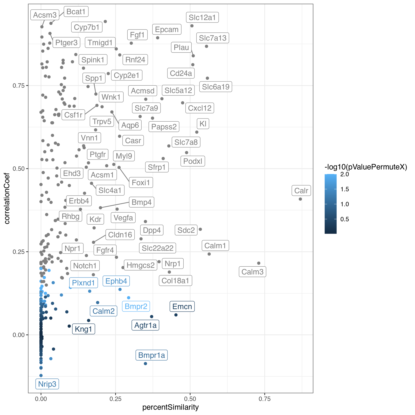
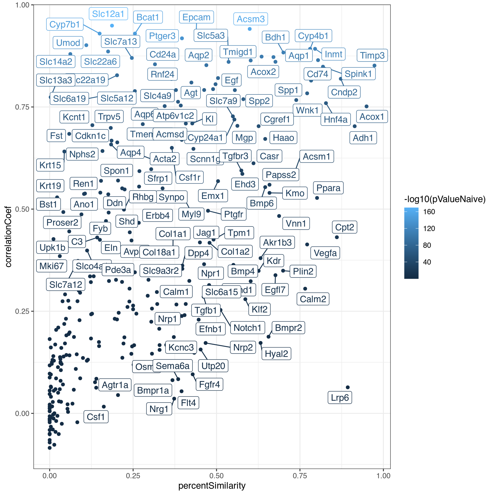
From here, I decided it was actually faster for me to just manually code to explore further rather than try to describe what I wanted in English. In particular, I wanted to take a look at the relationship between the spatial correlation and spatial similarity metrics with respect to significance. So I made a visualization capturing all these metrics using different visual channels (x for spatial similarity, y for spatial correlation and color for signifiance).
ggplot(results, aes(x=percentSimilarity,
                    y=correlationCoef,
                    col=-log10(pValuePermuteX),
                    label=gene)) +
  geom_point() + ggrepel::geom_label_repel() + theme_bw()
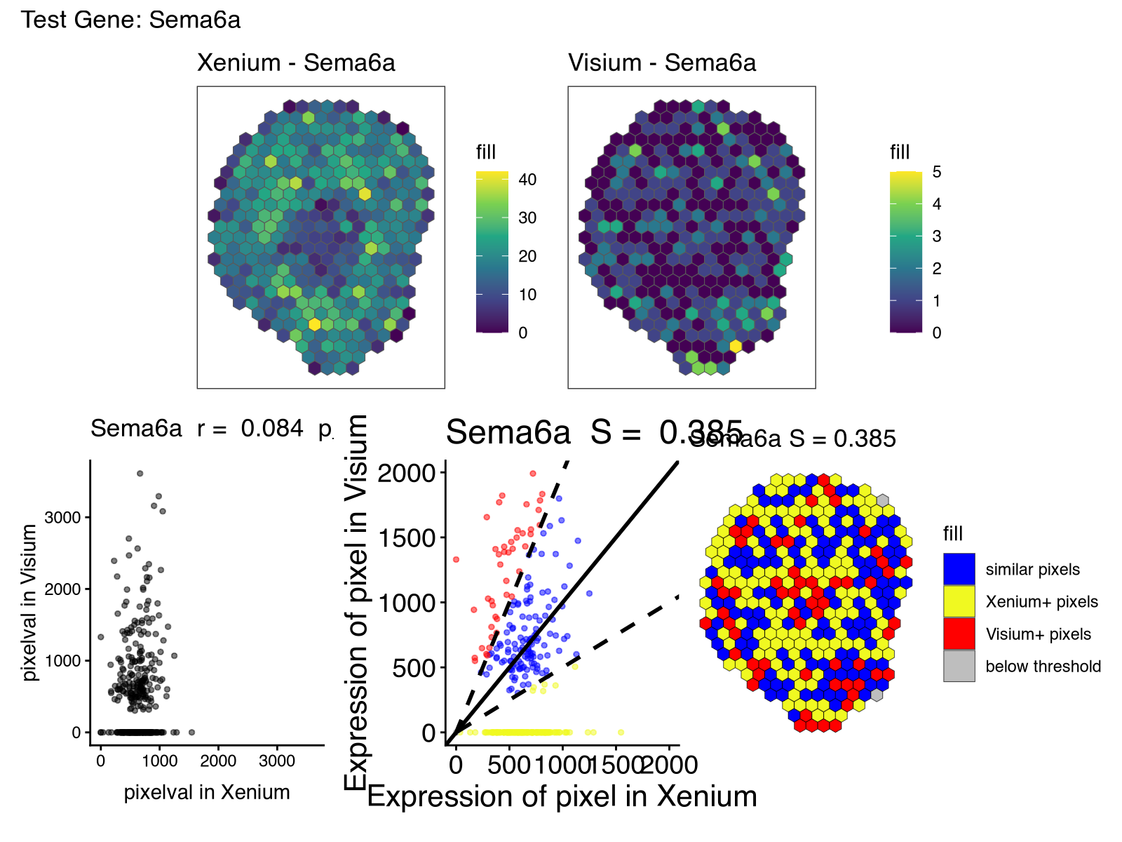
From this, we can build on our vibed code to focus on specific test genes gene_test.
shared_pixels <- intersect(colnames(rast$Xenium), colnames(rast$Visium))
corr_test  <- plotCorrelationGeneExp(rastList, sc, gene_test)
lr_test    <- linearRegression(ss, gene_test)
pc_test    <- pixelClass(ss, gene_test)
rast_test_x <- SEraster::plotRaster(rast$Xenium[gene_test, shared_pixels],
                                     plotTitle = paste0("Xenium - ", gene_test))
rast_test_v <- SEraster::plotRaster(rast$Visium[gene_test, shared_pixels],
                                     plotTitle = paste0("Visium - ", gene_test))

print(
  (rast_test_x + rast_test_v) / (corr_test + lr_test + pc_test) +
    plot_annotation(title = paste0("Test Gene: ", gene_test))
)
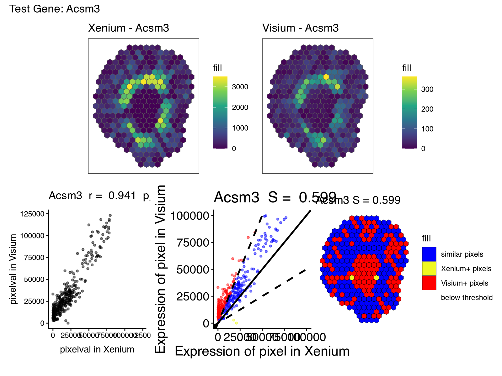
For gene_test <- 'Acsm3', we can see how the gene is highly spatially correlated across the two samples but very different in expression magnitude.
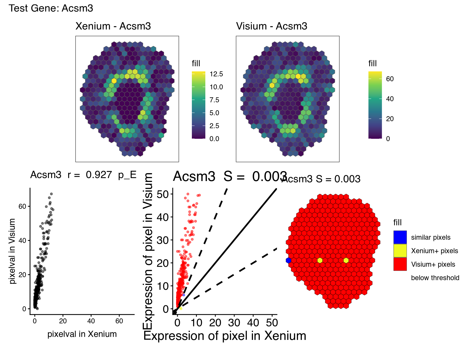
This is where I realized I didn’t normalize this data at all! Given the known detection sensitivity and through-put differences with regard to the number of different genes profiled between these two technologies, it’s not surprising that the raw counts are not on a comparable scale. Likewise, the vibed code had used a mean function for aggregating gene expression into pixels whereas sum would’ve made more sense in this context given that the detected genes in Visium is a sum of all gene expression in each spot. Vibe coding is still no substitute for critical thinking!
So I had to go back and manually fix this and rerun my whole analysis…
My manually fixed code is below so you can see how the vibed code provided us with a strong template:
library(STcompare)
library(SpatialExperiment)
library(SEraster)
library(ggplot2)
library(patchwork)
## ── Read data ───────────────────────────────────────────────────────────────
xenium <- read.csv("~/Desktop/genomic-data-visualization-2026/data/Xenium-IRI-ShamR_matrix.csv.gz", row.names=1)
visium <- read.csv("~/Desktop/genomic-data-visualization-2026/data/Visium-IRI-ShamR_matrix.csv.gz", row.names=1)
## ── Build SpatialExperiment objects ─────────────────────────────────────────
make_spe <- function(df) {
pos <- as.matrix(df[, c(1, 2)])
colnames(pos) <- c("x", "y")
gexp <- as(t(df[, 3:ncol(df)]), "dgCMatrix")
SpatialExperiment(
assays = list(counts = gexp),
spatialCoords = pos
)
}
spe_xenium <- make_spe(xenium)
spe_visium <- make_spe(visium)
## ── Rasterize together (hex bins, size 200) ─────────────────────────────────
spe_list <- list(Xenium = spe_xenium, Visium = spe_visium)
rast <- SEraster::rasterizeGeneExpression(
spe_list,
resolution = 200,
fun = "sum",
square = FALSE
)
## ── Visualize rasterized outputs side by side ───────────────────────────────
p1 <- SEraster::plotRaster(rast$Xenium, plotTitle = "Xenium (hex 200)")
p2 <- SEraster::plotRaster(rast$Visium, plotTitle = "Visium (hex 200)")
p1 + p2
## ── Spatial correlation for all shared genes ────────────────────────────────
shared_genes <- intersect(rownames(rast$Xenium), rownames(rast$Visium))
#rastList <- list(Xenium = rast$Xenium[shared_genes,], Visium = rast$Visium[shared_genes,])
# CPM normalization
normXenium <- rast$Xenium[shared_genes,]
assay(normXenium) <- t(t(assay(normXenium))/colSums(assay(normXenium)))*1e6
normVisium <- rast$Visium[shared_genes,]
assay(normVisium) <- t(t(assay(normVisium))/colSums(assay(normVisium)))*1e6
rastList <- list(Xenium = normXenium, Visium = normVisium)
# skip assessing auto-correlated signifiance since we're not using significance thresholds anyway
sc <- spatialCorrelationGeneExp(rastList, nThreads = 1, nPermutations=0)
## ── Spatial fold change (similarity) for all shared genes ───────────────────
ss <- spatialSimilarity(rastList)
## ── Combined results table ──────────────────────────────────────────────────
results <- data.frame(
gene = rownames(sc),
correlationCoef = sc$correlationCoef,
pValueNaive = sc$pValueNaive,
pValuePermuteX = sc$pValuePermuteX,
pValuePermuteY = sc$pValuePermuteY,
percentSimilarity = ss$similarityTable$percentSimilarity[
match(rownames(sc), ss$similarityTable$gene)
]
)
results <- results[order(results$correlationCoef, decreasing = TRUE), ]
cat("\n══ Spatial Correlation & Fold-Change Results ══\n\n")
print(head(results), row.names = FALSE)
print(tail(results), row.names = FALSE)
## ── Identify most and least correlated genes ────────────────────────────────
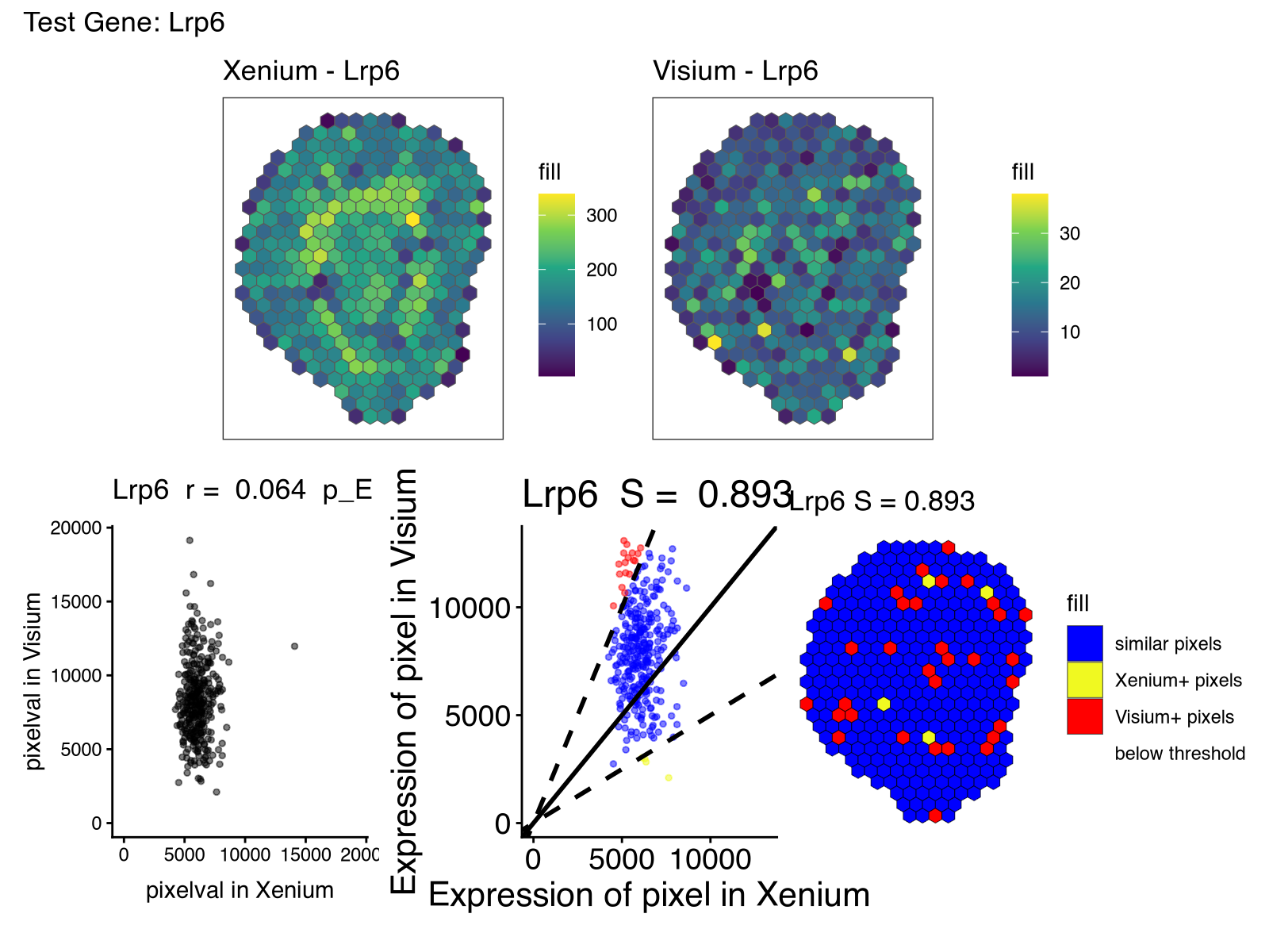
gene_most <- results$gene[which.max(results$correlationCoef)]
gene_least <- results$gene[which.min(results$correlationCoef)]
cat("\nMost spatially correlated gene: ", gene_most,
" (r = ", round(results$correlationCoef[which.max(results$correlationCoef)], 3), ")\n")
cat("Least spatially correlated gene:", gene_least,
" (r = ", round(results$correlationCoef[which.min(results$correlationCoef)], 3), ")\n")
## ── Visualize most correlated gene ──────────────────────────────────────────
shared_pixels <- intersect(colnames(rast$Xenium), colnames(rast$Visium))
corr_most <- plotCorrelationGeneExp(rastList, sc, gene_most)
lr_most <- linearRegression(ss, gene_most)
pc_most <- pixelClass(ss, gene_most)
rast_most_x <- SEraster::plotRaster(rast$Xenium[gene_most, shared_pixels],
plotTitle = paste0("Xenium - ", gene_most))
rast_most_v <- SEraster::plotRaster(rast$Visium[gene_most, shared_pixels],
plotTitle = paste0("Visium - ", gene_most))
cat("\nPlotting most spatially correlated gene:", gene_most, "\n")
print(
(rast_most_x + rast_most_v) / (corr_most + lr_most + pc_most) +
plot_annotation(title = paste0("Most Correlated Gene: ", gene_most))
)
## ── Visualize least correlated gene ─────────────────────────────────────────
shared_pixels <- intersect(colnames(rast$Xenium), colnames(rast$Visium))
corr_least <- plotCorrelationGeneExp(rastList, sc, gene_least)
lr_least <- linearRegression(ss, gene_least)
pc_least <- pixelClass(ss, gene_least)
rast_least_x <- SEraster::plotRaster(rast$Xenium[gene_least, shared_pixels],
plotTitle = paste0("Xenium - ", gene_least))
rast_least_v <- SEraster::plotRaster(rast$Visium[gene_least, shared_pixels],
plotTitle = paste0("Visium - ", gene_least))
cat("\nPlotting least spatially correlated gene:", gene_least, "\n")
print(
(rast_least_x + rast_least_v) / (corr_least + lr_least + pc_least) +
plot_annotation(title = paste0("Least Correlated Gene: ", gene_least))
)
## ── Manual code ─────────────────────────────────────────
ggplot(results, aes(x=percentSimilarity,
y=correlationCoef,
col=-log10(pValueNaive),
label=gene)) +
geom_point() + ggrepel::geom_label_repel() + theme_bw()
gene_test <- 'Acsm3'
shared_pixels <- intersect(colnames(rast$Xenium), colnames(rast$Visium))
corr_test <- plotCorrelationGeneExp(rastList, sc, gene_test)
lr_test <- linearRegression(ss, gene_test)
pc_test <- pixelClass(ss, gene_test)
rast_test_x <- SEraster::plotRaster(rast$Xenium[gene_test, shared_pixels],
plotTitle = paste0("Xenium - ", gene_test))
rast_test_v <- SEraster::plotRaster(rast$Visium[gene_test, shared_pixels],
plotTitle = paste0("Visium - ", gene_test))
print(
(rast_test_x + rast_test_v) / (corr_test + lr_test + pc_test) +
plot_annotation(title = paste0("Test Gene: ", gene_test))
)
Along with the new visualizations:
And we can look again at Acsm3, which after proper normalization, is expressed at more comparable magnitudes across the two technologies as expected.
Interpreting results
Vibe coding is just a start. It’s still up to us to interpret these results!
So looking through these results, I noticed how some genes like Acsm3 and others were highly consistent across the two technologies as quantified by both spatial correlation and similarity. Visually, the spatial expression pattern for this gene was effectively the same across the two serial sections, as expected.
However, there were other genes that had lower spatial correlation (in particular) and spatial similarity than what I had expected based on these being serial sections. As mentioned previously, some of this, in particular the low spatial similarity, may be due to detection sensitivity and other technical differences between the two technologies, or perhaps the spatial pattern itself is small and more sensitive to alignment error or section-specific differences, and other technical factors.
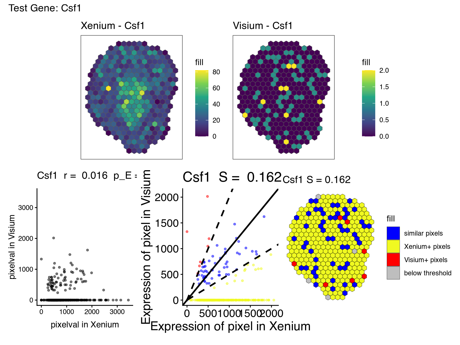
But noted in our paper on evidence of off-target probe binding affecting Xenium probes to comprise the accuracy of spatial transcriptomic profiles, it may be that one reason for the differences is that the Xenium probes are exhibiting off-target binding to another gene. Unfortunately, the probe sequences used for this Xenium dataset is not available so we have no way of knowing for certain.
But in our paper, many of the off-targets identified were homologs with high sequence similarity. One of the genes with low spatial correlation and similarity is Sema6a.
So I obtained all Sema* genes as a quick and dirty way to get putative orthologs. I wrote some manual code to visualize their spatial gene expression pattern in Visium and also their correlation across spatially matched pixels.
rastListRaw <- list(Xenium = rast$Xenium[, shared_pixels], Visium = rast$Visium[, shared_pixels])

g <- 'Sema6a'
lapply(rownames(rastListRaw$Visium)[grepl('Sema', rownames(rastListRaw$Visium))], function(g2) {

  p_xen <- plotRaster(rastListRaw$Xenium,
                      feature_name = g,
                      plotTitle = paste0("Xenium: ", g),
                      name = "expr")

  p_vis <- plotRaster(rastListRaw$Visium,
                      feature_name = g,
                      plotTitle = paste0("Visium: ", g),
                      name = "expr")

  p_vis2 <- plotRaster(rastListRaw$Visium,
                       feature_name = g2,
                       plotTitle = paste0("Visium: ", g2),
                       name = "expr")

  expr_vis2 <- assay(rastListRaw$Visium)[g2, ]
  expr_vis <- assay(rastListRaw$Visium)[g, ]
  expr_xen <- assay(rastListRaw$Xenium)[g, ]

  df_scatter <- data.frame(
    Visium = as.numeric(expr_vis),
    Xenium = as.numeric(expr_xen)
  )
  p_scatter <- ggplot(df_scatter, aes(x = Xenium, y = Visium)) +
    geom_point(alpha = 0.6, size = 2) +
    geom_smooth(method = "lm", se = FALSE, linetype = "dashed", color = "steelblue") +
    labs(
      x = paste0("Xenium ", g, " expression"),
      y = paste0("Visium ", g, " expression")
    ) +
    theme_bw()

  df_scatter2 <- data.frame(
    Visium = as.numeric(expr_vis) + as.numeric(expr_vis2),
    Xenium = as.numeric(expr_xen)
  )
  p_scatter2 <- ggplot(df_scatter2, aes(x = Xenium, y = Visium)) +
    geom_point(alpha = 0.6, size = 2) +
    geom_smooth(method = "lm", se = FALSE, linetype = "dashed", color = "steelblue") +
    labs(
      x = paste0("Xenium ", g, " expression"),
      y = paste0("Visium ", g, "+", g2, " expression")
    ) +
    theme_bw()

  (p_xen + p_vis + p_vis2) / (p_scatter + p_scatter2)
})
Notably, the spatial pattern of Sema4g in Visium is visually more similar to the spatial pattern of Sema6a in Xenium. Likewise, the aggregate expression of Sema4a and Sema4g in Visium across matched spatial locations is more similar to Sema6a in Xenium than Sema4g in Visium alone.
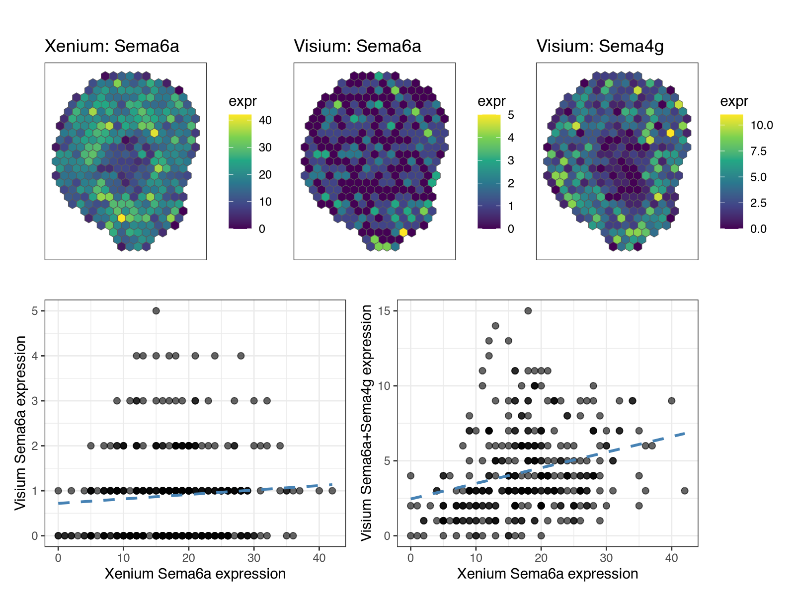
This would lead us to speculate that Xenium Sema6a probes may exhibit off-target binding to Sema4g. Again, without access to the probe sequences used for this Xenium dataset, we won’t know for sure. Therefore, if you are reviewing a paper using Xenium or even writing a paper yourself using Xenium, please publish your probe sequences for transparency and reproducibility of spatial transcriptomics research. Check out our paper for more commentary and guidelines.
Try it out for yourself
- What other genes exhibit very different spatial expression patterns across these two serial section mouse kidney datasets assayed by different spatial transcriptomics technologies? Do you think off-target probe binding or something else could explain these differences?
- Compare data from two other spatial transcriptomics technologies? Are the results more or less consistent?
Recent Posts
- The Mentorship Index on 01 March 2026
- Vibe coding with SEraster and STcompare to compare spatial transcriptomics technologies on 22 February 2026
- RNA velocity in situ infers gene expression dynamics using spatial transcriptomics data on 13 October 2025
- Analyzing ICE Arrest Data - Part 2 on 27 September 2025
- Analyzing ICE Detention Data from 2021 to 2025 on 10 July 2025