Identifying And Characterizing Heterogeneity In Single Cell Rnaseq Data
Identifying and Characterizing Heterogeneity in Single Cell RNA-seq Data
In this tutorial, we will become familiar with a few computational techniques we can use to identify and characterize heterogeneity in single cell RNA-seq data. Pre-prepared data for this tutorial can be found as part of the Single Cell Genomics 2016 Workshop I did at Harvard Medical School.
Getting started
A single cell dataset from Camp et al. has been pre-prepared for you. The data is provided as a matrix of gene counts, where each column corresponds to a cell and each row a gene.
load('../../data/cd.RData')

# how many genes? how many cells?
dim(cd)
## [1] 23228 224
# look at snippet of data
cd[1:5,1:5]
##             SRR2967608 SRR2967609 SRR2967610 SRR2967611 SRR2967612
## 1/2-SBSRNA4          1         18          0          0          0
## A1BG                 0          0          2          0          0
## A1BG-AS1             0          0          0          0          0
## A1CF                 0          0          0          0          0
## A2LD1                0          0          0          0          0
# filter out low-gene cells (often empty wells)
cd <- cd[, colSums(cd>0)>1.8e3]
# remove genes that don't have many reads
cd <- cd[rowSums(cd)>10, ]
# remove genes that are not seen in a sufficient number of cells
cd <- cd[rowSums(cd>0)>5, ]

# how many genes and cells after filtering?
dim(cd)
## [1] 12453 224
# transform to make more data normal
mat <- log10(as.matrix(cd)+1)
# look at snippet of data
mat[1:5, 1:5]
##             SRR2967608 SRR2967609 SRR2967610 SRR2967611 SRR2967612
## 1/2-SBSRNA4  0.3010300   1.278754  0.0000000          0   0.000000
## A1BG         0.0000000   0.000000  0.4771213          0   0.000000
## A2M          0.0000000   0.000000  0.0000000          0   0.000000
## A2MP1        0.0000000   0.000000  0.0000000          0   0.000000
## AAAS         0.4771213   1.959041  0.0000000          0   1.361728
In the original publication, the authors proposed two main subpopulations: neurons and neuroprogenitor cells (NPCs). These labels have also been provided to you as a reference so we can see how different methods perform in recapitulating these labels.
load('../../data/sg.RData')
head(sg, 5)
## SRR2967608 SRR2967609 SRR2967610 SRR2967611 SRR2967612
##     neuron     neuron     neuron        npc     neuron
## Levels: neuron npc
PCA
Note that there are over 10,000 genes that can be used to cluster cells into subpopulations. One common technique to identify subpopulations is by using dimensionality reduction to summarize the data into 2 dimensions and then visually identify obvious clusters. Principal component analysis (PCA) is a linear dimensionality reduction method.
# use principal component analysis for dimensionality reduction
base.pca <- prcomp(t(mat))
# visualize in 2D the first two principal components and color by cell type
plot(base.pca$x[,1], base.pca$x[,2], col=rainbow(2)[sg], pch=16, main='PCA')
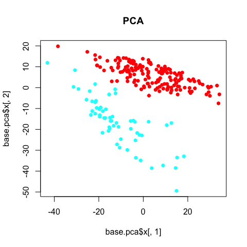
The PCA clearly separates the two annotated subpopulations. However, we can see some additional aspects of heterogeneity driving the first principal componenent. Coloring each cell by its library size reveals that this first component is being driven by variation in library size, which, in this case, can be interpreted as technical noise as opposed to biological insight.
lib.size <- colSums(mat)
plot(base.pca$x[,1], base.pca$x[,2], col=colorRampPalette(c("magenta", "yellow"))(100)[round(lib.size/max(lib.size)*100)], pch=16, main='PCA')
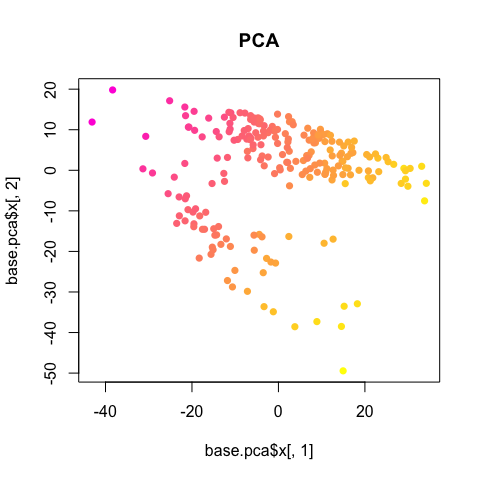
So we should always double check for obvious, non-biological factors (such as library size, batch, patient/mouse, etc), potentially influencing or driving observed heterogeneity.
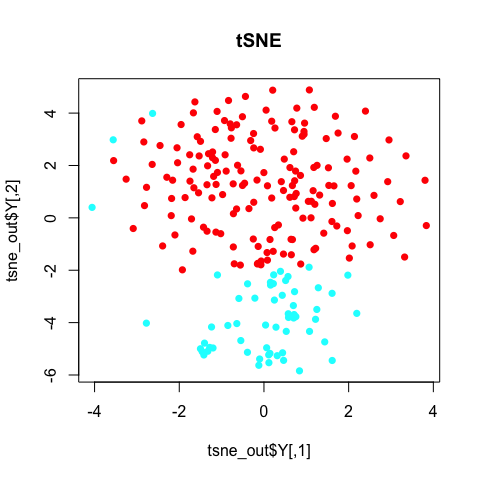
tSNE
T-embedded stochastic neighbor embedding (tSNE) is a non-linear dimensionality reduction method. Note that in tSNE, the perplexity parameter is an estimate of the number of effective neighbors. Here, we have 224 cells. A perplexity of 10 is suitable. For larger or smaller numbers of cells, you will want to change the perplexity accordingly.
library(Rtsne)
d <- dist(t(mat))
set.seed(0) # tsne has some stochastic steps (gradient descent) so need to set random
tsne_out <- Rtsne(d, is_distance=TRUE, perplexity=10, verbose = TRUE)
## Read the 224 x 224 data matrix successfully!
## Using no_dims = 2, perplexity = 10.000000, and theta = 0.500000
## Computing input similarities...
## Building tree...
##  - point 0 of 224
## Done in 0.01 seconds (sparsity = 0.243025)!
## Learning embedding...
## Iteration 50: error is 118.973680 (50 iterations in 0.06 seconds)
## Iteration 100: error is 127.558911 (50 iterations in 0.06 seconds)
## Iteration 150: error is 123.943221 (50 iterations in 0.07 seconds)
## Iteration 200: error is 130.050267 (50 iterations in 0.06 seconds)
## Iteration 250: error is 127.913196 (50 iterations in 0.08 seconds)
## Iteration 300: error is 3.617403 (50 iterations in 0.06 seconds)
## Iteration 350: error is 2.286202 (50 iterations in 0.04 seconds)
## Iteration 400: error is 2.190548 (50 iterations in 0.04 seconds)
## Iteration 450: error is 2.133582 (50 iterations in 0.04 seconds)
## Iteration 500: error is 2.086473 (50 iterations in 0.04 seconds)
## Iteration 550: error is 2.060643 (50 iterations in 0.04 seconds)
## Iteration 600: error is 2.031325 (50 iterations in 0.04 seconds)
## Iteration 650: error is 1.983069 (50 iterations in 0.04 seconds)
## Iteration 700: error is 1.846377 (50 iterations in 0.04 seconds)
## Iteration 750: error is 1.827168 (50 iterations in 0.05 seconds)
## Iteration 800: error is 1.825835 (50 iterations in 0.05 seconds)
## Iteration 850: error is 1.825061 (50 iterations in 0.05 seconds)
## Iteration 900: error is 1.825387 (50 iterations in 0.04 seconds)
## Iteration 950: error is 1.824545 (50 iterations in 0.05 seconds)
## Iteration 1000: error is 1.823723 (50 iterations in 0.04 seconds)
## Fitting performed in 0.98 seconds.
plot(tsne_out$Y, col=rainbow(2)[sg], pch=16, main='tSNE')
Note with tSNE, your results are stochastic. Change the random seed, change your results. (If you don’t use a random seed at all, your results will be different every time! So always use a random seed to ensure reproducable research!)
set.seed(1) # tsne has some stochastic steps (gradient descent) so need to set random
tsne_out <- Rtsne(d, is_distance=TRUE, perplexity=10, verbose = TRUE)
## Read the 224 x 224 data matrix successfully!
## Using no_dims = 2, perplexity = 10.000000, and theta = 0.500000
## Computing input similarities...
## Building tree...
##  - point 0 of 224
## Done in 0.01 seconds (sparsity = 0.243025)!
## Learning embedding...
## Iteration 50: error is 123.486260 (50 iterations in 0.06 seconds)
## Iteration 100: error is 127.644744 (50 iterations in 0.07 seconds)
## Iteration 150: error is 125.135074 (50 iterations in 0.06 seconds)
## Iteration 200: error is 129.868562 (50 iterations in 0.06 seconds)
## Iteration 250: error is 138.279847 (50 iterations in 0.06 seconds)
## Iteration 300: error is 4.395593 (50 iterations in 0.05 seconds)
## Iteration 350: error is 3.569927 (50 iterations in 0.05 seconds)
## Iteration 400: error is 2.725121 (50 iterations in 0.05 seconds)
## Iteration 450: error is 2.243356 (50 iterations in 0.04 seconds)
## Iteration 500: error is 2.204841 (50 iterations in 0.04 seconds)
## Iteration 550: error is 2.168027 (50 iterations in 0.04 seconds)
## Iteration 600: error is 2.136227 (50 iterations in 0.03 seconds)
## Iteration 650: error is 2.094058 (50 iterations in 0.03 seconds)
## Iteration 700: error is 2.045998 (50 iterations in 0.04 seconds)
## Iteration 750: error is 2.039275 (50 iterations in 0.04 seconds)
## Iteration 800: error is 2.028664 (50 iterations in 0.04 seconds)
## Iteration 850: error is 2.007481 (50 iterations in 0.04 seconds)
## Iteration 900: error is 1.976311 (50 iterations in 0.03 seconds)
## Iteration 950: error is 1.926869 (50 iterations in 0.03 seconds)
## Iteration 1000: error is 1.835692 (50 iterations in 0.04 seconds)
## Fitting performed in 0.90 seconds.
plot(tsne_out$Y, col=rainbow(2)[sg], pch=16, main='tSNE')
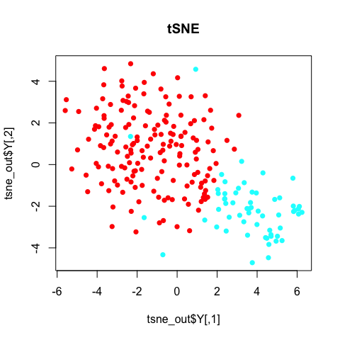
In general, the annotated subpopulations from these tSNE results are not particularly clear-cut.
Still, we may be wondering what genes and pathways characterize these subpopulation? For that, additional analysis is often needed and dimensionality reduction alone does not provide us with such insight.
Pathway and gene set overdispersion analysis (PAGODA)
Additionally, we may be interested in finer, potentially
overlapping/non-binary subpopulations. For example, if we were
clustering apples, PCA might separate red apples from green apples, but
we may be interested in sweet vs. sour apples, or high fiber apples from
low fiber apples. Similarly, in single cells, there may be such
overlapping aspects of heterogeneity that are of biological interest.
PAGODA is a method developed by the Kharchenko lab that enables
identification and characterization of subpopulations in a manner that
resolves these overlapping aspects of transcriptional heterogeneity. For
more information, please refer to the original manuscript by Fan et
al.
PAGODA functions are implemented as part of the scde package.
library(scde)
Each cell is modeled using a mixture of a negative binomial (NB) distribution (for the amplified/detected transcripts) and low-level Poisson distribution (for the unobserved or background-level signal of genes that failed to amplify or were not detected for other reasons). These models can then be used to identify robustly differentially expressed genes.
# EVALUATION NOT NEEDED FOR SAKE OF TIME
knn <- knn.error.models(cd, k = ncol(cd)/4, n.cores = 1, min.count.threshold = 2, min.nonfailed = 5, max.model.plots = 10)

# just load from what we precomputed for you
load('../../data/knn.RData')
head(knn)
PAGODA relies on accurate quantification of excess variance or
overdispersion in genes and gene sets in order to cluster cells and
identify subpopulations. Accurate quantification of this overdispersion
means that we must normalize out expected levels of technical and
intrinsic biological noise. Intuitively, lowly-expressed genes are often
more prone to drop-out and thus may exhibit large variances simply due
to such technical noise.
# EVALUATION NOT NEEDED FOR SAKE OF TIME
varinfo <- pagoda.varnorm(knn, counts = cd, trim = 3/ncol(cd), max.adj.var = 5, n.cores = 1, plot = TRUE)
# normalize out library size as well
varinfo <- pagoda.subtract.aspect(varinfo, colSums(cd[, rownames(knn)]>0))

# just load from what we precomputed for you
load('../../data/varinfo.RData')
names(varinfo)
## [1] "mat"     "matw"    "arv"     "modes"   "avmodes" "prior"   "edf"
## [8] "batch"   "trim"
Briefly, mat is the new normalized gene expression matrix, You can use
?pagoda.varnorm to learn more about the varinfo object.
When assessing for overdispersion in gene sets, we can take advantage of
pre-defined pathway gene sets such as GO annotations and look for
pathways that exhibit statistically significant excess of coordinated
variability. Intuitively, if a pathway is differentially perturbed, we
expect all genes within said pathway to be upregulated or downregulated
in the same group of cells. In PAGODA, for each gene set, we test
whether the amount of variance explained by the first principal
component significantly exceed the background expectation.
# load gene sets
load('../../data/go.env.RData')
# look at some gene sets
head(ls(go.env))
## [1] "GO:0000002 mitochondrial genome maintenance"
## [2] "GO:0000012 single strand break repair"
## [3] "GO:0000018 regulation of DNA recombination"
## [4] "GO:0000030 mannosyltransferase activity"
## [5] "GO:0000038 very long-chain fatty acid metabolic process"
## [6] "GO:0000041 transition metal ion transport"
# look at genes in gene set
get("GO:0000002 mitochondrial genome maintenance", go.env)
## [1] "AKT3"    "C10orf2" "DNA2"    "MEF2A"   "MPV17"   "PID1"    "SLC25A4"
## [8] "TYMP"
# filter out gene sets that are too small or too big
go.env <- list2env(clean.gos(go.env, min.size=10, max.size=100))
# how many pathways
length(go.env)
## [1] 3225
# EVALUATION NOT NEEDED FOR SAKE OF TIME
# pathway overdispersion
pwpca <- pagoda.pathway.wPCA(varinfo, go.env, n.components = 1, n.cores = 1)
Instead of relying on pre-defined pathways, we can also test on ‘de novo’ gene sets whose expression profiles are well-correlated within the given dataset. This is the most necessary and useful when the provided annotated gene sets are poor or incomplete.
# EVALUATION NOT NEEDED FOR SAKE OF TIME
# de novo gene sets
clpca <- pagoda.gene.clusters(varinfo, trim = 7.1/ncol(varinfo$mat), n.clusters = 150, n.cores = 1, plot = FALSE)
Testing these pre-defined pathways and annotated gene sets may take a few minutes so for the sake of time, we will load a pre-computed version.
load('../../data/pwpca.RData')
clpca <- NULL # For the sake of time, set to NULL
Taking into consideration (ideally) both pre-defined pathways and de-novo gene sets, we can see which aspects of heterogeneity are the most overdispersed and base our cell cluster only on the most overdispersed and informative pathways and gene sets.
# get full info on the top aspects
df <- pagoda.top.aspects(pwpca, clpca, z.score = 1.96, return.table = TRUE)
head(df)
##                                                    name npc   n    score
## 78  GO:0000779 condensed chromosome, centromeric region   1  24 4.689757
## 743                   GO:0007059 chromosome segregation   1  97 4.632092
## 17                           GO:0000087 mitotic M phase   1 198 4.606980
## 77          GO:0000777 condensed chromosome kinetochore   1  20 4.529740
## 746                 GO:0007067 mitotic nuclear division   1 189 4.506514
## 47                          GO:0000280 nuclear division   1 189 4.506514
##            z    adj.z sh.z adj.sh.z
## 78  22.64153 22.44831   NA       NA
## 743 33.07666 32.90101   NA       NA
## 17  40.87730 40.71825   NA       NA
## 77  20.85181 20.65224   NA       NA
## 746 39.43297 39.28004   NA       NA
## 47  39.43297 39.28004   NA       NA
tam <- pagoda.top.aspects(pwpca, clpca, z.score = 1.96)
# determine overall cell clustering
hc <- pagoda.cluster.cells(tam, varinfo)
Because many of our annotated pathways and de novo gene sets likely share many genes or exhibit similar patterns of variability, we must reduce such redundancy to come up with a final coherent characterization of subpopulations.
# reduce redundant aspects
tamr <- pagoda.reduce.loading.redundancy(tam, pwpca, clpca)
tamr2 <- pagoda.reduce.redundancy(tamr, plot = FALSE)
# view final result
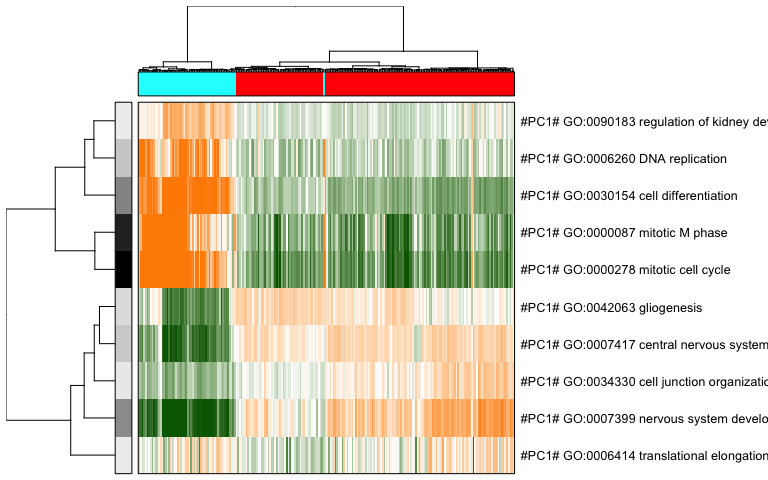
pagoda.view.aspects(tamr2, cell.clustering = hc, box = TRUE, labCol = NA, margins = c(0.5, 20), col.cols = rbind(rainbow(2)[sg]), top=10)
We can also use a 2D embedding of the cells to aid visualization.
library(Rtsne)
# recalculate clustering distance .. we'll need to specify return.details=T
cell.clustering <- pagoda.cluster.cells(tam, varinfo, include.aspects=TRUE, verbose=TRUE, return.details=T)

# fix the seed to ensure reproducible results
set.seed(0)
tSNE.pagoda <- Rtsne(cell.clustering$distance, is_distance=TRUE, perplexity=10)

# plot
par(mfrow=c(1,1), mar = rep(5,4))
plot(tSNE.pagoda$Y, col=rainbow(2)[sg], pch=16, main='PAGODA tSNE')
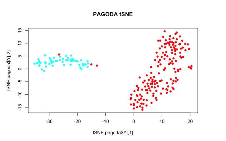
By using variance normalization and incorporating pathway-level information, our tSNE plot much more cleanly separates the two annotated subpopulations!
We can also create an app to further interactively browse the results. A pre-compiled app has been launched for you here: http:/pklab.med.harvard.edu/cgi-bin/R/rook/scw.xiaochang/index.html.
# compile a browsable app
app <- make.pagoda.app(tamr2, tam, varinfo, go.env, pwpca, clpca, col.cols = rbind(sg), cell.clustering = hc, title = "Camp", embedding = tSNE.pagoda$Y)
# show app in the browser (port 1468)
show.app(app, "Camp", browse = TRUE, port = 1468)
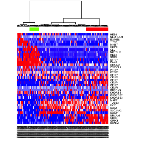
Based on these PAGODA results, we can see pathways and biological
processes driving the main division, which is consistent with previous
annotations of neurons vs NPCs, but we can also see further
heterogeneity not visible by PCA or tSNE alone. In this case, prior
knowledge with known marker genes
can allow us to better interpret these
identified subpopulations as IPCs, RGs, Immature Neurons, and Mature
Neurons.
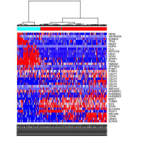
# visualize a few known markers
markers <- c(
"SCN2A","GRIK3","CDH6","NRCAM","SOX11",
"SLC24A2", "SOX4", "DCX", "TUBB3","MAPT",
"KHDRBS3",  "KHDRBS2", "KHDRBS1", "RBFOX3",
"CELF6", "CELF5", "CELF4", "CELF3", "CELF2", "CELF1",
"PTBP2", "PTBP1", "ZFP36L2",
"HMGN2", "PAX6", "SFRP1",
"SOX2", "HES1", "NOTCH2", "CLU","HOPX",
"MKI67","TPX2",
"EOMES", "NEUROD4","HES6"
)
# heatmap for subset of gene markers
mat.sub <- varinfo$mat[markers,]
mat.sub[mat.sub < -1] <- -1
mat.sub[mat.sub > 1] <- 1
heatmap(mat.sub[,hc$labels], Colv=as.dendrogram(hc), Rowv=NA, scale="none", col=colorRampPalette(c("blue", "white", "red"))(100), ColSideColors=rainbow(2)[sg])
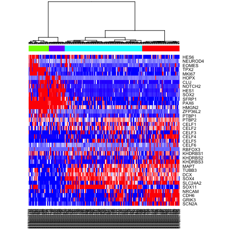
# Alternatively, define more refined subpopulations
sg2 <- as.factor(cutree(hc, k=4))
names(sg2) <- hc$labels
heatmap(mat.sub[,hc$labels], Colv=as.dendrogram(hc), Rowv=NA, scale="none", col=colorRampPalette(c("blue", "white", "red"))(100), ColSideColors=rainbow(4)[sg2])
Differential expression analysis with scde
To further characterize identified subpopulations, we can identify
differentially expressed genes between the two groups of single cells
using scde. For more information, please refer to the original
manuscript by Kharchenko et
al.
First, let’s pick which identified subpopulations we want to compare using differential expression analysis.
test <- as.character(sg2)
test[test==2] <- NA; test[test==3] <- NA
test <- as.factor(test)
names(test) <- names(sg2)
heatmap(mat.sub[,hc$labels], Colv=as.dendrogram(hc), Rowv=NA, scale="none", col=colorRampPalette(c("blue", "white", "red"))(100), ColSideColors=rainbow(4)[test])
Now, let’s use scde to identify differentially expressed genes.
# scde relies on the same error models
load('../../data/cd.RData')
load('../../data/knn.RData')

# estimate gene expression prior
prior <- scde.expression.prior(models = knn, counts = cd, length.out = 400, show.plot = FALSE)

# run differential expression tests on a subset of genes (to save time)
vi <- c("BCL11B", "CDH6", "CNTNAP2", "GRIK3", "NEUROD6", "RTN1", "RUNX1T1", "SERINC5", "SLC24A2", "STMN2", "AIF1L", "ANP32E", "ARID3C", "ASPM", "ATP1A2", "AURKB", "AXL", "BCAN", "BDH2", "C12orf48")
ediff <- scde.expression.difference(knn, cd[vi,], prior, groups = test, n.cores = 1, verbose = 1)
## comparing groups:
##
##  1  4
## 55 24
## calculating difference posterior
## summarizing differences
# top upregulated genes (tail would show top downregulated ones)
head(ediff[order(abs(ediff$Z), decreasing = TRUE), ])
##                 lb       mle        ub        ce         Z        cZ
## STMN2     2.303137  3.207941  7.320687  2.303137  7.160408  6.827743
## CDH6      7.567451 10.076226 10.569755  7.567451  7.150820  6.827743
## CNTNAP2   2.385392  3.331324  8.472255  2.385392  7.048047  6.779055
## BCAN     -9.171422 -8.307745 -4.236128 -4.236128 -6.820435 -6.585346
## RUNX1T1   1.932990  2.673284  7.896471  1.932990  6.749579  6.545467
## ATP1A2  -10.117353 -9.294804 -7.649706 -7.649706 -6.580727 -6.399339
We can visualize the results for one gene. The top and the bottom plots show expression posteriors derived from individual cells (colored lines) and joint posteriors (black lines). The middle plot shows posterior of the expression fold difference between the two cell groups, highlighting the 95% credible interval by the red shading.
# visualize results for one gene
scde.test.gene.expression.difference("NEUROD6", knn, cd, prior, groups = test)
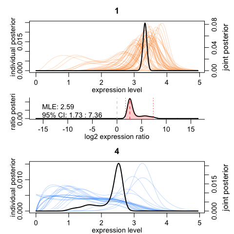
##               lb     mle       ub       ce       Z      cZ
## NEUROD6 1.727353 2.59103 7.361814 1.727353 5.06557 5.06557
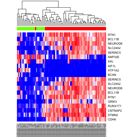
We can also cluster our cells by just the top 10 most differentially upregulated genes in each subpopulation and visualize results with a heatmap.
# heatmap
ediff.sig <- ediff[abs(ediff$cZ) > 1.96, ]
ediff.sig.up <- rownames(ediff.sig[order(ediff.sig$cZ, decreasing = TRUE), ])[1:10]
ediff.sig.down <- rownames(ediff.sig[order(ediff.sig$cZ, decreasing = FALSE), ])[1:10]
heatmap(mat[c(ediff.sig.up, ediff.sig.down), names(na.omit(test))], Rowv=NA, ColSideColors = rainbow(4)[test[names(na.omit(test))]],  col=colorRampPalette(c('blue', 'white', 'red'))(100), scale="none")
Once we have a set of differentially expressed genes, we may use techniques such as gene set enrichment analysis (GSEA) to determine which pathways are differentially up or down regulated. GSEA is not specific to single cell methods and not included in this session but users are encouraged to check out this light-weight R implementation with tutorials on their own time.
Pseudo-time trajectory analysis with monocle
Cells may not always fall into distinct subpopulations. Rather, they may
form a continuous gradient along a pseudo-time trajectory. To order
cells along their pseudo-time trajectory, we will use monocle from the
Trapnell
lab.
library(monocle)

# monocle takes as input fpkms
load('../../data/fpm.RData')
expression.data <- fpm

# create pheno data object
pheno.data.df <- data.frame(type=sg[colnames(fpm)], pagoda=sg2[colnames(fpm)])
pd <- new('AnnotatedDataFrame', data = pheno.data.df)

# convert data object needed for monocle
data <- newCellDataSet(expression.data, phenoData = pd)
Typically, to order cells by progress, we want to reduce the number of genes analyzed. So we can select for a subset of genes that we believe are important in setting said ordering, such as overdispersed genes. In this example, we will simply choose genes based on prior knowledge.
ordering.genes <- markers # Select genes used for ordering
data <- setOrderingFilter(data, ordering.genes) # Set list of genes for ordering
data <- reduceDimension(data, use_irlba = FALSE) # Reduce dimensionality
set.seed(0) # monocle is also stochastic
data <- orderCells(data, num_paths = 2, reverse = FALSE) # Order cells
# Plot trajectory with inferred branches
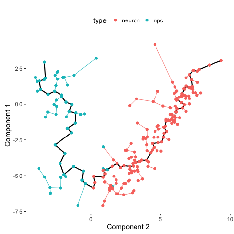
plot_spanning_tree(data)
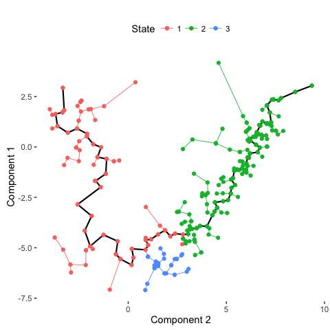
# Compare with previous annotations
plot_spanning_tree(data, color_by = "type")
# Compare with PAGODA annotations
plot_spanning_tree(data, color_by = "pagoda")
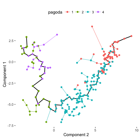
Indeed, we can see how neuronal maturation from NPCs to neurons spans a continuum along a single, non-branching trajectory. So do cells fall into distinct subpopulations or are they continuously changing or perhaps both? Just as with human life, age spans a continuum yet we fall into distinct phases of childhood, adolescence, adulthood, and so on, each marked by distinct characteristics. What do you think?
Recent Posts
- AI-guided data visualization of gas prices in different geographical locations across the US over time on 04 May 2026
- The Mentorship Index on 01 March 2026
- Vibe coding with SEraster and STcompare to compare spatial transcriptomics technologies on 22 February 2026
- RNA velocity in situ infers gene expression dynamics using spatial transcriptomics data on 13 October 2025
- Analyzing ICE Arrest Data - Part 2 on 27 September 2025