A Practical Introduction To Finite Mixture Models
A practical introduction to finite mixture modeling with flexmix in R
Introduction
Finite mixture models are very useful when applied to data where observations originate from various groups and the group affiliations are not known. For example, in single cell RNA-seq data, transcripts in each cell can be modeled as a mixture of two probabilistic processes: 1) a negative binomial process for when a transcript is amplified and detected at a level correlating with its abundance and 2) a low-magnitude Poisson process for when drop-outs occur. These error model can be then used to provide a basis for further statistical analysis including those described in Fan et al.
In this tutorial, we will use simulations and sample data to learn about finite mixture models using the flexmix package in R.
Simulated data
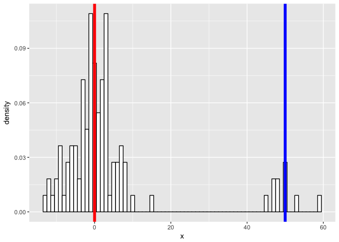
First, we will simulate some data. Let’s simulate two normal distributions - one with a mean of 0, another with a mean of 50, both with standard deviation of 5.
m1 <- 0
m2 <- 50
sd1 <- sd2 <- 5
N1 <- 100
N2 <- 10

a <- rnorm(n=N1, mean=m1, sd=sd1)
b <- rnorm(n=N2, mean=m2, sd=sd2)
Now let’s ‘mix’ the data together…
x <- c(a,b)
class <- c(rep('a', N1), rep('b', N2))
data <- data.frame(cbind(x=as.numeric(x), class=as.factor(class)))

library("ggplot2")
p <- ggplot(data, aes(x = x)) +
  geom_histogram(aes(x, ..density..), binwidth = 1, colour = "black", fill = "white") +
  geom_vline(xintercept = m1, col = "red", size = 2) +
  geom_vline(xintercept = m2, col = "blue", size = 2)
p
…and see if we can model our new mixture as two gaussian processes. We expect to be able to fit two gaussians and recover our initial parameters.
set.seed(0)
library(flexmix)

mo1 <- FLXMRglm(family = "gaussian")
mo2 <- FLXMRglm(family = "gaussian")
flexfit <- flexmix(x ~ 1, data = data, k = 2, model = list(mo1, mo2))
So how did we do? It looks like we got class assignments perfectly.
print(table(clusters(flexfit), data$class))
##
##       1   2
##   1 100   0
##   2   0  10
What about the parameters?
c1 <- parameters(flexfit, component=1)[[1]]
c2 <- parameters(flexfit, component=2)[[1]]

cat('pred:', c1[1], '\n')
cat('true:', m1, '\n\n')
cat('pred:', c1[2], '\n')
cat('true:', sd1, '\n\n')

cat('pred:', c2[1], '\n')
cat('true:', m2, '\n\n')
cat('pred:', c2[2], '\n')
cat('true:', sd2, '\n\n')
## pred: -0.5613484
## true: 0
##
## pred: 4.799484
## true: 5
##
## pred: 52.86911
## true: 50
##
## pred: 6.89413
## true: 5
Let’s visualize the real data and our fitted mixture models.
#' Source: http://tinyheero.github.io/2015/10/13/mixture-model.html
#' Plot a Mixture Component
#'
#' @param x Input data
#' @param mu Mean of component
#' @param sigma Standard deviation of component
#' @param lam Mixture weight of component
plot_mix_comps <- function(x, mu, sigma, lam) {
  lam * dnorm(x, mu, sigma)
}

lam <- table(clusters(flexfit))

ggplot(data) +
geom_histogram(aes(x, ..density..), binwidth = 1, colour = "black", fill = "white") +
stat_function(geom = "line", fun = plot_mix_comps,
                args = list(c1[1], c1[2], lam[1]/sum(lam)),
                colour = "red", lwd = 1.5) +
stat_function(geom = "line", fun = plot_mix_comps,
                args = list(c2[1], c2[2], lam[2]/sum(lam)),
                colour = "blue", lwd = 1.5) +
ylab("Density")
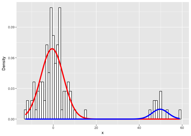
Looks like we did pretty well!
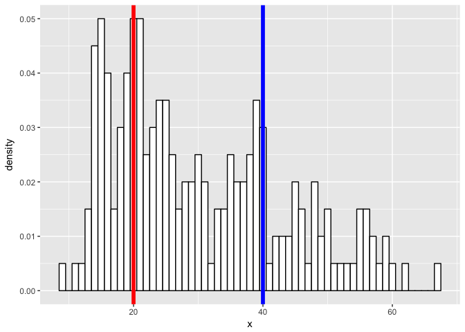
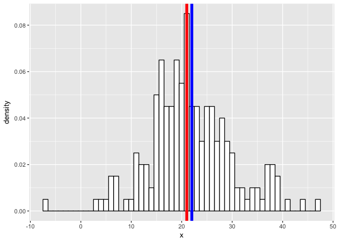
What if we have a more challenging mixture?
m1 <- 20
m2 <- 40
sd1 <- 5
sd2 <- 10
N1 <- 100
N2 <- 100

a <- rnorm(n=N1, mean=m1, sd=sd1)
b <- rnorm(n=N2, mean=m2, sd=sd2)
x <- c(a,b)
class <- c(rep('a', N1), rep('b', N2))
data <- data.frame(cbind(x=as.numeric(x), class=as.factor(class)))

library("ggplot2")
p <- ggplot(data, aes(x = x)) +
  geom_histogram(aes(x, ..density..), binwidth = 1, colour = "black", fill = "white") +
  geom_vline(xintercept = m1, col = "red", size = 2) +
  geom_vline(xintercept = m2, col = "blue", size = 2)
p
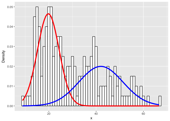
set.seed(0)
library(flexmix)

mo1 <- FLXMRglm(family = "gaussian")
mo2 <- FLXMRglm(family = "gaussian")
flexfit <- flexmix(x ~ 1, data = data, k = 2, model = list(mo1, mo2))

print(table(clusters(flexfit), data$class))

c1 <- parameters(flexfit, component=1)[[1]]
c2 <- parameters(flexfit, component=2)[[1]]

cat('\n')
cat('pred:', c1[1], '\n')
cat('true:', m1, '\n\n')
cat('pred:', c1[2], '\n')
cat('true:', sd1, '\n\n')

cat('pred:', c2[1], '\n')
cat('true:', m2, '\n\n')
cat('pred:', c2[2], '\n')
cat('true:', sd2, '\n\n')
##
##      1  2
##   1 99  8
##   2  1 92
##
## pred: 19.79264
## true: 20
##
## pred: 4.589394
## true: 5
##
## pred: 42.00423
## true: 40
##
## pred: 9.298677
## true: 10
lam <- table(clusters(flexfit))

ggplot(data) +
geom_histogram(aes(x, ..density..), binwidth = 1, colour = "black", fill = "white") +
stat_function(geom = "line", fun = plot_mix_comps,
                args = list(c1[1], c1[2], lam[1]/sum(lam)),
                colour = "red", lwd = 1.5) +
stat_function(geom = "line", fun = plot_mix_comps,
                args = list(c2[1], c2[2], lam[2]/sum(lam)),
                colour = "blue", lwd = 1.5) +
ylab("Density")
Or an even more challenging mixture?
m1 <- 21
m2 <- 22
sd1 <- 5
sd2 <- 10
N1 <- 100
N2 <- 100

a <- rnorm(n=N1, mean=m1, sd=sd1)
b <- rnorm(n=N2, mean=m2, sd=sd2)
x <- c(a,b)
class <- c(rep('a', N1), rep('b', N2))
data <- data.frame(cbind(x=as.numeric(x), class=as.factor(class)))

library("ggplot2")
p <- ggplot(data, aes(x = x)) +
  geom_histogram(aes(x, ..density..), binwidth = 1, colour = "black", fill = "white") +
  geom_vline(xintercept = m1, col = "red", size = 2) +
  geom_vline(xintercept = m2, col = "blue", size = 2)
p
set.seed(0)
library(flexmix)

mo1 <- FLXMRglm(family = "gaussian")
mo2 <- FLXMRglm(family = "gaussian")
flexfit <- flexmix(x ~ 1, data = data, k = 2, model = list(mo1, mo2))

print(table(clusters(flexfit), data$class))

c1 <- parameters(flexfit, component=1)[[1]]
c2 <- parameters(flexfit, component=2)[[1]]

cat('\n')
cat('pred:', c1[1], '\n')
cat('true:', m1, '\n\n')
cat('pred:', c1[2], '\n')
cat('true:', sd1, '\n\n')

cat('pred:', c2[1], '\n')
cat('true:', m2, '\n\n')
cat('pred:', c2[2], '\n')
cat('true:', sd2, '\n\n')
##
##      1  2
##   1 34 73
##   2 66 27
##
## pred: 23.88684
## true: 21
##
## pred: 10.06901
## true: 5
##
## pred: 18.75294
## true: 22
##
## pred: 2.421945
## true: 10
lam <- table(clusters(flexfit))

ggplot(data) +
geom_histogram(aes(x, ..density..), binwidth = 1, colour = "black", fill = "white") +
stat_function(geom = "line", fun = plot_mix_comps,
                args = list(c1[1], c1[2], lam[1]/sum(lam)),
                colour = "red", lwd = 1.5) +
stat_function(geom = "line", fun = plot_mix_comps,
                args = list(c2[1], c2[2], lam[2]/sum(lam)),
                colour = "blue", lwd = 1.5) +
ylab("Density")
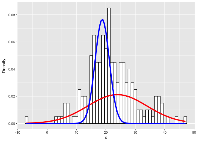
Expectedly, as the simulated distributions become less distinct, we have a harder time modeling them as the correct mixtures.
Iris example
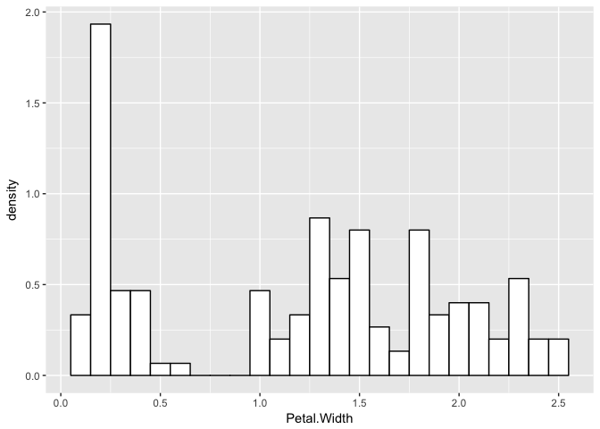
Now, let’s consider a real example with petal widths of iris flowers. Indeed, this distribution looks a little like a finite mixture of distributions.
data(iris)

library("ggplot2")
p <- ggplot(iris, aes(x = Petal.Width)) +
  geom_histogram(aes(x = Petal.Width, ..density..), binwidth = 0.1, colour = "black", fill = "white")
p
Let’s assume they are three normals and see what happens.
set.seed(0)
library(flexmix)

mo1 <- FLXMRglm(family = "gaussian")
mo2 <- FLXMRglm(family = "gaussian")
mo3 <- FLXMRglm(family = "gaussian")
flexfit <- flexmix(Petal.Width ~ 1, data = iris, k = 3, model = list(mo1, mo2, mo3))

print(table(clusters(flexfit), iris$Species))
##
##     setosa versicolor virginica
##   1      0          2        46
##   2      0         48         4
##   3     50          0         0
c1 <- parameters(flexfit, component=1)[[1]]
c2 <- parameters(flexfit, component=2)[[1]]
c3 <- parameters(flexfit, component=3)[[1]]
lam <- table(clusters(flexfit))

ggplot(iris) +
geom_histogram(aes(x = Petal.Width, ..density..), binwidth = 0.1, colour = "black", fill = "white") +
stat_function(geom = "line", fun = plot_mix_comps,
                args = list(c1[1], c1[2], lam[1]/sum(lam)),
                colour = "red", lwd = 1.5) +
stat_function(geom = "line", fun = plot_mix_comps,
                args = list(c2[1], c2[2], lam[2]/sum(lam)),
                colour = "blue", lwd = 1.5) +
stat_function(geom = "line", fun = plot_mix_comps,
                args = list(c3[1], c3[2], lam[3]/sum(lam)),
                colour = "green", lwd = 1.5) +
ylab("Density")
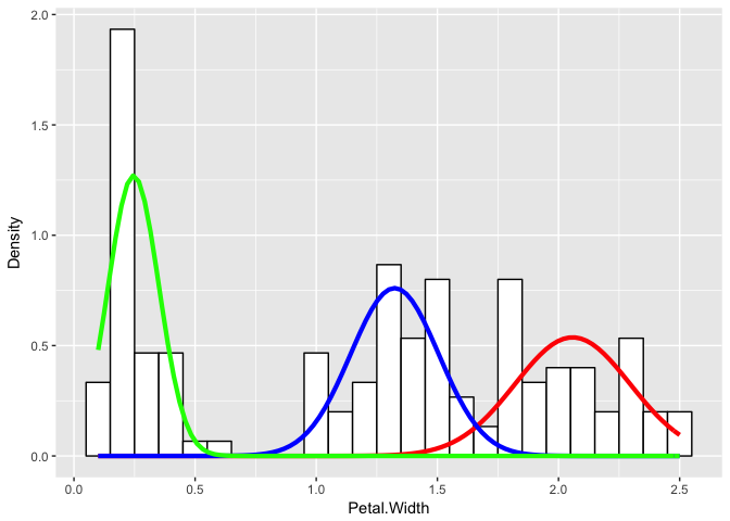
Even if we didn’t know the underlying species assignments, we would be able to make certain statements about the underlying distribution of petal widths as likely coming from three different groups with distinctly different means and variances for their petal widths.
What happens if we try to model petal width as only 2 normal processes? What if we use a Poisson and a negative binomial to categorize iris flowers as those with few petals (dead? damaged? ugly?) and some detectable number of petals (count-based processes)?
Recent Posts
- AI-guided data visualization of gas prices in different geographical locations across the US over time on 04 May 2026
- The Mentorship Index on 01 March 2026
- Vibe coding with SEraster and STcompare to compare spatial transcriptomics technologies on 22 February 2026
- RNA velocity in situ infers gene expression dynamics using spatial transcriptomics data on 13 October 2025
- Analyzing ICE Arrest Data - Part 2 on 27 September 2025