Animating the Cell Cycle
Introduction
There are many ways to visualize the same data. In Xia*, Fan*,Emanuel* et al (2019), we used transcriptome-scale MERFISH along with RNA velocity in situ analysis to identify genes associated with the cell cycle. For more details on the analysis, please refer to the original manuscript or check out RNA Velocity Analysis (In Situ) - Tutorials and Tips.
Static visualizations
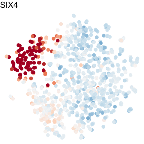
To visualize these identified cell cycle genes, we used a variety of different static visualizations, including those similar to the ones below. These tSNE plots visualize cells as points and are colored by scaled gene expression magnitude of select identified cell cycle genes.
m <- mat[genes.final,]
m <- t(scale(t(m)))
m[m > 2] <- 2
m[m < -2] <- -2

library(ggplot2)
ps <- lapply(seq_along(genes.final), function(i) {
  gexp <- m[genes.final[i], rownames(emb.test)]
  df <- data.frame(emb.test, gexp)
  p <- ggplot(df, aes(x = X1, y = X2, col=gexp)) + geom_point()
  p <- p + theme_void() +
    theme(legend.position = "none") +
    scale_color_distiller(palette = 'RdBu',
                          limits = c(-2,2)) +
    labs(title = genes.final[i])
  p
})

library(gridExtra)
grid.arrange(
  grobs = ps,
  nrow=4, ncol=4
)
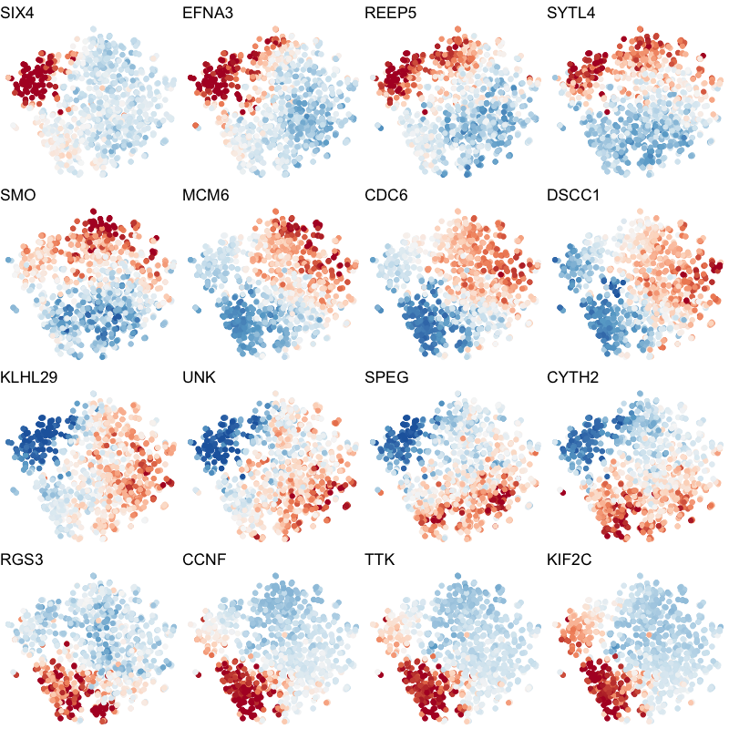
In the original manuscript, we also used heatmaps to visualize the pseudotemporal ordering of cells versus the peak expression of identified cell cycle genes and scatterplots of the pseudotemporal ordering of cells versus gene expression magnitude to visualize the shifting peak expression of cell cycle genes along pseudotime. Each visualization seeks to communicate and highlight a different aspect of the results.
Animating with gganimate
Still, when we are able to operature outside of traditional printed media and static visualizations, we can now take advantage of the additional time dimension for visualization offered by animations! We can use the gganimate package to visualize the same cell cycle genes as above.
library(gganimate)

df.all <- do.call(rbind, lapply(1:length(genes.final), function(i) {
  gexp <- m[genes.final[i], rownames(emb.test)]
  df <- data.frame(emb.test, gexp, gene=genes.final[i], order=i)
}))
p <- ggplot(df.all, aes(x = X1, y = X2, col=gexp)) + geom_point()
p <- p + theme_void() +
  theme(legend.position = "none") +
  scale_color_distiller(palette = 'RdBu',
                        limits = c(-2,2))
anim <- p +
  transition_states(order,
                    transition_length = 5,
                    state_length = 1) +
  labs(title = '{genes.final[as.integer(closest_state)]}') +
  theme(plot.title = element_text(size = 28)) +
  geom_point(size = 5) +
  enter_fade()
anim
For more information about gganimate, check out:
Recent Posts
- AI-guided data visualization of gas prices in different geographical locations across the US over time on 04 May 2026
- The Mentorship Index on 01 March 2026
- Vibe coding with SEraster and STcompare to compare spatial transcriptomics technologies on 22 February 2026
- RNA velocity in situ infers gene expression dynamics using spatial transcriptomics data on 13 October 2025
- Analyzing ICE Arrest Data - Part 2 on 27 September 2025