Aligning Spatial Transcriptomics Data With Stalign
Alignment of Spatial Transcriptomics Data with STalign
A scientific paper is a great way to communicate with fellow scientists in the field. But some times this style of communication may be challenging to understand. In this blog post, I will try to summarize the gist of our latest bioRxiv preprint “Alignment of spatial transcriptomics data using diffeomorphic metric mapping” in a way that is hopefully more accessible to the newer and more junior members of my lab. We will also walk through a use case of the associated tool, STalign, to take a more hands-on approach to understanding the underlying computational methodology.
Getting started with ST data
Spatial transcriptomics (ST) refers to a set of technologies that allow us to measure how genes are expressed within thin tissue slices. For example, here, we have two ST datasets that provide single-cell resolution gene expression measurements for a slice of the mouse brain from different animals at approximately the same brain locations assayed by Xenium and STARmap PLUS. Let’s visualize these ST datasets by plotting the positions of detected cells in the tissue.
## starmap data
pos1 <- read.csv('well11_spatial.csv.gz')
pos1 <- pos1[-1,] ## get rid of first row since it's comments
gexp1 <- read.csv('well11raw_expression_pd.csv.gz', row.names=1)
gexp1 <- as.matrix(gexp1)

## xenium data
pos2 <- read.csv('Xenium_V1_FF_Mouse_Brain_MultiSection_1_outs/cells.csv.gz')
gexp2 <- Matrix::readMM('Xenium_V1_FF_Mouse_Brain_MultiSection_1_outs/cell_feature_matrix/matrix.mtx.gz')
colnames(gexp2) <- read.csv('Xenium_V1_FF_Mouse_Brain_MultiSection_1_outs/cell_feature_matrix/barcodes.tsv.gz', header=FALSE)[,1]
rownames(gexp2) <- read.csv('Xenium_V1_FF_Mouse_Brain_MultiSection_1_outs/cell_feature_matrix/features.tsv.gz', sep="\t", header=FALSE)[,2]

#head(pos1)
#head(pos2)
#sort(intersect(rownames(gexp1), toupper(rownames(gexp2)))) ## double check shared genes

df1 <- data.frame(x = (as.numeric(pos1$Y))/5, ## change units
                  y = (max(as.numeric(pos1$X))-as.numeric(pos1$X))/5 , ## flip to same orientation
                  Gad1 = gexp1['GAD1',pos1$NAME], ## not sure why capitalized; definitely mouse
                  Slc17a7 = gexp1['SLC17A7',pos1$NAME],
                  sample = 'STARmap')
df2 <- data.frame(x = pos2$x_centroid,
                  y = pos2$y_centroid,
                  Gad1 = gexp2['Gad1',],
                  Slc17a7 = gexp2['Slc17a7',],
                  sample = "Xenium")
original <- rbind(df1, df2)

library(ggplot2)
g0 <- ggplot(original, aes(x = x, y = y, col=sample)) +
  geom_point(size=0.1, alpha = 0.1) +
  theme_void() +
  ggtitle('Samples') + facet_grid(~sample)
g0
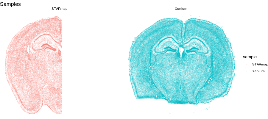
Notice for the STARmap dataset (left), we have a full hemi-brain slice. And for the Xenium dataset (right), we have a full-brain slice. Visually, they do indeed look somewhat similar with similar structural features. Let’s look at two genes measured by both ST technologies and expressed by these cells in the tissue.
g1 <- ggplot(original, aes(x = x, y = y, col=log10(Gad1+1))) +
  geom_point(size=0.1, alpha = 0.1) +
  scale_colour_gradientn(
    colours = colorRampPalette(c('lightgrey', 'red'))(100)) +
  theme_void() +
  ggtitle('Gad1') + facet_grid(~sample)

g2 <- ggplot(original, aes(x = x, y = y, col=log10(Slc17a7+1))) +
  geom_point(size=0.1, alpha = 0.1) +
  scale_colour_gradientn(
    colours = colorRampPalette(c('lightgrey', 'red'))(100)) +
  theme_void() +
  ggtitle('Slc17a7') + facet_grid(~sample)

library(gridExtra)
grid.arrange(g1 + theme(legend.position = "none"),
             g1 + geom_point(size=0.1, alpha = 0.2) +
               xlim(2000, 6000) + ylim(3000, 6000) +
               ggtitle('zoom'),
             g2 + theme(legend.position = "none"),
             g2 + geom_point(size=0.1, alpha = 0.2) +
               xlim(2000, 6000) + ylim(3000, 6000) +
               ggtitle('zoom'),
             ncol=2
)

Again, visually, the two slices look somewhat in terms of the expression patterns of these genes.
We may be interesting in asking questions like: at this particular region of the tissue, how are genes similar or different between these two tissue slices? This would require us to identify the same region in both tissue slices. While, we could manually do this to some extent, that can become quite tedious especially if there are a lot of regions we want to test.
Looking at these two tissue sections more closely by overlaying them, even though they look similar, they are not a perfect match.
## no alignment
g1 <- ggplot(original, aes(x = x, y = y, col = sample)) +
  geom_point(size = 0.1, alpha = 0.1) +
  theme_void() +
  ggtitle('original')

grid.arrange(g1 + theme(legend.position = "none"),
             g1 + geom_point(size = 0.1, alpha = 0.2) +
               xlim(2000, 6000) + ylim(3000, 6000) +
               ggtitle('zoom'),
             ncol=2
)
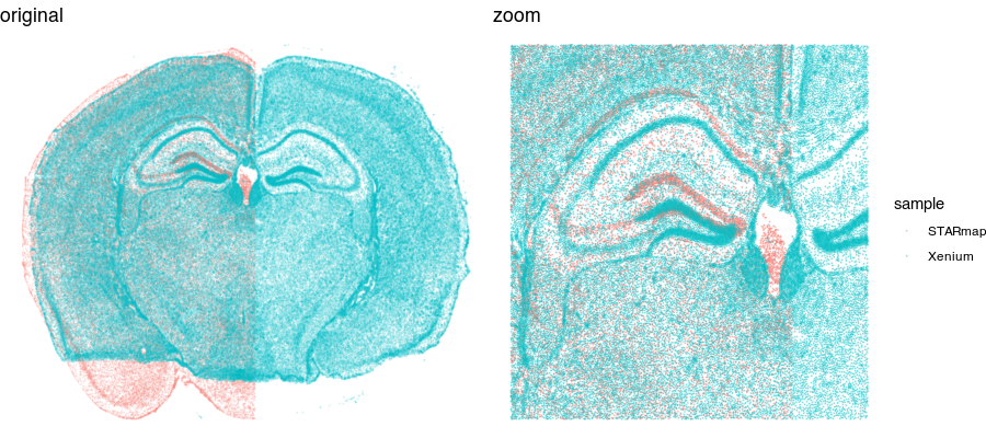
So we still need to perform some type of spatial alignment to really be able to make spatial comparisons at a fine resolution.
Aligning ST data
We could try simply rotating and shifting around one sample to best match the other (called an affine transformation). But often this is insufficient. Let’s see what happens when we perform a manual affine transformation on the first sample to try to get it to align with the second.
## rotate manually by radians
theta <- 0.05
## multiply rotation matrix
rotmat <- matrix(c(cos(theta), -sin(theta), sin(theta), cos(theta)), nrow=2, byrow = TRUE)
df.affine <- df1
df.affine[,1:2] <- as.matrix(df.affine[,1:2]) %*% rotmat

## manually scale down a little
df.affine[,1:2] <- df.affine[,1:2]*0.95

## manually translate up a little
df.affine[,2] <- df.affine[,2] + 280

affine <- rbind(df.affine, df2)

g1 <- ggplot(affine, aes(x = x, y = y, col = sample)) +
  geom_point(size = 0.1, alpha = 0.1) +
  theme_void() +
  ggtitle('affine')

grid.arrange(g1 + theme(legend.position = "none"),
             g1 + geom_point(size = 0.1, alpha = 0.2) +
               xlim(2000, 6000) + ylim(3000, 6000) +
               ggtitle('zoom'),
             ncol=2
)
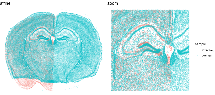
We can get pretty close! But no matter how we shift, scale, translate, and rotate, we will not be able to achieve a perfect alignment. This is because local, nonlinear transformations are needed for alignment. That’s where STalign comes in!
What does STalign do and how does it work?
STalign is a Python tool that allows us to take one single-cell resolution ST dataset (called the “source”) and align it to another single-cell resolution ST dataset or histology image (called the “target”). There are some other details regarding 3D atlas alignments that are a bit more involved and perhaps will be the topic of a future blog post.
Anyways, STalign first represents these single-cell centroids in an ST dataset (sets of x,y positions) as a smooth image through a process called rasterization. Once we have a set of two smooth images, we can solve for a transformation function that allows us to morph one image to look like the other.
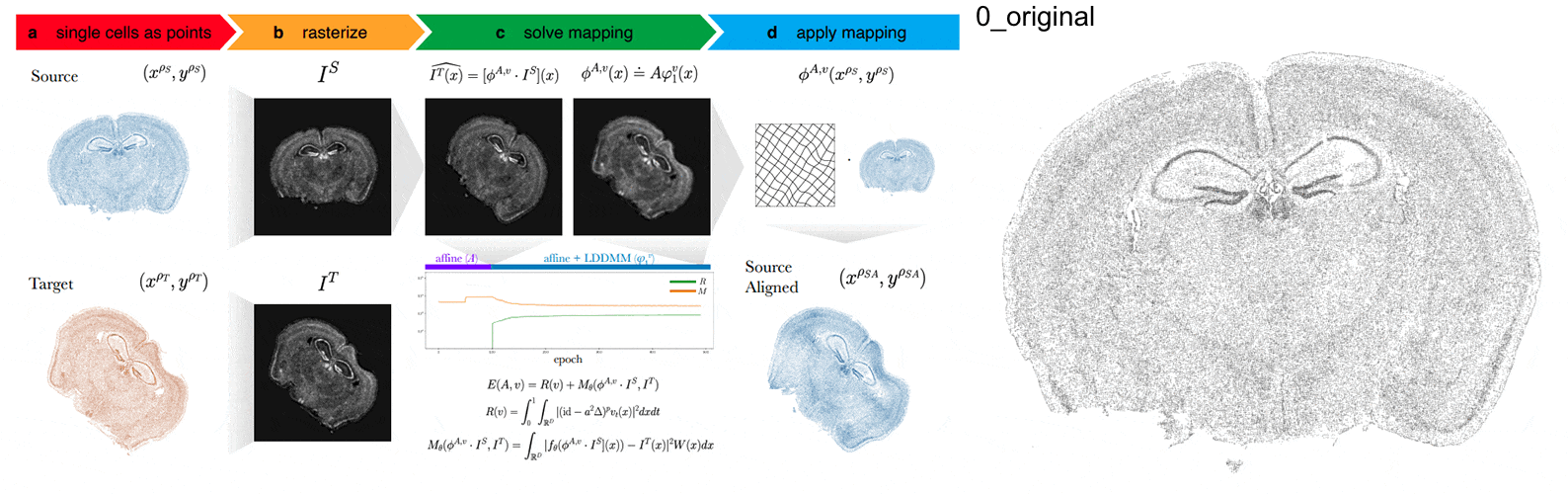
To solve this transformation function, we need to essentially gradually morph the source image to increase a metric that assesses how similar it is to the target (the matching term) as much as possible while still adhering to certain constraints (the regularization term). By imposing these regularization constraints, we do not allow our transformation, for example, to pick up one small chunk of the source and drop it at some other part in order to create a match with the target. Essentially, this regularization term helps keep our transformation realistic as far as tissue disortions tend to go. But this also means that we assume in order to align our source and target images, we won’t have to cut out small chunks and do some kind of Frankenstein-like re-arrangement.
In this case, note that I only expect the source and target images to ‘partially match’ ie. one tissue slice only overlaps partly with the other tissue slice. That’s ok. The matching term mentioned earlier tries to partition the image into 3 components: a matching component, a background component, and an artifact component. It achieves this using a Gaussian mixture model. This allows us to identify tissue regions where we would not expect a match because it is part of the background or it is perhaps an artifact and instead just focus on matching the parts we would expect to match. Whether a portion of the tissue is considered part of the matching, background, or artifact component can be visualized as the Gaussian mixture model weights.
We solve this transformation function by iteratively improving this metric using gradient descent. Think of the metric as a mountain and we’re trying to explore the mountain to find the lowest point. Having a smooth image also greatly helps with this gradient descent. And solving for this transformation, we can apply it back on the original set of single-cell centroids in our source ST dataset to move these x,y positions into a set of new positions where they are aligned with the target!
Check out our various STalign tutorials to try aligning for yourself! For now, we will just read in the results from running STalign.
stalign <- read.csv("starmap_data/starmap_STalign_to_xenium.csv.gz", header=FALSE)
df.aligned <- data.frame(x = stalign[,2], ## exported as y,x
                 y=stalign[,1],
                 Gad1 = gexp1['GAD1',pos1$NAME],
                 Slc17a7 = gexp1['SLC17A7',pos1$NAME],
                 sample = 'STARmap aligned')

aligned <- rbind(df.aligned, df2)

g1 <- ggplot(aligned, aes(x = x, y = y, col = sample)) +
  geom_point(size = 0.1, alpha = 0.1) +
  theme_void() +
  ggtitle('STalign')

grid.arrange(g1 + theme(legend.position = "none"),
             g1 + geom_point(size = 0.1, alpha = 0.2) +
               xlim(2000, 6000) + ylim(3000, 6000) +
               ggtitle('zoom'),
             ncol=2
)
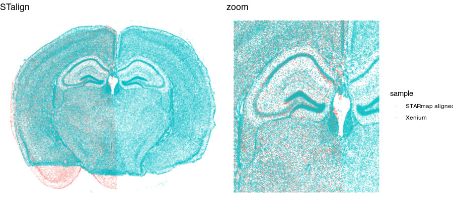
Now that our cells are aligned, we can at least visually inspect their spatial gene expression correspondence!
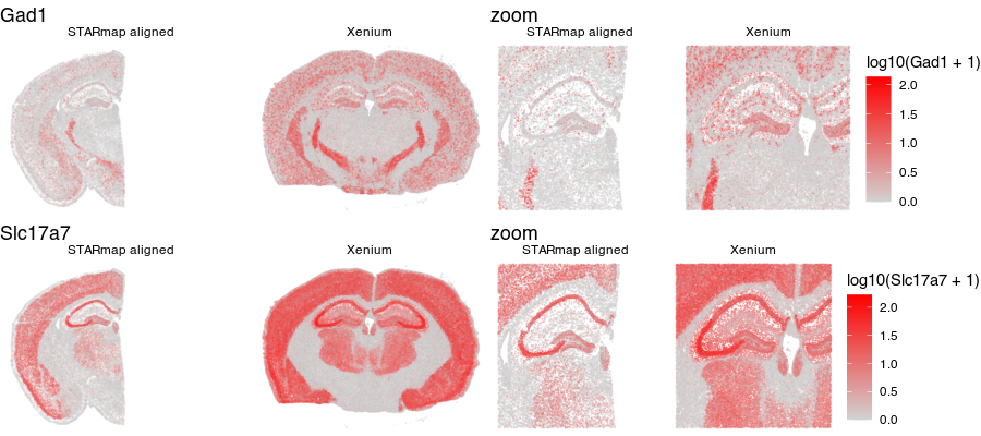
g1 <- ggplot(aligned, aes(x = x, y = y, col=log10(Gad1+1))) +
  geom_point(size=0.1, alpha = 0.1) +
  scale_colour_gradientn(
    colours = colorRampPalette(c('lightgrey', 'red'))(100)) +
  theme_void() +
  ggtitle('Gad1') + facet_grid(~sample)

g2 <- ggplot(aligned, aes(x = x, y = y, col=log10(Slc17a7+1))) +
  geom_point(size=0.1, alpha = 0.1) +
  scale_colour_gradientn(
    colours = colorRampPalette(c('lightgrey', 'red'))(100)) +
  theme_void() +
  ggtitle('Slc17a7') + facet_grid(~sample)

library(gridExtra)
grid.arrange(g1 + theme(legend.position = "none"),
             g1 + geom_point(size=0.1, alpha = 0.2) +
               xlim(2000, 6000) + ylim(3000, 6000) +
               ggtitle('zoom'),
             g2 + theme(legend.position = "none"),
             g2 + geom_point(size=0.1, alpha = 0.2) +
               xlim(2000, 6000) + ylim(3000, 6000) +
               ggtitle('zoom') ,
             ncol=2
)
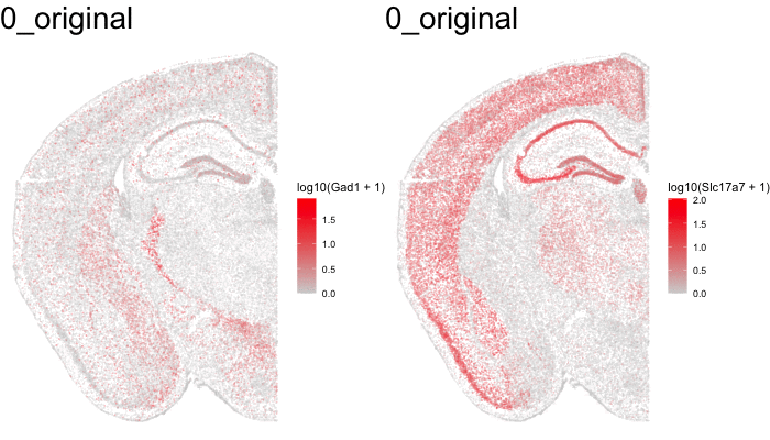
Just for fun, let’s use animation to visualize the local distortions that had to take place in order to align these two ST datasets.
df1 <- original[original$sample == 'STARmap',]
df1$sample <- '0_original'
#df2 <- affine[affine$sample == 'STARmap',]
#df2$sample <- '1_affine'
df3 <- aligned[aligned$sample == 'STARmap aligned',]
df3$sample <- '2_STalign'
dfanim <- rbind(df1, df3)

library(gganimate)
g1 <- ggplot(dfanim, aes(x = x, y = y, col=log10(Gad1+1))) +
  geom_point(size=0.1, alpha = 0.2) +
  scale_colour_gradientn(
    colours = colorRampPalette(c('lightgrey', 'red'))(100)) +
  theme_void()
g2 <- ggplot(dfanim, aes(x = x, y = y, col=log10(Slc17a7+1))) +
  geom_point(size=0.1, alpha = 0.2) +
  scale_colour_gradientn(
    colours = colorRampPalette(c('lightgrey', 'red'))(100)) +
  theme_void()

anim1 <- g1 +
  transition_states(sample,
                    transition_length = 5,
                    state_length = 5) +
  labs(title = '{closest_state}') +
  theme(plot.title = element_text(size = 28)) +
  enter_fade()

anim2 <- g2 +
  transition_states(sample,
                    transition_length = 5,
                    state_length = 5) +
  labs(title = '{closest_state}') +
  theme(plot.title = element_text(size = 28)) +
  enter_fade()

animate(anim1, height = 400, width = 350)
anim_save("anim1.gif")

animate(anim2, height = 400, width = 350)
anim_save("anim2.gif")
What can we do with these aligned ST data?
In this case, these two tissue slices were assayed by different ST technologies. Perhaps we’re interested in the technology that is most sensitive to certain genes like transcription factors within certain tissue regions like highly dense areas. With alignment of these samples from different ST technologies, we may now better compare apples to apples.
Alternatively, perhaps we know the strengths and weaknesses of these different ST technologies. Some technologies have low sensitivity but allows us to profile the whole transcriptome while others have high sensitivity but can only meausre a few genes. Now with alignment, we can leverage the best of both worlds when evaluating matched spatial locations.
Finally, had these samples been from different disease contexts (perhaps one tissue slice from a disease sample and another tissue slice from a control sample), we would now be able to evaluate where gene expression may differ at for what particular tissue regions. Of course, given that these particular samples were from different technologies, we would be quite concerned about differences due to technical differences between the technologies and other potential confounders.
In the future, as my lab is interested in how cells are organized within tissues, thin sections can only give us a 2D view of cellular organization. Yet tissues are inherently 3D. Until technologies advance to the point where we reliably spatially measure gene expression in thick tissue blocks, we may be able to begin evaluating 3D cellular organization by aligning serial tissue sections back into their original 3D configuration.
Likewise, my lab is interested in how genes, proteins, metabolites, etc are spatially distributed in a tissue. Again, until technologies advance to the point where we can reliable spatially measure all these different things in the same tissue section, we may be able to begin spatially evaluating such multiple modalities of molecular information by applying them to serial sections. We can measure gene expression in one thin tissue section, protein in another, and metabolites in another, and so forth. Then align these thin tissue sections back together to compare spatial patterns. Of course these measurements won’t be in the same single cells. But at a meso-scale patterning level, they may still reveal interesting insights about spatial correspondence between these modalities of molecular information.
We hope that STalign will be a useful tool in these and other research endeavors for ourselves and the scientific community!
Try it out for yourself!
- Try to make your own (better) manual affine transformation.
- Find (and/or collect) your own ST datasets and perform an alignment.
- What are other things do you think we can do once we have an alignment?
Recent Posts
- AI-guided data visualization of gas prices in different geographical locations across the US over time on 04 May 2026
- The Mentorship Index on 01 March 2026
- Vibe coding with SEraster and STcompare to compare spatial transcriptomics technologies on 22 February 2026
- RNA velocity in situ infers gene expression dynamics using spatial transcriptomics data on 13 October 2025
- Analyzing ICE Arrest Data - Part 2 on 27 September 2025