AI-guided data visualization of gas prices in different geographical locations across the US over time
In this blog post, I will walk through how I went from a question regarding gas prices in different geographical locations across the US over time, to using AI to help me find the relevant data for my question, to using AI to vibe code data visualizations to address my question.
It starts with a question
Soooo gas prices are going up. I live in Maryland. The gas station price near my house is currently $4.59. That price is higher than last week or last month. But frankly I can’t recall if the price was higher a few years ago, especially since I had moved to Maryland within the past couple years. In other parts of the US like California, $4.59 would be somewhat typical, at least in my memories. So I got curious: how have gas prices been changing in different geographical locations across the US over time?
The challenge: data scouting
To address my question, I needed to find data of gas prices for different regions or states across the US over time.
I first Googled around for “gas prices united states over time by state” and came across the AAA Gas Prices website. However, after clicking around for a bit, I realized there was only data for one day.
So I asked AI:
https://gasprices.aaa.com/state-gas-price-averages/ provides today’s state gas price averages for regular gas. I want to scrape the data of state gas price averages for regular gas over time for the past 2 years. What’s the best way to do this?
Response:
That AAA page is a current snapshot (national average “as of” a date plus today’s state table), not a built-in two-year archive you can paginate by changing a query string in the obvious way. To cover the past two years, you need either a time-series source AAA exposes (often behind JS/API calls) or an official third-party series that already stores history. For US retail gasoline by geography over years, the U.S. Energy Information Administration (EIA) is the usual answer: documented API, stable identifiers, and clear licensing for analysis. It may be weekly regional data rather than “every state every day” identical to AAA’s methodology, but it is the standard way to get two years of history without fighting a consumer site.
So AI says I can’t scrape the data from the AAA Gas Prices website. But it did point me to the U.S. Energy Information Administration (EIA). So I went on their website and found a beautiful excel spreadsheet of gas prices by region. But I was hoping to get to the resolution of state.
So I asked AI:
Is there a way to get each state’s gas price over time from this website? https://www.eia.gov/petroleum/gasdiesel/
Response:
The Gasoline and Diesel Fuel Update is a weekly snapshot of U.S. regular retail prices. The main table is mostly PADD regions (East Coast, Midwest, Gulf Coast, etc.), plus a short list of states and cities in the expandable “States” section—not all 50 states on one table. From the content you shared, the states called out there are things like California, Colorado, Florida, Massachusetts, Minnesota, New York, Ohio, Texas, Washington (plus cities). That matches how this product works: it is built from the weekly retail gasoline survey (EIA-878), which publishes defined cities/states, not necessarily a separate weekly series for every state. So: you do not get “each state” as 50 parallel weekly series from that single summary page alone, unless EIA publishes a series for that state.
Based on this response, I decided to pivot to focus on region rather than expending more time, effort, and tokens to try to get data for every state.
Vibe coding data visualizations
I have previously ‘trad-coded’ data visualizations of ICE detention patterns across geographical locations over time. So from that experience, I already have a good vision for the visualization I wanted to make: a line plot of gas prices with a separate colored line for each region, next to a map that visualizes gas prices as a divergent color hue for each region animated over time.
I downloaded the excel spreadsheet (XLS) file for “U.S. Regular Gasoline Prices (dollars per gallon)”. I looked through the data manaually and found the sheet corresponding to regular gas (as opposed to diesel). I noticed each column was a different region and each row was a date going back to 1995 with the entry as the gas price. So now that I have a good understanding of the data, I can vibe code an R script to create a data visualization to make salient the spatiotemporal trends.
I thought it would be too challenging to try to one-shot describe the final data visualization and have AI generate the correct code. So I decided to work up to the final visualization in steps, first making a static version of the line plot component. This step-by-step build-up in complexity is how I would do it if I was trad-coding.
Prompt:
@pswrgvwall.xls contains weekly average prices of gasoline for different regions of the United States. Sheet Data 10 is the all grades convention prices. Write an R script to use ggplot2 to visualize these trends in different regions over time using a line plot. Represent different regions as different colored lines. Focus on visualizing the data since January 2024.
Result:
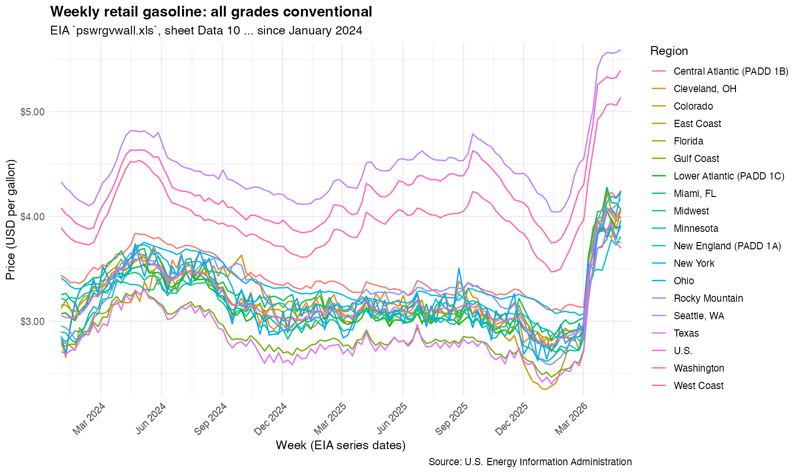
A great start! From this, I realized there was a lot more data than what I wanted to visualize. I only wanted to visualize certain regions. So I used this map to figure out what states corresponded to what regions. From experience, I know specifying the states will be needed later for our map visualization. So eventhough I anticipate the AI could’ve limited to the correct columns of data without the state information, I gave it the state information anyway in anticipation.
Instead of all columns, focus on just the following regions, which are comprised of states (abbreviated names provided):
West Coast = WA, OR, NV, CA, AZ, HI, AK
Rocky Mountain = MT, ID, WY, UT, CO
Gulf Coast = NM, TX, AR, LA, MS, AL
Midwest = ND, SD, NE, KS, OK, MN, IA, MO, WI, IL, MI, IN, OH, KY, TN
New England = ME, VT, NH, MA, CT, RI
Central Atlantic = NY, PA, NJ, MD, DE
East Coast = WV, VA, NC, SC, GA, FL
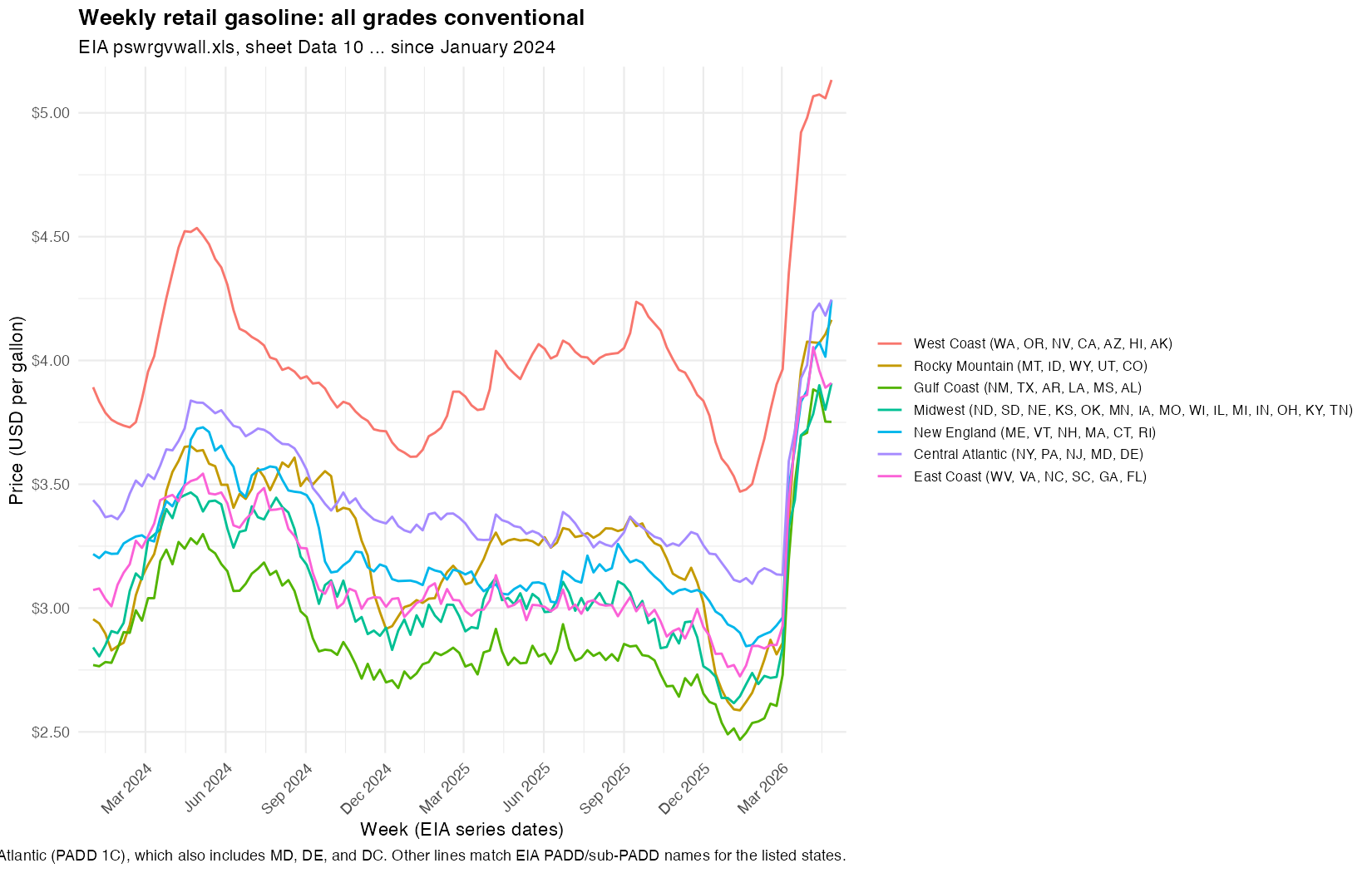
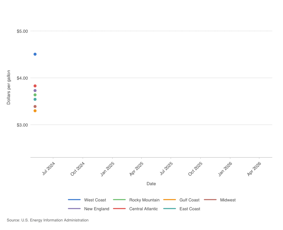
Now we’re ready to animate. I basically describe the same animation options I used previous to visualize ICE arrest trends over time. Except now, instead of specifying specific parameters/options (like transition_reveal), I can conveniently use the English language. It’s still very helpful to know what parameters/options are available though.
Now use
gganimateto visualize an animation of the line plot. Add ageom_pointto mark the beginning of the line. Transition reveal by week. Enter and exit fade. Use a view follow with flexible y-axis that tracks the moving line.
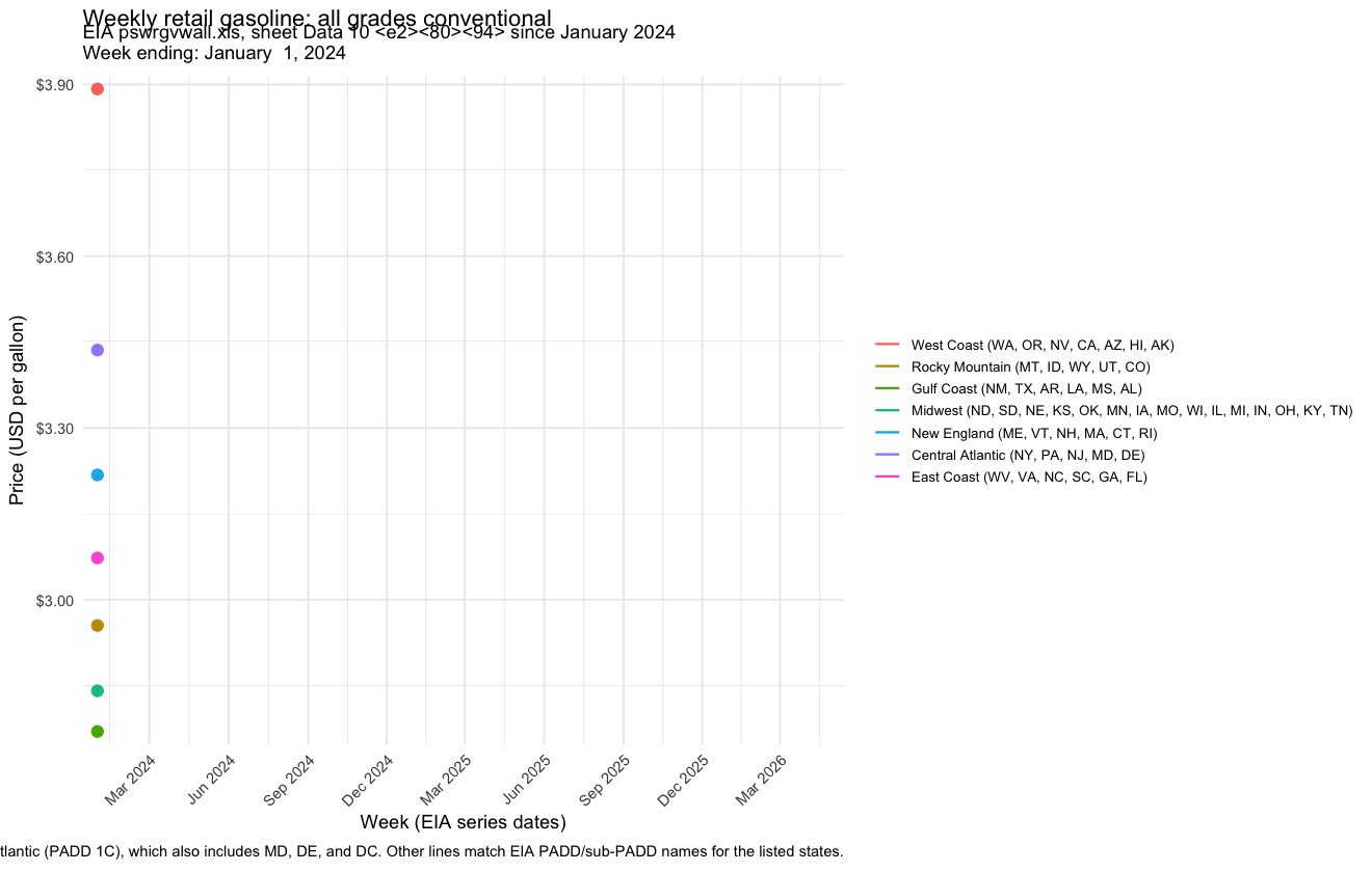
The animated line plot looks good. So we can add in a map.
Now use the
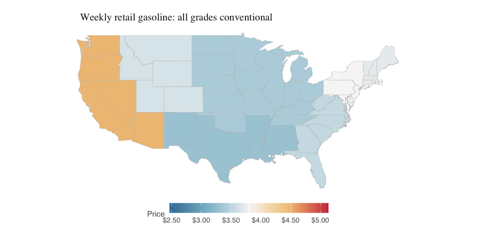
mapslibrary to also add an animated visualization of gas price by geographical location over time. Use blue to represent low gas prices and red to represent high gas prices. Color the state by the gas price for that region. Place this animated visualization on top of the line plot just made. The two animations should be synced to show week by week changes.
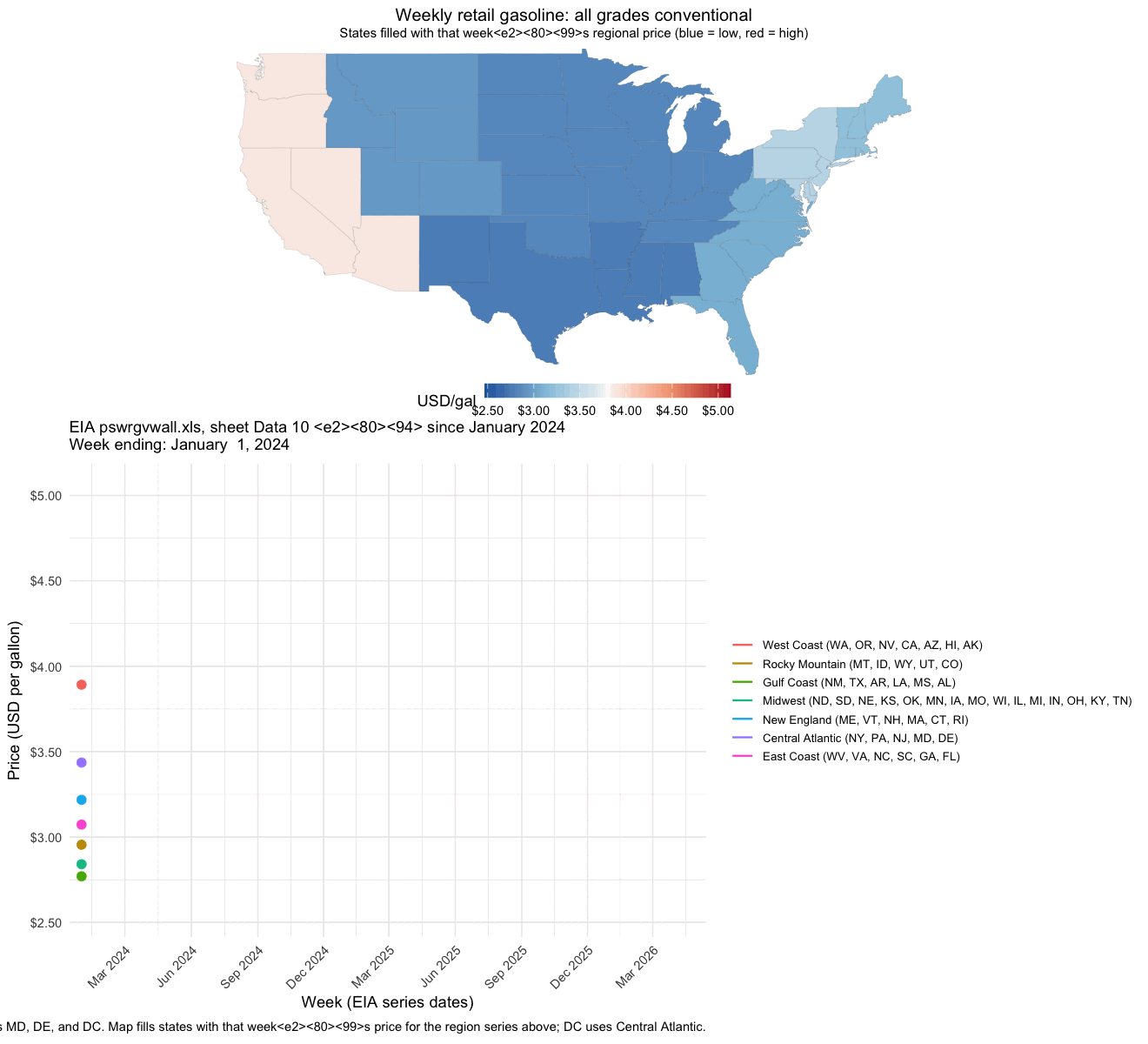
Ok I actually have no idea what happened here. I tried to use AI to debug but it did not improve the result and kept making the same end plot…
Keep the background white, not transparent. Do not use view follow. Fix the axes to keep the plot sizes consistent to avoid jittering in the animation from frame to frame.
Since the individual line plot animation looked good, I figured something about trying to combine the two animations was causing issues. So at this point, I decided to pivot just make two separate plots rather than expending more time, effort, and tokens.
Create two separate gifs instead of one. Flatten the background to avoid transparency. Move the legend to the bottom. Omit the
lab_sub_staticand subtitle. Pause for 5 seconds on the last frame for the most recent date.
The results looked good to me. I can always use a separate tool to combine the two gifs later. I thought the color and padding was a bit off so I tried to get AI to make the aesthetic choices more consistent with a professional publication. I didn’t always agree with its choices so I did manually go back into the code and change a few things. But the generated well-commented code definitely allowed me to more easily adjust the start date, specific colors, frame widths, and other options.
Update the theme, padding, font colors, etc, to be more aesthetically pleasing and more appropriate for a New York Times or Bloomberg article.
Question asked. Question answered!
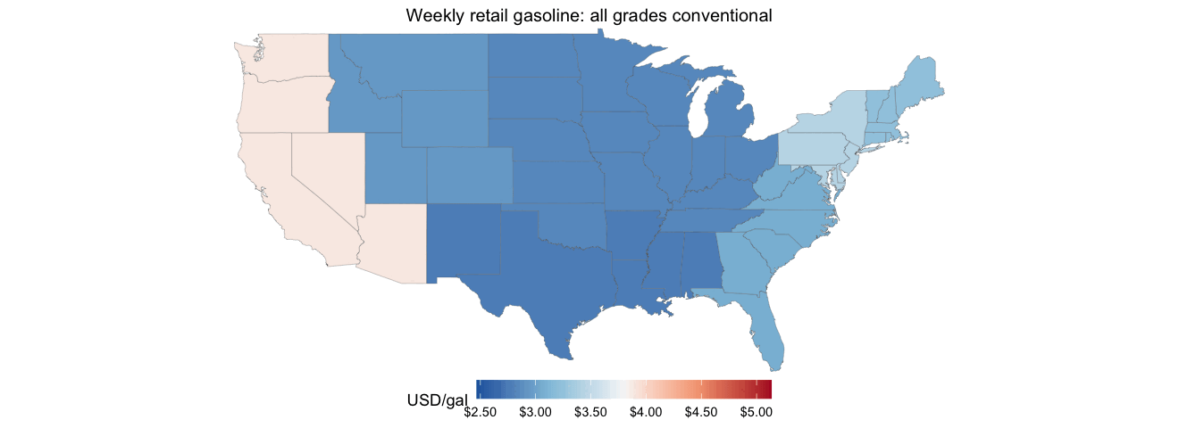
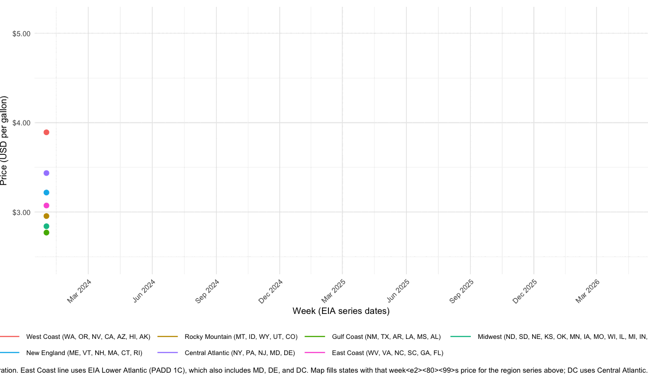
And this is the end result! So how have gas prices been changing in different geographical locations across the US over time? We can really appreciate how gas prices have fluctuated over time but really drastically increased starting around Feb 2026 when the Strait of Hormuz was closed to maritime traffic following the US-Israel-Iran conflict. We can see a teeny price dip in late March that corresponds to the US Department of Energy releasing 17.5 million barrels of oil from the Strategic Petroleum Reserve in an attempt to stabilize global supplies. But prices continue to increase to historic highs, consistent across all US regions.
Final code:
#!/usr/bin/env Rscript
#' Line plot plus two animated GIFs (map-only and line-only) of weekly all-grades
#' conventional gasoline prices for selected regions from EIA sheet "Data 10"
#' (pswrgvwall.xls). GIFs are flattened onto a white background (no transparency).
#'
#' Map colors states by the regional EIA series each state belongs to (see
#' state_region assignment). DC uses the Central Atlantic regional price.

suppressPackageStartupMessages({
  library(readxl)
  library(dplyr)
  library(tidyr)
  library(ggplot2)
  library(stringr)
  library(scales)
  library(gganimate)
  library(grid)
  library(maps)
})

if (!requireNamespace("gifski", quietly = TRUE)) {
  stop("Install gifski for GIF output: install.packages(\"gifski\")", call. = FALSE)
}
if (!requireNamespace("magick", quietly = TRUE)) {
  stop("Install magick to flatten GIF backgrounds: install.packages(\"magick\")", call. = FALSE)
}

# Default: workbook in working directory.
args <- commandArgs(trailingOnly = TRUE)
xls_path <- if (length(args) >= 1) args[[1]] else "pswrgvwall.xls"
start_date <- as.Date("2024-05-01")

stopifnot(file.exists(xls_path))

raw <- read_excel(xls_path, sheet = "Data 10", skip = 2)

region_cols <- setdiff(names(raw), "Date")
if (length(region_cols) == 0) {
  stop("Expected a 'Date' column plus price columns; check skip / sheet name.")
}

# Legend labels (your state groupings) -> regex matching exactly one EIA column name.
# East Coast: EIA does not publish a series for only WV, VA, NC, SC, GA, FL. Lower
# Atlantic (PADD 1C) is the closest weekly series (also includes MD, DE, DC).
region_defs <- data.frame(
  region = c(
    "West Coast",
    "Rocky Mountain",
    "Gulf Coast",
    "Midwest",
    "New England",
    "Central Atlantic",
    "East Coast"
  ),
  col_pattern = c(
    "^Weekly West Coast All Grades Conventional",
    "^Weekly Rocky Mountain All Grades Conventional",
    "^Weekly Gulf Coast All Grades Conventional",
    "^Weekly Midwest All Grades Conventional",
    "^Weekly New England \\(PADD 1A\\) All Grades Conventional",
    "^Weekly Central Atlantic \\(PADD 1B\\) All Grades Conventional",
    "^Weekly Lower Atlantic \\(PADD 1C\\) All Grades Conventional"
  ),
  stringsAsFactors = FALSE
)

pick_column <- function(pattern) {
  hit <- region_cols[str_detect(region_cols, pattern)]
  if (length(hit) == 0L) {
    stop("No column matched pattern: ", pattern)
  }
  if (length(hit) > 1L) {
    stop("Multiple columns matched pattern: ", pattern, "\n", paste(hit, collapse = "\n"))
  }
  hit[[1]]
}

selected_pairs <- region_defs |>
  mutate(eia_col = unname(vapply(col_pattern, pick_column, character(1)))) |>
  select(region, eia_col)

plot_data <- raw |>
  mutate(date = as.Date(.data$Date)) |>
  filter(!is.na(date), date >= start_date) |>
  select(date, all_of(unname(selected_pairs$eia_col))) |>
  pivot_longer(
    cols = -date,
    names_to = "eia_col",
    values_to = "price_usd_per_gal",
    values_drop_na = TRUE
  ) |>
  left_join(selected_pairs, by = "eia_col") |>
  transmute(date, region = factor(region, levels = region_defs$region), price_usd_per_gal) |>
  arrange(date, region)

# --- Map: assign each state (map_data "region" name) to one plotted region ---
state_region <- bind_rows(
  tibble(
    abbr = c("WA", "OR", "NV", "CA", "AZ", "HI", "AK"),
    region = factor("West Coast", levels = region_defs$region)
  ),
  tibble(
    abbr = c("MT", "ID", "WY", "UT", "CO"),
    region = factor("Rocky Mountain", levels = region_defs$region)
  ),
  tibble(
    abbr = c("NM", "TX", "AR", "LA", "MS", "AL"),
    region = factor("Gulf Coast", levels = region_defs$region)
  ),
  tibble(
    abbr = c(
      "ND", "SD", "NE", "KS", "OK", "MN", "IA", "MO", "WI", "IL", "MI", "IN", "OH", "KY", "TN"
    ),
    region = factor(
      "Midwest",
      levels = region_defs$region
    )
  ),
  tibble(
    abbr = c("ME", "VT", "NH", "MA", "CT", "RI"),
    region = factor("New England", levels = region_defs$region)
  ),
  tibble(
    abbr = c("NY", "PA", "NJ", "MD", "DE"),
    region = factor("Central Atlantic", levels = region_defs$region)
  ),
  tibble(
    abbr = c("WV", "VA", "NC", "SC", "GA", "FL"),
    region = factor("East Coast", levels = region_defs$region)
  ),
  tibble(
    abbr = "DC",
    region = factor("Central Atlantic", levels = region_defs$region)
  )
) |>
  mutate(
    state = tolower(datasets::state.name[match(abbr, datasets::state.abb)]),
    state = if_else(abbr == "DC", "district of columbia", state)
  ) |>
  filter(!is.na(state))

state_week_prices <- state_region |>
  select(state, region) |>
  left_join(plot_data, by = "region", relationship = "many-to-many")

week_levels <- sort(unique(plot_data$date))
display_week_fct <- function(x) factor(x, levels = week_levels, ordered = TRUE)

line_anim <- plot_data |>
  crossing(display_week = week_levels) |>
  filter(date <= .data$display_week) |>
  mutate(display_week = display_week_fct(.data$display_week))

line_pts <- line_anim |>
  group_by(region, display_week) |>
  slice_max(order_by = date, n = 1L, with_ties = FALSE) |>
  ungroup()

# Each map vertex row is repeated for every week for that state (needed for
# transition_states); join is intentionally many-to-many.
map_anim <- map_data("state") |>
  inner_join(
    state_week_prices |> dplyr::rename(display_date = date),
    by = c("region" = "state"),
    relationship = "many-to-many"
  ) |>
  mutate(display_week = display_week_fct(.data$display_date))

price_limits <- range(plot_data$price_usd_per_gal, na.rm = TRUE)
date_limits <- range(plot_data$date, na.rm = TRUE)
y_pad <- max(diff(price_limits) * 0.04, 0.02)
y_limits_line <- c(price_limits[1] - y_pad, price_limits[2] + y_pad)

us_outline <- map_data("state")
map_xlim <- range(us_outline$long, na.rm = TRUE)
map_ylim <- range(us_outline$lat, na.rm = TRUE)

lab_title <- "Weekly retail gasoline: all grades conventional"
lab_caption <- "Source: U.S. Energy Information Administration"

# Editorial palette (newsprint-style neutrals + restrained ink colors)
COL_BG <- "#ffffff"
COL_TEXT <- "#121212"
COL_TEXT_MUTED <- "#595959"
COL_GRID <- "#e3e3e3"
COL_AXIS <- "#d0d0d0"
COL_CAPTION <- "#737373"
COL_MAP_BORDER <- "#b8b8b8"

# Seven muted, distinguishable hues aligned with region_defs row order
pal_regions <- c(
  "#4A90D9",
  "#7EC882",
  "#F5A623",
  "#C9847A",
  "#9D8FC2",
  "#E86B63",
  "#5BB8B5"
)

map_fill_colors <- c("#3A7CA5", "#8FBFD0", "#F5F5F5", "#F0C888", "#CD3A4A")

white_bg_theme <- function() {
  theme(
    plot.background = element_rect(fill = COL_BG, colour = NA),
    panel.background = element_rect(fill = COL_BG, colour = NA),
    legend.background = element_rect(fill = COL_BG, colour = NA),
    legend.key = element_rect(fill = COL_BG, colour = NA)
  )
}

# Fixed x/y limits keep line-chart axes stable across animation frames (no jitter).
add_scales_theme <- function(p, x_date_limits = NULL, y_limits = NULL) {
  p +
    scale_x_date(
      limits = x_date_limits,
      date_breaks = "3 months",
      date_labels = "%b %Y",
      expand = c(0.02, 0),
      oob = scales::oob_keep
    ) +
    scale_y_continuous(
      limits = y_limits,
      labels = label_dollar(accuracy = 0.01),
      expand = c(0.02, 0),
      oob = scales::oob_keep
    ) +
    scale_color_manual(values = pal_regions, drop = FALSE, name = NULL) +
    labs(
      title = lab_title,
      x = "Date",
      y = "Dollars per gallon",
      caption = lab_caption
    ) +
    theme_minimal(base_size = 11, base_family = "sans") +
    white_bg_theme() +
    theme(
      text = element_text(color = COL_TEXT_MUTED),
      plot.title = element_text(
        family = "serif",
        face = "bold",
        size = rel(1.15),
        colour = COL_TEXT,
        hjust = 0,
        margin = margin(b = 14)
      ),
      plot.title.position = "plot",
      plot.caption = element_text(
        family = "sans",
        size = rel(0.72),
        colour = COL_CAPTION,
        hjust = 0,
        lineheight = 1.35,
        margin = margin(t = 14)
      ),
      plot.caption.position = "plot",
      plot.margin = margin(18, 22, 14, 14),
      panel.grid.major.x = element_blank(),
      panel.grid.major.y = element_line(colour = COL_GRID, linewidth = 0.35),
      panel.grid.minor = element_blank(),
      axis.line.x = element_line(colour = COL_AXIS, linewidth = 0.45),
      axis.ticks.x = element_line(colour = COL_AXIS, linewidth = 0.35),
      axis.ticks.y = element_blank(),
      axis.title = element_text(size = rel(0.82), colour = COL_TEXT_MUTED, face = "plain"),
      axis.title.x = element_text(margin = margin(t = 10)),
      axis.title.y = element_text(margin = margin(r = 10)),
      axis.text = element_text(size = rel(0.82), colour = COL_TEXT_MUTED),
      axis.text.x = element_text(angle = 45, hjust = 1, vjust = 1),
      legend.position = "bottom",
      legend.direction = "horizontal",
      legend.box = "horizontal",
      legend.box.margin = margin(t = 6),
      legend.margin = margin(t = 4),
      legend.spacing.x = unit(10, "pt"),
      legend.text = element_text(size = rel(0.78), colour = COL_TEXT_MUTED),
      legend.key.height = unit(0.45, "cm"),
      legend.key.width = unit(1.05, "cm")
    ) +
    guides(color = guide_legend(nrow = 2, byrow = TRUE, override.aes = list(linewidth = 1)))
}

# --- Static PNG (line chart only) ---
p_static <- add_scales_theme(
  ggplot(plot_data, aes(x = date, y = price_usd_per_gal, color = region, group = region)) +
    geom_line(linewidth = 0.55, lineend = "round", linejoin = "round"),
  x_date_limits = date_limits,
  y_limits = y_limits_line
)

# --- Animated GIFs (map and line separately) ---
# Re-save via magick with flatten so enter/exit fades do not leave transparent pixels.
# magick::image_animate() requires fps to divide 100 (ImageMagick constraint).
# Appends duplicate copies of the last frame so playback pauses pause_last_seconds.
flatten_gif_white <- function(path_in, path_out, fps = 10L, pause_last_seconds = 5) {
  img <- magick::image_read(path_in)
  img <- magick::image_background(img, "white", flatten = TRUE)
  tw <- tempfile(fileext = ".gif")
  on.exit(unlink(tw), add = TRUE)
  magick::image_write(magick::image_animate(img, fps = fps), tw)
  n <- nrow(magick::image_info(magick::image_read(tw)))
  n_hold <- as.integer(max(0L, ceiling(pause_last_seconds * as.numeric(fps))))
  if (n_hold == 0L) {
    file.copy(tw, path_out, overwrite = TRUE)
    return(invisible(NULL))
  }
  last <- magick::image_read(sprintf("%s[%d]", tw, n - 1L))
  last <- magick::image_background(last, "white", flatten = TRUE)
  out <- magick::image_read(tw)
  for (.k in seq_len(n_hold)) {
    out <- c(out, last)
  }
  magick::image_write(magick::image_animate(out, fps = fps), path_out)
}

# Bare column names in aes (not .data[[]]); gganimate + geom_polygon can fail silently otherwise.
p_map <- ggplot(map_anim, aes(long, lat, group = group, fill = price_usd_per_gal)) +
  geom_polygon(
    color = COL_MAP_BORDER,
    linewidth = 0.12
  ) +
  coord_fixed(
    ratio = 1.15,
    xlim = map_xlim,
    ylim = map_ylim,
    expand = FALSE,
    clip = "off"
  ) +
  scale_fill_gradientn(
    colours = map_fill_colors,
    limits = price_limits,
    oob = squish,
    name = "Price",
    labels = label_dollar(accuracy = 0.01)
  ) +
  labs(title = lab_title) +
  theme_void(base_size = 11, base_family = "sans") +
  white_bg_theme() +
  theme(
    text = element_text(colour = COL_TEXT_MUTED),
    plot.title = element_text(
      family = "serif",
      face = "bold",
      size = rel(1.12),
      colour = COL_TEXT,
      hjust = 0,
      margin = margin(b = 10, l = 4, r = 4)
    ),
    plot.title.position = "plot",
    plot.margin = margin(16, 18, 18, 14),
    legend.position = "bottom",
    legend.direction = "horizontal",
    legend.title = element_text(size = rel(0.85), colour = COL_TEXT_MUTED, face = "plain"),
    legend.text = element_text(size = rel(0.78), colour = COL_TEXT_MUTED),
    legend.key.width = unit(1.35, "cm"),
    legend.key.height = unit(0.42, "cm"),
    legend.margin = margin(t = 8),
    legend.box.margin = margin(t = 4)
  )

p_line_anim <- add_scales_theme(
  ggplot(line_anim, aes(x = date, y = price_usd_per_gal, color = region, group = region)) +
    geom_line(linewidth = 0.55, lineend = "round", linejoin = "round") +
    geom_point(
      data = line_pts,
      aes(x = date, y = price_usd_per_gal, color = region, group = region),
      size = 2.5,
      stroke = 0.25,
      shape = 19,
      show.legend = FALSE
    ),
  x_date_limits = date_limits,
  y_limits = y_limits_line
) +
  labs(title = NULL, caption = lab_caption) +
  coord_cartesian(clip = "off")

trans <- transition_states(
  display_week,
  transition_length = 0,
  state_length = 1,
  wrap = FALSE
)

n_weeks <- length(week_levels)
fps <- 10L
w_in <- 8
res <- 120L
h_map_in <- 4
h_line_in <- 6.5

tmp_map <- tempfile(fileext = ".gif")
tmp_line <- tempfile(fileext = ".gif")
out_map <- "gasoline_regions_since_2024_map.gif"
out_line <- "gasoline_regions_since_2024_lines.gif"

anim_map <- animate(
  p_map + trans + enter_fade() + exit_fade(),
  nframes = n_weeks,
  fps = fps,
  renderer = gifski_renderer(),
  width = w_in,
  height = h_map_in,
  units = "in",
  res = res,
  bg = "white"
)
anim_save(tmp_map, animation = anim_map)

anim_line <- animate(
  p_line_anim + trans + enter_fade() + exit_fade(),
  nframes = n_weeks,
  fps = fps,
  renderer = gifski_renderer(),
  width = w_in,
  height = h_line_in,
  units = "in",
  res = res,
  bg = "white"
)
anim_save(tmp_line, animation = anim_line)

pause_last <- 5
flatten_gif_white(tmp_map, out_map, fps = fps, pause_last_seconds = pause_last)
flatten_gif_white(tmp_line, out_line, fps = fps, pause_last_seconds = pause_last)
unlink(c(tmp_map, tmp_line))

n_hold <- as.integer(ceiling(pause_last * as.numeric(fps)))
message(
  "Wrote ", out_map, " and ", out_line, " (", n_weeks, " data frames + ", n_hold,
  " hold frames on last week; flattened white bg; ", pause_last, "s pause at end)"
)
Try it out for yourself!
Coding is power. I am so excited to see what happens when more people are able to use AI to specifically harness the power of coding to tackle questions they deem important. I hope this blog post will provide those in journalism and other service-oriented sectors (who may not consider themselves super coding wizards) with a template on how to use AI in assisting you in data scouting and coding to answer and tell data-driven stories. So try it out for yourself!
Recent Posts
- AI-guided data visualization of gas prices in different geographical locations across the US over time on 04 May 2026
- The Mentorship Index on 01 March 2026
- Vibe coding with SEraster and STcompare to compare spatial transcriptomics technologies on 22 February 2026
- RNA velocity in situ infers gene expression dynamics using spatial transcriptomics data on 13 October 2025
- Analyzing ICE Arrest Data - Part 2 on 27 September 2025