Figure style faux pas
Introduction
Recently, I collaborated with a fellow lab member to put together figures for a manuscript. I believe, regardless of whether the figures were made by 1, 2, or 10 people, every figure should look like they were made by the same person. The same principle applies to programming - regardless of whether the code was written by 1, 2, or 10 people, it should look like it was written by the same person. This is typically achieved in programming through the adherence to a style guide.
When making figures, I had a hard time communicating what my stylistic preferences were and what style faux pas drive me absolutely insane. So I made this figure faux pas style guide along with tips to help lay out what are the stylistic features that distinguish a good, bad, and ugly figure (in my opinion) regardless of the underlying data that’s presented. If you notice and are annoyed by these pixel-level imperfections like me, feel free to adapt this style guide for your own collaborations.
Style faux pas
Style faux pas 1. Inconsistent font
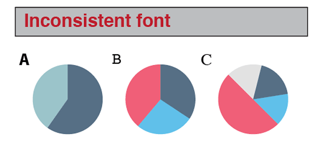
Tip:
- Use the font Helvetica for all text
- Figure panel labels (A,B,C,D, etc) should be capitalized and bolded, size 25pt
- Figure titles should be bolded, size 18pt
- Figure axis labels should be regular (not bolded), size 15pt
- Figure axis tick labels (#s) should be regular, size 10pt
- Other figure labels like legends should be regular, size 12pt
- No font should be smaller than 8pt
Style faux pas 2. Lack of alignment
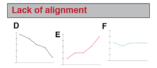
Tip:
- All figure panel labels should be aligned/justified
- All figures should also be aligned/justified
- All figure panel labels should be consistent in terms of their relative position to figure panels
Style faux pas 3. Insufficient padding
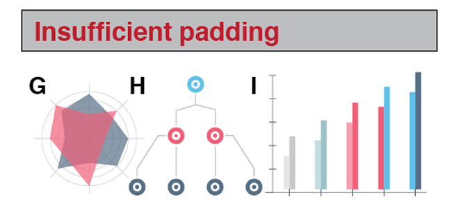
Tip:
- Maintain a consistent degree of padding around figures
- Figure panel labels should be closer to their figure panel than other figure panels
- Maintain at least a 1/2 inch padding around the whole figure
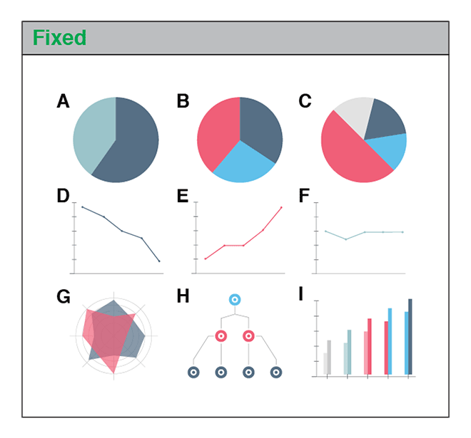
What it looks like when these style faux pas are addressed
The Good, Bad, and Ugly
Test yourself! See if you can distinguish the good, from the bad, from the ugly figures.
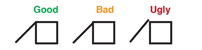
Good: Snapping to grid. Rounded, matching corners.
Bad: Missed grid so unmatched corners.
Ugly: Come on! You’re not even trying!

Good: Even spacing above and below line and words
Bad: Too little spacing below line, too much spacing below words.
Ugly: Overlapping, illegible words. Think of your readers!
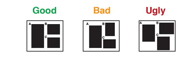
Good: Aligned panel labels and panels. Labels aligned with each other. Panels aligned with each other.
Bad: Inconsistent alignment among panels. Inconsistent relation between panels and panel labels.
Ugly: You’re not even properly using the whole space! Way to waste paper!
Recent Posts
- AI-guided data visualization of gas prices in different geographical locations across the US over time on 04 May 2026
- The Mentorship Index on 01 March 2026
- Vibe coding with SEraster and STcompare to compare spatial transcriptomics technologies on 22 February 2026
- RNA velocity in situ infers gene expression dynamics using spatial transcriptomics data on 13 October 2025
- Analyzing ICE Arrest Data - Part 2 on 27 September 2025