Interactive Honeybadger Laf Profiles
Interactive visualization of allelic expression patterns in single-cell RNA-seq data
I recently developed an R package called HoneyBADGER that infers copy number alteration and loss-of-heterozygocity events in single cells based on persistent allelic imbalance in single-cell RNA-sequencing data. Intuitively, if a cell has a copy number alteration such as a deletion of a particular chromosomal region, then, within this region, we should only observe expression from the non-deleted allele. In contrast, in a neutral diploid region, we should be able to detect expression from both alleles.
Visualizing the patterns of allelic expression for heterozygous SNPs within a deletion or neutral region can really drive home this point. We can use the HoneyBADGER package to plot such lesser-allele fraction (LAF) profiles for heterozygous SNPs in 75 single cells from a glioblastoma cancer patient where we expect a subpopulation of cells to harbor a Chromosome 10 deletion.
library(HoneyBADGER)

# Get data
data(r) ## alternate allele
data(cov.sc) ## total coverage
# Set the allele matrices
allele.mats <- setAlleleMats(r, cov.sc)
# Map snps to genes
library(TxDb.Hsapiens.UCSC.hg19.knownGene)
geneFactor <- setGeneFactors(allele.mats$snps,
    TxDb.Hsapiens.UCSC.hg19.knownGene)
# Plot static version
r.maf=allele.mats$r.maf
n.sc=allele.mats$n.sc
l.maf=allele.mats$l.maf
n.bulk=allele.mats$n.bulk
snps=allele.mats$snps
region=GRanges(seqname='chr10', IRanges(start=0, end=1e9))
plotAlleleProfile(r.maf, n.sc, l.maf, n.bulk, snps, region)
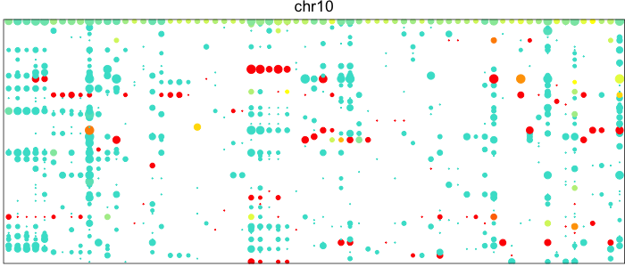
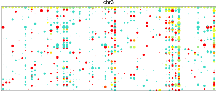
Each point here represents a heterozygous SNP (column) in a cell (row). The top row corresponds to the composite of all single cells. Coverage is reflected in the dot size and allelic bias in color. Yellow indicates equal expression of both alleles, while blue indicates only expression of the lesser allele and red only expression of the major allele.
Visually, we can see how on Chromosome 10, in a subset of cells, there is persistent expression from one allele. In contrast, in a neutral diploid region such as Chromosome 3, we are able to see expression of both alleles.
However, this plot is static and difficult to explore. It’s difficult to say which SNPs in which cells specifically are coming from the non-deleted allele and how many reads are at each SNP without going back into R and tediously looking through a data matrix. Inspired by the GTEx eQLT visualizer and applying what I’ve blogged about previously on interactive visualizations with highcharter, I sought to make an interactive version of these LAF profiles.
# Make interactive plot with highcharter
library(highcharter)
# restrict SNPs to region
overlap <- IRanges::findOverlaps(region, snps)
hit <- rep(FALSE, length(snps))
hit[S4Vectors::subjectHits(overlap)] <- TRUE
vi <- hit
r.maf <- r.maf[vi,]
n.sc <- n.sc[vi,]
l.maf <- l.maf[vi]
n.bulk <- n.bulk[vi]
snps <- snps[vi]
chrs <- region@seqnames@values
# order snps
mat <- r.maf/n.sc
tl <- tapply(seq_along(snps), as.factor(as.character(snps@seqnames)),function(ii) {
	mat[names(snps)[ii[order(snps@ranges@start[ii],decreasing=F)]],,drop=FALSE]
})
tl <- tl[chrs]
# reshape into data frame
r.tot <- cbind(r.maf/n.sc, 'Bulk'=l.maf/n.bulk)
n.tot <- cbind(n.sc, 'Bulk'=n.bulk)
m <- reshape2::melt(t(r.tot))
colnames(m) <- c('cell', 'snp', 'alt.frac')
rownames(m) <- paste(m$cell, m$snp)
m$alt.frac[is.nan(m$alt.frac)] <- NA
n <- reshape2::melt(t(n.tot))
colnames(n) <- c('cell', 'snp', 'coverage')
rownames(n) <- paste(n$cell, n$snp)
dat <- cbind(m, coverage=n$coverage)
# convert categorical data to numeric
# numbers to colors
# for highcharter plotting
dat$x = as.numeric(as.factor(dat$snp))
dat$y = as.numeric(as.factor(dat$cell))
colors <- dat$alt.frac
colors <- colors/max(colors, na.rm=TRUE)
gradientPalette <- colorRampPalette(c("turquoise", "yellow", "red"), space = "Lab")(1024)
cols <- gradientPalette[colors * (length(gradientPalette) - 1) + 1]
cols[is.na(cols)] <- '#eeeeee'
dat$color = cols

# plot as interactive scatter/bubble plot using highcharter
hc = hchart(dat, type="scatter", mapping = hcaes(x=x, y=y,
	z=coverage, color=color,
	af=alt.frac, name=cell, snp=snp)) %>%
hc_plotOptions(bubble = list(minSize=0, maxSize=10)) %>%
hc_title(text = "Scatter chart with size and color") %>%
hc_title(text = paste0('HoneyBADGER LAF Profile for ', chr)) %>%
hc_tooltip(headerFormat = "", pointFormat = "<b>cell</b>: {point.name} <br>
	<b>snp</b>: {point.snp} <br>
	<b>alt frac</b>: {point.af}
	<br> <b>cov</b>: {point.z}") %>%
hc_xAxis(visible=FALSE) %>%
hc_yAxis(visible=FALSE)

## export as laf1.js
export_hc(filename='laf1', hc)
I then can take the exported laf1.js and include it in this blog post (you can view the page source to see for yourself) to generate the interactive plot below.
Result
Now, we can easily hover over a particular dot and see which SNP it corresponds to in which cells and exactly how many reads were at this SNP site. We can even add in more information on each SNP into the tooltip like what gene it’s in or its known rsIDs. Who knows? Use your imagination. Try it out for yourself with a different chromosome or apply to your own data.
Warning! Each SNP in each cell is rendered as an SVG. Generating such an interactive plot for a large number of cells or a large number of SNPs may crash your browser.
Recent Posts
- AI-guided data visualization of gas prices in different geographical locations across the US over time on 04 May 2026
- The Mentorship Index on 01 March 2026
- Vibe coding with SEraster and STcompare to compare spatial transcriptomics technologies on 22 February 2026
- RNA velocity in situ infers gene expression dynamics using spatial transcriptomics data on 13 October 2025
- Analyzing ICE Arrest Data - Part 2 on 27 September 2025
Related Posts
- Exploring UMAP parameters in visualizing single-cell spatially resolved transcriptomics data
- Animating RNA velocity with moving arrows
- A tale of two cell populations: integrating RNA velocity information in single cell transcriptomic data visualization with VeloViz
- Story-telling with Data Visualization