Visually Summarizing Differential Gene Expression
Summarizing differential gene expression in large single cell datasets
So you’re analyzing a large single cell dataset. After you identify transcriptionally distinct clusters, you identify a set of differentially expressed genes marking each cluster. There could be hundreds of significantly upregulated genes in each cluster and hundreds of cells per cluster. How do you visually peruse through all this data?
library(MUDAN)
## load built in 10X pbmcA dataset
data(pbmcA)
pbmcA <- as.matrix(pbmcA)
cd <- cleanCounts(pbmcA, min.reads = 10, min.detected = 10, verbose=FALSE)
mat <- normalizeCounts(cd, verbose=FALSE)
matnorm.info <- normalizeVariance(mat, details=TRUE, verbose=FALSE)
matnorm <- log10(matnorm.info$mat+1)
pcs <- getPcs(matnorm[matnorm.info$ods,], nGenes=length(matnorm.info$ods), nPcs=30, verbose=FALSE)
d <- dist(pcs, method='man')
emb <- Rtsne::Rtsne(d, is_distance=TRUE, perplexity=50, num_threads=parallel::detectCores(), verbose=FALSE)$Y
rownames(emb) <- rownames(pcs)
com <- getComMembership(pcs, k=30, method=igraph::cluster_infomap, verbose=FALSE)
dg <- getDifferentialGenes(cd, com)
plotEmbedding(emb, com, xlab=NA, ylab=NA, mark.clusters=TRUE, alpha=0.1, mark.cluster.cex=0.5, verbose=FALSE)
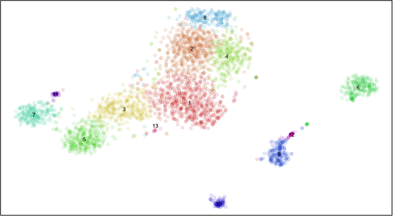
Plotting all significantly differentially expressed genes in all cells is too messy. Plus, each cluster may have very different numbers of cells such that plotting all cells visually overwhelms small clusters. We will probably want to summarize the expression of genes within clusters. So let’s summarize using the average expression and fraction of cells expressing the gene (ie. non-zero detection) per cluster.
## Summarize gene expression within groups
## average expression
mat.summary <- do.call(cbind, lapply(levels(com), function(ct) {
  cells <- which(com==ct)
  if(length(cells) > 1) {
    Matrix::rowMeans(matnorm[, cells])
  } else {
    matnorm[,cells]
  }
}))
colnames(mat.summary) <- levels(com)
## fraction expressing
fe.summary <- do.call(cbind, lapply(levels(com), function(ct) {
  cells <- which(com==ct)
  if(length(cells) > 1) {
    Matrix::rowMeans(matnorm[, cells]>0)
  } else {
    matnorm[,cells]>0
  }
}))
colnames(fe.summary) <- levels(com)
For the sake of demonstration, we will just select a handful of significantly differentially expressed genes to visualize.
## Order groups
dend <- hclust(dist(t(mat.summary)), method='ward.D')

## Select a few differential genes
dg.sig <- lapply(dg, function(x) {
  x <- x[x$Z>1.96,] ## significant z-score
  x <- x[x$highest,]
  x <- head(na.omit(x))
  return(x)
})
names(dg.sig) <- levels(com)

## Get summary matrices for differential genes only
select.groups <- dend$labels[dend$order]
dg.genes <- unlist(lapply(dg.sig[select.groups], rownames))
m <- mat.summary[dg.genes, select.groups]
m <- t(scale(t(m)))
fe <- fe.summary[dg.genes, select.groups]
We could plot just a conventional heatmap of the average gene expression per cluster for all our differentially expressed genes.
library(highcharter)
library(magrittr)

## Visualize as a regular heatmap
hc = hchart(t(m), "heatmap", hcaes(x = group, y = gene, value = value)) %>%
  hc_colorAxis(stops = color_stops(10, colorRampPalette(c("steelblue", "white", "red"), space = "Lab")(10))) %>%
  hc_title(text = "Differentially Expressed Genes Heatmap") %>%
  hc_plotOptions(series = list(dataLabels = list(enabled = FALSE)))
export_hc(filename='heatmap1', hc)
But when exploring our data, maybe we want to encode in additional levels of information such as the fraction of cells expressing the gene.
library(reshape2)

## Visualize fraction expressing as dot size
## reshape for highcharter
mm <- reshape2::melt(m)
mfe <- reshape2::melt(fe)
colnames(mm) <- c('gene', 'group', 'value')
mm <- cbind(mm, fe=mfe$value)
## convert value to colors
colors <- mm$value
colors <- colors - min(colors)
colors <- colors/max(colors)
gradientPalette <- colorRampPalette(c("steelblue", "white", "red"), space = "Lab")(1024)
cols <- gradientPalette[round(colors * (length(gradientPalette) - 1) + 1)]
cols[is.na(cols)] <- '#eeeeee'
mm$color = cols
## convert group and gene names to indices for plotting
mm$x = sapply(mm$gene, function(x) which(dg.genes==x))
mm$y = -sapply(mm$group, function(x) which(select.groups==x))
## visualize as bubble plot
hc = hchart(mm, type="scatter", mapping = hcaes(x=x, y=y, z=fe,
                                                mag=value, color=color,
                                                fe=fe, name=group, gene=gene)) %>%
  hc_plotOptions(bubble = list(minSize=1, maxSize=10)) %>%
  hc_title(text = 'Heatmap Alternative') %>%
  hc_tooltip(headerFormat = "", pointFormat = "<b>group</b>: {point.name} <br> <b>gene</b>: {point.gene} <br> <b>fraction expressing</b>: {point.fe} <br> <b>z-score</b>: {point.mag}") %>%
  hc_xAxis(visible=FALSE) %>%
  hc_yAxis(visible=FALSE) %>%
  hc_plotOptions(series = list(showInLegend=FALSE))
export_hc(filename='heatmap2', hc)
Now we can more easily see which gene may or may not be a better facs marker based on its fractional expression in our cell subpopulation of interest compared to the fractional expression in other subpopulations.
Or maybe we want to encode in AUC metrics, gene expression variance, or other information. However, keep in mind that the purposes of your visualization may be different depending on your goals. If your goal is to more easily explore your data, a more complex visualization with lots of encoded information may be warranted. If your goal is to communicate information, a simpler standard heatmap that’s easier to understand may be sufficient.
Additional Resources
Recent Posts
- AI-guided data visualization of gas prices in different geographical locations across the US over time on 04 May 2026
- The Mentorship Index on 01 March 2026
- Vibe coding with SEraster and STcompare to compare spatial transcriptomics technologies on 22 February 2026
- RNA velocity in situ infers gene expression dynamics using spatial transcriptomics data on 13 October 2025
- Analyzing ICE Arrest Data - Part 2 on 27 September 2025
Related Posts
- Exploring UMAP parameters in visualizing single-cell spatially resolved transcriptomics data
- Animating RNA velocity with moving arrows
- A tale of two cell populations: integrating RNA velocity information in single cell transcriptomic data visualization with VeloViz
- Story-telling with Data Visualization