Story-telling with Data Visualization
Introduction
In our last blog post, we used our recently published bioinformatics tool MERINGUE to identify spatial gene expression patterns in the new MERFISH spatially resolved transcriptomics data of the mouse cortex from Vizgen.
Data visualization remains an important hypothesis generating and analytical technique in data-driven research to facilitate new discoveries. As such, visualizing these identified gene expression patterns is a natural and intuitive way to communicate certain results such as regarding the association between spatial gene expression patterns and the underlying spatial organization of cell-types.
However, must we be limited to static visualizations? Animations can help draw attention to certain aspects of the data, in particular how datapoints are related across different visualizations, and enhance our understanding of the data. Though scientific journals are limited to static pictures (for now), perhaps we can begin integrating more dynamic data visualizations into our presentations, or even blog posts to enhance communication with the audience.
If a static picture is worth a thousand words, perhaps an animation is worth a million?
Creating animated data visualizations with gganimate
We previously discussed how we can use the gganimate package to visualize cell cycle genes. Here, I will use gganimate again to visually communicate the following points:
- spatially resolved transcriptomics allow us to measure gene expression within cells while preserving spatial context within tissues
- these cells can be clustered into transcriptionally distinct cell-types based on their measured gene expression
- these cell-types may be spatially organized within tissues
- for a given cell-type, genes may exhibit spatially organized expression patterns
library(gganimate)
## start from where the last tutorial left off
## put on same scale for animation purposes
emb <- scale(emb)
pos <- scale(pos)
range(emb)
range(pos)
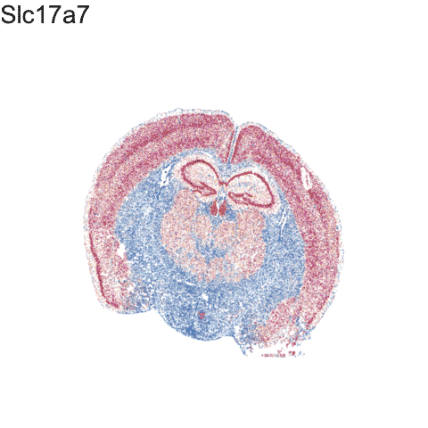
## pick and animate a few genes
library(Matrix)
genes.final <- c('Slc17a7', "Epha6", 'Gad1', "Peg10", 'Gjc3')
length(genes.final)
m <- mat[genes.final,]
m <- t(scale(t(m)))
range(m)
m[m > 1] <- 1
m[m < -1] <- -1
dim(m)
df.all <- do.call(rbind, lapply(1:length(genes.final), function(i) {
gexp <- m[genes.final[i], rownames(pos)]
df <- data.frame(pos, gexp, gene=genes.final[i], order=i)
}))
p <- ggplot(df.all, aes(x = center_x, y = center_y, col=gexp)) +
geom_point(size = 0.1, alpha=0.1)
p <- p + theme_void() +
theme(legend.position = "none") +
scale_color_distiller(palette = 'RdBu',
limits = c(-1,1)) +
xlim(-3, 3) + ylim(-3,3)
anim1 <- p +
transition_states(order,
transition_length = 5,
state_length = 5) +
labs(title = '{genes.final[as.integer(closest_state)]}') +
theme(plot.title = element_text(size = 28)) +
enter_fade()
anim1
## visualize clustering
a <- data.frame(emb, com, 'umap')
b <- data.frame(pos, com, 'pos')
colnames(a) <- colnames(b) <- c('x', 'y', 'com', 'type')
df.trans <- rbind(a, b)
p <- ggplot(df.trans, aes(x = x, y = y)) +
geom_point(size = 0.1, alpha=0.1, show.legend = FALSE) +
theme_void() +
xlim(-3, 3) + ylim(-3,3)
anim2 <- p +
transition_states(type,
transition_length = 5,
state_length = 1) +
labs(title = '{closest_state}') +
theme(plot.title = element_text(size = 28)) +
enter_fade()
anim2
## color by clusters
p <- ggplot(df.trans, aes(x = x, y = y, col=com)) +
geom_point(size = 0.1, alpha=0.1, show.legend = FALSE) +
theme_void() +
xlim(-3, 3) + ylim(-3,3)
anim3 <- p +
transition_states(type,
transition_length = 5,
state_length = 1) +
labs(title = '{closest_state}') +
theme(plot.title = element_text(size = 28)) +
enter_fade()
anim3
## focus on one cluster
ct = 12 ## pyrimidal layer
df.12 <- data.frame(pos, com==ct, 'pos')
colnames(df.12) <- c('x', 'y', 'com', 'type')
head(df.12)
p <- ggplot(df.12, aes(x = x, y = y, col=com)) +
geom_point(size = 0.1, alpha=0.1, show.legend = FALSE) +
scale_color_manual(values=c("#dddddd", "#E69F00")) +
theme_void() +
xlim(-3, 3) + ylim(-3,3)
p + labs(title = 'cluster 12') +
theme(plot.title = element_text(size = 28))
## animate cluster 12 genes
## previously found by MERINGUE
genes.final12 <- c('Gpr161', 'Epha10', 'Amigo2','Mas1','Kit', 'Ephb1')
m <- mat[genes.final12,cells]
m <- t(scale(t(m)))
range(m)
m[m > 1] <- 1
m[m < -1] <- -1
df.all <- do.call(rbind, lapply(1:length(genes.final), function(i) {
gexp <- m[genes.final12[i], ]
gexp <- gexp[rownames(pos)]
names(gexp) <- rownames(pos)
df <- data.frame(pos, gexp, gene=genes.final[i], order=i)
}))
p <- ggplot(df.all, aes(x = center_x, y = center_y, col=gexp)) +
geom_point(size = 0.1, alpha=0.1)
p <- p + theme_void() +
theme(legend.position = "none") +
scale_color_distiller(palette = 'RdBu',
limits = c(-1,1),
na.value="#dddddd") +
xlim(-3, 3) + ylim(-3,3)
anim4 <- p +
transition_states(order,
transition_length = 5,
state_length = 5) +
labs(title = 'MERINGUE: {genes.final12[as.integer(closest_state)]}') +
theme(plot.title = element_text(size = 28)) +
enter_fade()
anim4
Stitching all 4 animations together:
Try it out for yourself!
- Given this series of animations, what do you think is being communicated?
- Do you think this animation is effective at communicating the above points?
- What additional data visualizations can be integrated to more effectively communicate the above points?
- Check out gganimate.com for more
Recent Posts
- AI-guided data visualization of gas prices in different geographical locations across the US over time on 04 May 2026
- The Mentorship Index on 01 March 2026
- Vibe coding with SEraster and STcompare to compare spatial transcriptomics technologies on 22 February 2026
- RNA velocity in situ infers gene expression dynamics using spatial transcriptomics data on 13 October 2025
- Analyzing ICE Arrest Data - Part 2 on 27 September 2025