Exploring UMAP parameters in visualizing single-cell spatially resolved transcriptomics data
Introduction
A student learning how to do single-cell and spatial transcriptomics analysis recently remarked how nice my UMAPs looked compared to theirs. I was surprised since my sense was that our filtering, normalization, and other processing of the data was quite similar. The main source of the difference turned out to be the different default parameters being used in the different UMAP implementations we were using. So in this blog post, I explore how different UMAP parameters can influence visualization of single-cell spatially resolved transcriptomics data.
Getting Started
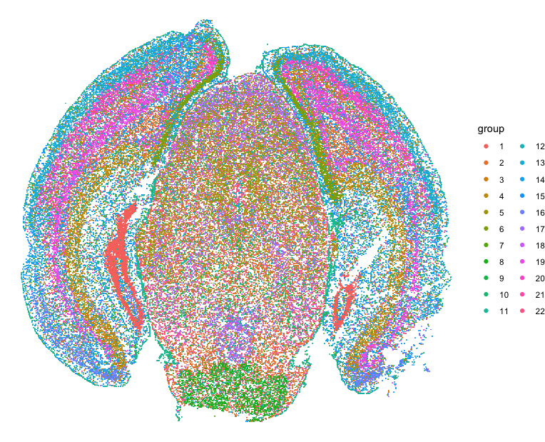
Let’s first read in the data and perform some single-cell transcriptional clustering on the MERFISH data of the mouse cortex from Vizgen.
## read in data
cd <- read.csv('~/Desktop/mouse_cortex_analysis/data/datasets_mouse_brain_map_BrainReceptorShowcase_Slice1_Replicate1_cell_by_gene_S1R1.csv.gz', row.names = 1)
annot <- read.csv('~/Desktop/mouse_cortex_analysis/data/datasets_mouse_brain_map_BrainReceptorShowcase_Slice1_Replicate1_cell_metadata_S1R1.csv.gz', row.names = 1)
pos <- annot[, c('center_x', 'center_y')]
pos[,2] <- -pos[,2] ## flip Y coordinates

library(MERINGUE)
## remove blanks
good.genes <- colnames(cd)[!grepl('Blank', colnames(cd))]
counts <- t(cd[, good.genes])
## filter
counts <- MERINGUE::cleanCounts(counts, verbose = FALSE)

## normalize, log transform
mat <- MERINGUE::normalizeCounts(counts, log = TRUE)
dim(mat)
## pca, take top 30 PCs
pca <- RSpectra::svds(A = t(mat), k=30,
    opts = list(center = TRUE, scale = FALSE, maxitr = 2000, tol = 1e-10))
pcs <- as.matrix(t(mat) %*% pca$v[,1:30])
## subset data for clustering and impute rest to make faster
com <- MUDAN::getApproxComMembership(pcs, k=10,
	nsubsample = nrow(pcs)*0.1,
	method=igraph::cluster_louvain)

## plot clusters on original spatial positions
library(ggplot2)
library(scattermore)
d <- data.frame(x=pos$center_x, y=pos$center_y, group=com)
p <- ggplot(d) +
	geom_scattermore(
		mapping = aes(x = x, y = y, color = group),
		pointsize = 1,
		pixels    = c(1000, 1000)
	) +
	theme(
		axis.text = element_blank(),
		axis.ticks = element_blank(),
		axis.title = element_blank(),
		legend.position = "none"
	)
p <- p + theme_void()
p
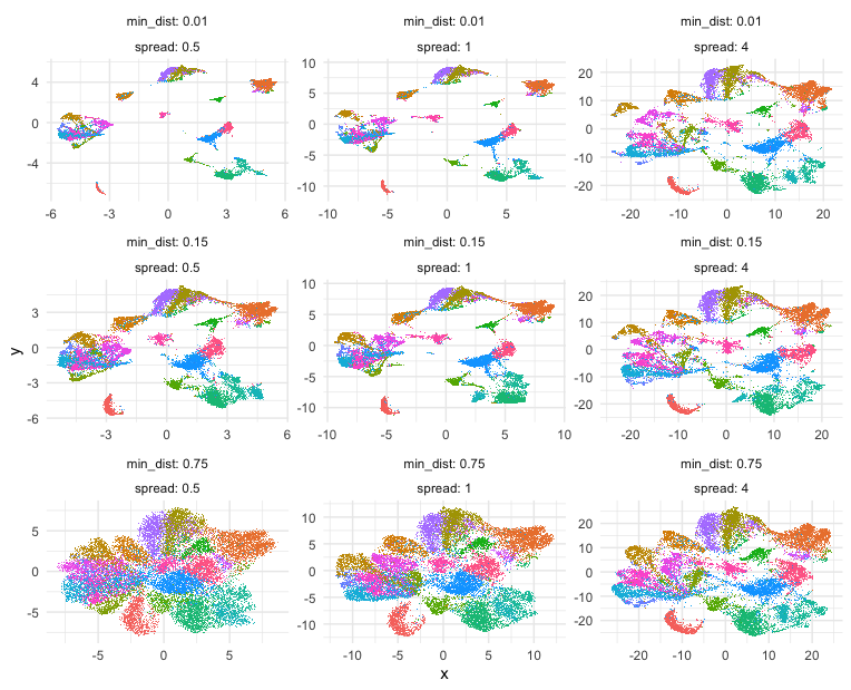
Exploring UMAP parameters
Building on some code courtesy of Kamil Slowikowski’s Gist, let’s try out some different UMAP parameters, namely min_dist and spread, and see how they impact the final 2D UMAP embedding and visualization.
## try some different parameters
umap_params <- expand.grid(
	spread   = c(0.5, 1, 4),
	min_dist = c(0.01, 0.15, 0.75)
)

umaps <- lapply(seq(nrow(umap_params)), function(i) {
	print(i)
	emb <- uwot::umap(
		X         = pcs,
		spread    = umap_params$spread[i],
		min_dist  = umap_params$min_dist[i],
	)
	rownames(emb) <- colnames(mat)
	return(emb)
})

library(data.table)
d <- rbindlist(lapply(seq(nrow(umap_params)), function(i) {
	data.table(
		x = umaps[[i]][,1],
		y = umaps[[i]][,2],
		spread = umap_params$spread[i],
		min_dist = umap_params$min_dist[i],
		group = com
	)
}))

library(ggplot2)
library(scattermore)
p <- ggplot(d) +
	geom_scattermore(
		mapping = aes(x = x, y = y, color = group),
		pointsize = 1,
		pixels    = c(1000, 1000)
	) +
	theme(
		axis.text = element_blank(),
		axis.ticks = element_blank(),
		axis.title = element_blank(),
		legend.position = "none"
	) +
	facet_wrap(min_dist ~ spread ,
		labeller = label_both,
		scales = "free")
p <- p + theme_minimal() +
	theme(legend.position = "none")
Indeed, different combinations of parameters may give us somewhat different impressions of how different these transcriptionally distinct clusters of cells are!
Just for fun
Just for fun, let’s take what we learned from Story-telling with Data Visualization and animate two of the UMAP embeddings to see how the cells transition between these embeddings.
## animation
a <- data.frame(umaps[[1]], com, 'umap (min_dist: 0.01, spread: 0.5)')
b <- data.frame(umaps[[9]], com, 'umap (min_dist: 0.75, spread: 4)')
colnames(a) <- colnames(b) <- c('x', 'y', 'group', 'type')
df.trans <- rbind(a, b)

p <- ggplot(df.trans, aes(x = x, y = y)) +
	geom_scattermore(
		mapping = aes(x = x, y = y, color = group),
		pointsize = 1,
		pixels    = c(1000, 1000)
	)

anim <- p +
	transition_states(type,
		transition_length = 5,
		state_length = 1) +
		labs(title = '{closest_state}') +
	theme(plot.title = element_text(size = 28)) +
		enter_fade()
anim + theme_minimal() +
	theme(legend.position = "none") +
	view_follow()
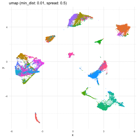
A good reminder to always follow up on the hunches a visualization gives you and dig into what are the genes driving these different cell clusters. Ultimately, we should do our best in interpreting these visualizations in the context of the underlying data!
Try it out for yourself!
- What are some other parameters we can toggle? Check out the original UMAP paper or documentation for ideas.
- Try out a different dimensionality reduction approach like tSNE
- What if we vary other things the number of PCs?
Recent Posts
- AI-guided data visualization of gas prices in different geographical locations across the US over time on 04 May 2026
- The Mentorship Index on 01 March 2026
- Vibe coding with SEraster and STcompare to compare spatial transcriptomics technologies on 22 February 2026
- RNA velocity in situ infers gene expression dynamics using spatial transcriptomics data on 13 October 2025
- Analyzing ICE Arrest Data - Part 2 on 27 September 2025