Deconvolution vs Clustering Analysis: An exploration via simulation
Introduction
We recently developed a reference-free deconvolution approach for
analyzing multi-cellular pixel-resolution spatially resolved
transcriptomics data called STdeconvolve now published in Nature
Communications. In
our paper, we show that STdeconvolve can be applied to multi-cellular
pixel-resolution spatially resolved transcriptomics data to recover the
proportion of cell types comprising each spatially resolved pixel along
with each cell types’ putative transcriptional profile without reliance
on external single-cell transcriptomics references.
In a previous blog post, I used a real multi-cellular pixel-resolution
spatially resolved transcriptomics dataset to demonstrate the
differences between deconvolution and clustering
analysis.
Likewise, in our paper, we used a number of single-cell resolution
targeted spatial transcriptomic profiling datasets as well as single-cell
RNA-seq datasets to create simulations to benchmark the performance of
STdeconvolve as well as demonstrate the differences between
deconvolution and clustering analysis when applied to multi-cellular
spatially resolved transcriptomics data.
However, some times I find that simpler, albeit less realistic, simulations can be more helpful for students to build intuition and enable exploration with fewer simultaneous moving pieces. So in this blog post, I will use a very simple simulation to demonstrate the differences between deconvolution and clustering analysis when applied to multi-cellular spatially resolved transcriptomics data.
Our general goal will be to simulate some multi-cellular spatially resolved transcriptomics data, apply either deconvolution or clustering analysis, and then evaluating how the results from these different analyses compare to our expectations.
Simulating single-cell resolution transcriptomics data
Before we simulate multi-cellular spatially resolved transcriptomics data, let’s first simulate some single cells and their transcriptional profiles. There are more sophisticated and realistic ways to simulate or just obtain single cell transcriptional profiles, but for proof of concept, let’s try something simple that we’ve used before. In particular, we’re going to create 3 cell-types each with 100 cells and 300 genes with some random baseline Gaussian noise.
set.seed(0)
G <- 3
N <- 100
M <- 300
initmean <- 10
initvar <- 10
mat <- matrix(rnorm(N*M*G, initmean, initvar), M, N*G)
rownames(mat) <- paste0('gene', 1:M)
colnames(mat) <- paste0('cell', 1:(N*G))
ct <- factor(sapply(1:G, function(x) {
rep(paste0('ct', x), N)
}))
names(ct) <- colnames(mat)
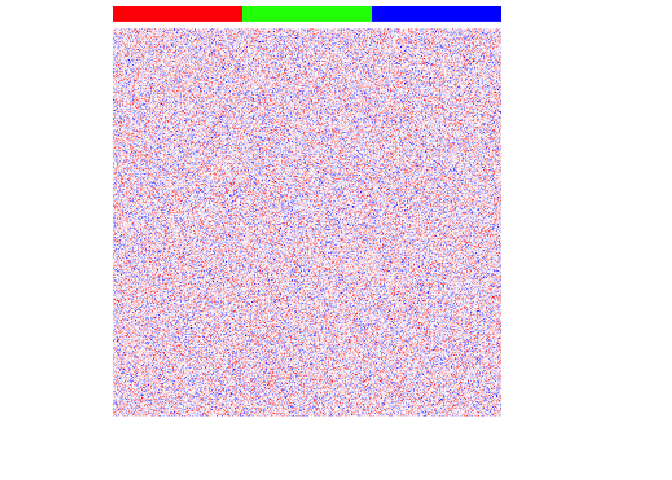
## Visualize heatmap where each row is a gene, each column is a cell
## Column side color notes the cell-type
par(mfrow=c(1,1))
heatmap(mat,
Rowv=NA, Colv=NA,
col=colorRampPalette(c('blue', 'white', 'red'))(100),
scale="none",
ColSideColors=rainbow(G)[ct],
labCol=FALSE, labRow=FALSE)
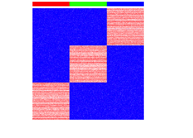
For each cell-type, we will then upregulate 100 genes by increasing these genes’ expression for each cell-type to create differentially upregulated genes. We will also make these simulated gene expressions positive counts.
set.seed(0)
upreg <- 100
upregvar <- 10
ng <- 100
diff <- lapply(1:G, function(x) {
  diff <- rownames(mat)[(((x-1)*ng)+1):(((x-1)*ng)+ng)]
  mat[diff, ct==paste0('ct', x)] <<-
    mat[diff, ct==paste0('ct', x)] +
    rnorm(ng, upreg, upregvar)
  return(diff)
})
names(diff) <- paste0('ct', 1:G)

## positive expression only
mat[mat < 0] <- 0
## make counts
mat <- round(mat)

par(mfrow=c(1,1))
heatmap(mat,
        Rowv=NA, Colv=NA,
        col=colorRampPalette(c('blue', 'white', 'red'))(100),
        scale="none",
        ColSideColors=rainbow(G)[ct],
        labCol=FALSE, labRow=FALSE)
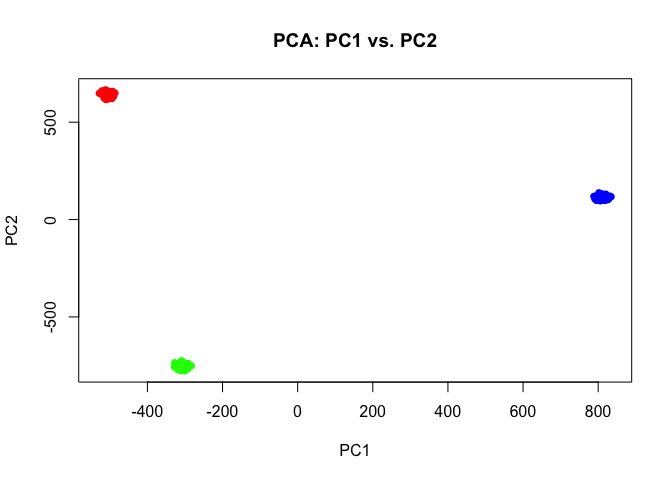
If we perform simple principal components dimensionality reduction on these single-cell resolution transcriptomic profiles, we get 3 well defined clusters as expected.
pcs <- prcomp(t(mat))

## Plot PC1 and PC2 coloring cells by cell-type
par(mfrow=c(1,1))
plot(pcs$x[,1:2],
     col=rainbow(G)[ct],
     pch=16,
     main='PCA: PC1 vs. PC2')
Indeed, we can perform simple k-means clustering analysis and recover our 3 ground truth cell-types. We can visualize our clustering analysis results by coloring the points (e.g. single cells) by their identified clusters in the reduced dimensional principal components space.
## kmeans clustering
com <- kmeans(t(mat), 3)$cluster
plot(pcs$x[,1:2],
     col=rainbow(G, v=0.8)[com],
     pch=16,
     main='PCA: PC1 vs. PC2')
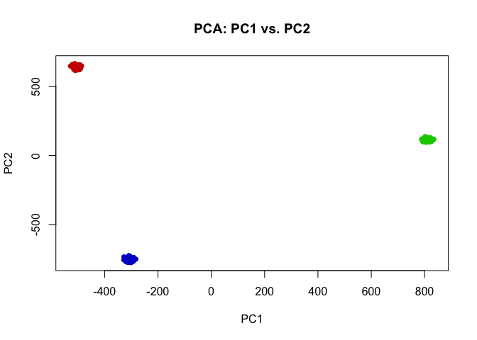
## perfect correspondence as expected
table(com, ct)
##    ct
## com ct1 ct2 ct3
##   1    100      0      0
##   2      0      0    100
##   3      0    100      0
In this case, our identified cluster 1 from k-means clustering analysis corresponds perfectly to our ground-truth cell-type 1, and likewise our identified cluster 2 corresponds to cell-type 3, and cluster 3 to cell-type 2.
Simulating multi-cellular pixel-resolution spatially resolved transcriptomics data
Some spatially resolved transcriptomics technologies provide us with pixel-resolution transcriptomic profiling of small spots tiled across tissues. As such, the transcriptomic profiles observed at these spots may reflect multiple cells of different cell types. Let’s simulate such a multi-cellular pixel-resolution spatially resolved transcriptomics dataset from the single-cell resolution data we just simulated.
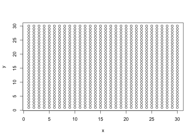
First, let’s make some spots. We will use a grid of 30x30 for 900 spots total across the “tissue”.
spotpos <- cbind(unlist(lapply(1:30, function(i) rep(i,30))), 1:30)
rownames(spotpos) <- paste0('spot-', 1:nrow(spotpos))
colnames(spotpos) <- c('x','y')
dim(spotpos)
## [1] 900 2
par(mfrow=c(1,1))
plot(spotpos, cex=1)
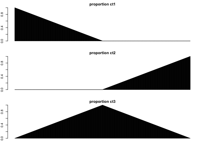
Now let’s make each spot a mixture of our 3 cell-types. Some spots will be primarily 1 cell-type, other spots will be mixtures of 2 cell-types.
## mix 3 cell-types
ct1 <- names(ct)[ct == 'ct1']
ct2 <- names(ct)[ct == 'ct2']
ct3 <- names(ct)[ct == 'ct3']

nmix <- nrow(spotpos)/2
pct1 <- c(unlist(lapply(rev(1:nmix), function(i) i/nmix)), rep(0,nmix))
pct2 <- c(rep(0,nmix), unlist(lapply(1:nmix, function(i) i/nmix)))
pct3 <- 1-(pct1+pct2)

## Show proportion of each cell-type across spots
par(mfrow=c(3,1), mar=rep(2,4))
barplot(pct1, ylim=c(0,1), main='proportion ct1')
barplot(pct2, ylim=c(0,1), main='proportion ct2')
barplot(pct3, ylim=c(0,1), main='proportion ct3')
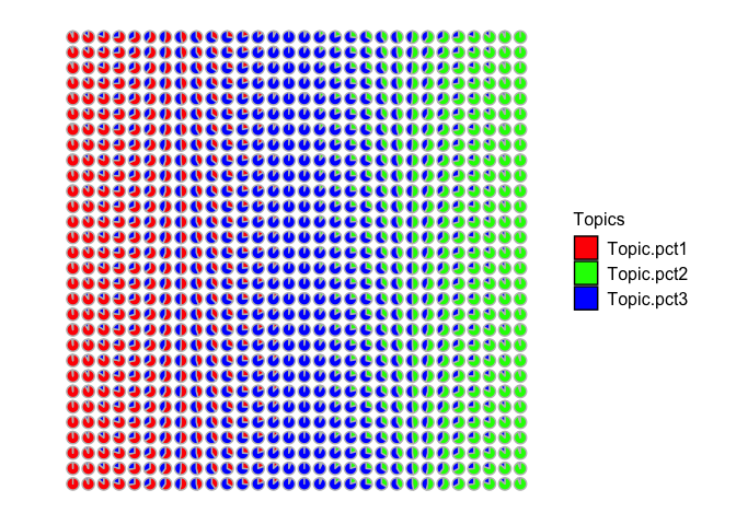
Let’s visualize these simulated cell-type proportion as pie charts. Visually, we can see that some spots are simulated as primarily cell-type 1, others are mixtures of cell-types 1 and 2, others are primarily cell-type 2, and so forth.
pct <- cbind(pct1, pct2, pct3)
rownames(pct) <- rownames(spotpos)

## Visualize as pie charts
STdeconvolve::vizAllTopics(pct, spotpos) +
  ggplot2::guides(colour = "none")
## Plotting scatterpies for 900 pixels with 3 cell-types...this could take a while if the dataset is large.
Now let’s make the corresponding gene expression matrix for each spot by sampling single cells from our simulated single cell gene expression matrix. For simplicity, let’s assume each spot has 10 cells. Therefore to simulate the transcriptional profile observed at each multi-cellular spot, we can grab the appropriate number of cells from each cell-type based on our simulated cell-type proportions and just sum up their gene expressions for each gene.
## assume 10 cells per spot
ncells <- 10

## make gene expression matrix
spotmat <- do.call(cbind, lapply(1:nrow(spotpos), function(i) {
  spotcells <- c(
    sample(ct1, pct1[i]*ncells),
    sample(ct2, pct2[i]*ncells),
    sample(ct3, pct3[i]*ncells)
  )
  rowSums(mat[,spotcells])
}))
colnames(spotmat) <- rownames(spotpos)
So now that we’ve simulated this multi-cellular pixel resolution transcriptomic data, what do you think would happen if we try to do deconvolution vs. clustering analysis on these multi-cellular spots?
Clustering analysis of multi-cellular pixel-resolution spatially resolved transcriptomics data
Let’s see what happens if we try to perform clustering analysis on these multi-cellular spots. We will use the same principal components dimensionality reduction and clustering analysis we did previously for our single-cell resolution transcriptomic data but now on these multi-cellular spots.
We can visualize our clustering analysis results by coloring the points (e.g. multi-cellular spots) by their identified clusters in both the reduced dimensional principal components space or the simulated spatial positions.
pcs <- prcomp(t(spotmat))
com <- kmeans(t(spotmat), 3)$cluster

par(mfrow=c(1,2))
## plot on PCs
plot(pcs$x[,1:2],
     col=rainbow(G)[com],
     pch=16,
     main='PCA: PC1 vs. PC2')
## plot on spatial position
plot(spotpos,
     col=rainbow(G)[com],
     pch=16,
     main='Spot Pos')
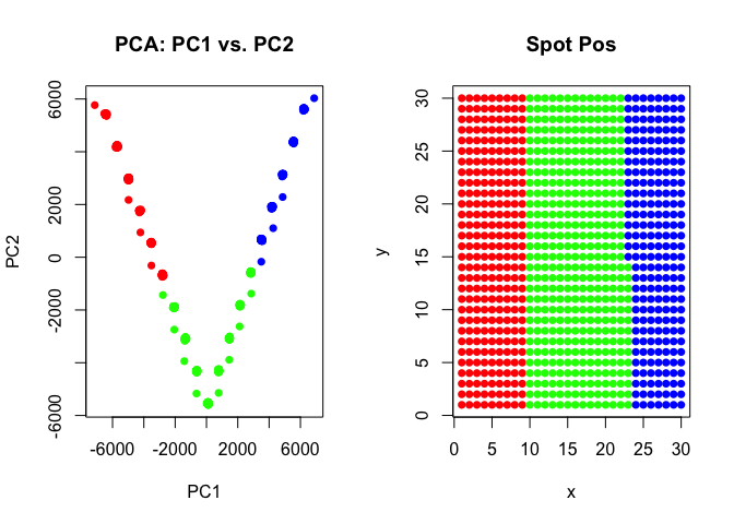
As we can see, our k-means clustering can still pull out 3 transcriptional clusters, though visualizing in principal components space would suggest that there is some type of “trajectory” connecting these clusters? We saw these supposed “trajectories” before in our analysis of real multi-cellular pixel resolution spatially resolved transcriptomics data as well.
However, here, because we simulated this data to begin with, we know that there is no true “trajectory” of transitioning cells but rather these spots represent different mixtures of the 3 underlying cell-types at differing proportions!
Deconvolution analysis of multi-cellular pixel-resolution spatially resolved transcriptomics data
Now let’s see what happens if we try to perform deconvolution analysis
with STdeconvolve on these multi-cellular spots.
## run STdeconvolve
ldas <- STdeconvolve::fitLDA(t(spotmat), Ks=3, plot=FALSE)
## Time to fit LDA models was 0.13 mins

## Computing perplexity for each fitted model...

## Time to compute perplexities was 0 mins

## Getting predicted cell-types at low proportions...

## Time to compute cell-types at low proportions was 0 mins
optLDA <- STdeconvolve::optimalModel(models = ldas, opt = "min")
results <- STdeconvolve::getBetaTheta(optLDA)
## Filtering out cell-types in pixels that contribute less than 0.05 of the pixel proportion.
## get deconvolved cell-type proportions per spot
deconProp <- results$theta

## visualize as piecharts
STdeconvolve::vizAllTopics(deconProp, spotpos)
## Plotting scatterpies for 900 pixels with 3 cell-types...this could take a while if the dataset is large.
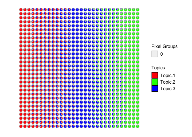
Now we can recover 3 underlying cell-types at varying proportions across these multi-cellular spots. Visually, the proportional of each deconvolved cell-type at each multi-cellular spot looks pretty similar to the simulated ground truth cell-type proportions. We can further try to quantify this by looking at the proportional correlation. Indeed, spots with high simulated proportion of each cell-type has a corresponding deconvolved cell-type with a high deconvolved proportion corresponding (close to 1).
## check correspondence via correlation
cor(pct, deconProp)
##               1          2          3
## pct1  0.9972193 -0.5787389 -0.4636724
## pct2 -0.5871010  0.9968980 -0.4244320
## pct3 -0.4591385 -0.4681405  0.9942568
What do you think about deconvolution vs. clustering analysis when applied to multi-cellular pixel-resolution spatially resolved transcriptomics data?
Try it out for yourself!
- What if you try to resolved more clusters in your clustering analysis? Can you recover the “truth”?
- What if each multi-cellular spot comprised only 1 cell-type? What happens then?
- What if you mix more or fewer cell-types?
- What if these cell-types were less transcriptionally distinct to begin with?
Additional resources
STdeconvolvetutorials: https://jef.works/STdeconvolve/STdeconvolveon Github: https://github.com/JEFworks-Lab/STdeconvolveSTdeconvolveon Bioconductor: https://bioconductor.org/packages/devel/bioc/html/STdeconvolve.html
Recent Posts
- AI-guided data visualization of gas prices in different geographical locations across the US over time on 04 May 2026
- The Mentorship Index on 01 March 2026
- Vibe coding with SEraster and STcompare to compare spatial transcriptomics technologies on 22 February 2026
- RNA velocity in situ infers gene expression dynamics using spatial transcriptomics data on 13 October 2025
- Analyzing ICE Arrest Data - Part 2 on 27 September 2025