Welcome
Welcome to the Course Website for EN.580.428 Genomic Data Visualization!
As the primary mode through which analysts and audience members alike consume data, data visualization remains an important hypothesis generating and analytical technique in data-driven research to facilitate new discoveries. However, if done poorly, data visualization can also mislead, bias, and slow down progress. This hands-on course will cover the principles of perception and cognition relevant for data visualization and apply these principles to genomic data, including large-scale single-cell and spatially-resolved omics datasets, using the R statistical programming language. Students will be expected to complete class readings, create weekly data visualizations as homework assignments, and make a major class presentation.
Course Information
Course Staff: Prof. Jean Fan and Kalen Clifton
Office Hours: 10:00am-10:50am Monday, Wednesday, and Friday. See Slack for location details.
Lectures: 8:00am-9:50am Monday, Wednesday, and Friday. See Slack for location details.
Course Details
☞ see Course tabFeatured Visualizations
Cell Type Exploration of Charmander Data Set
The cluster appears to be endothelial cells that make up adipose tissue. When looking at the Wilcox vs log2fc graph three of most significantly upregulated...

Identification of a Cluster Associated with CD8+ T cells
Description of my multi-panel plot Here, I identified a cluster that seems to be CD8+ T cells. In order to generate the plot above, I...

Homework 5
Description

Validation of cell type clustering via differential gene expression
The purpose of this visualization to present the usage of differential gene expression to validate cell type identification in k-means and tsne analysis of the...

Running tSNE analysis on genes or PCs
What data types are you visualizing? In this multi-panel plot, I am visualizing various quantitative and categorical data. For the PCA plot on the upper...
AQP1 Expression for Contrasting Principle Component Numbers
What data types are you visualizing? I am using categorical data (zero and nonzero expression) as well as quantitative (color gradient of expression).

Comparison of Dimensionality Reduction Methods for Representation of Clustered Data
What data are you visualizing

The effect of Count Per Million normalization on Dimensionality Reduction
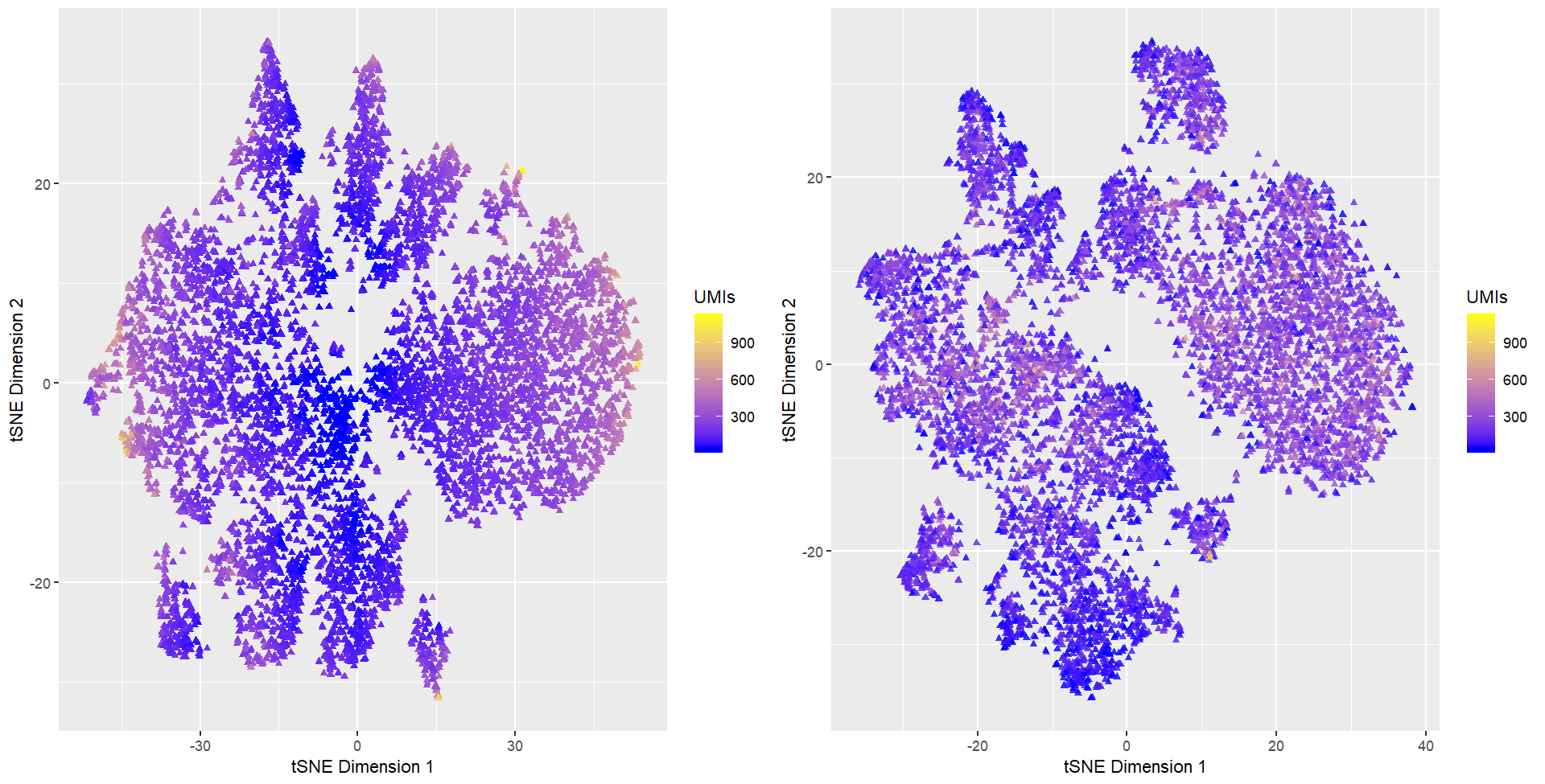
What data types are you visualizing? I am visualizing quantitative data of cells’ position on tSNE embedded 2-dimensional space. I am also visualizing the total...

Cells Clustered By Gene Expression
What data are you visualizing
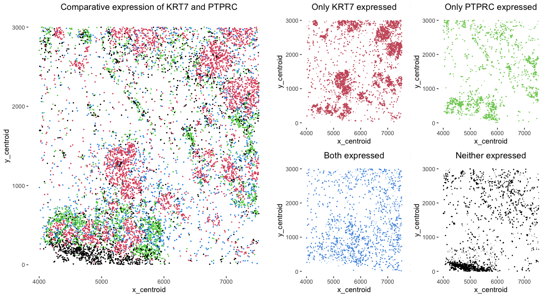
Comparative detection of KRT7 and PTPRC gene expression
What data types are you visualizing? I am visualizing categorical data of the comparative gene expression detection of two genes KRT7 and PTPRC. There are...
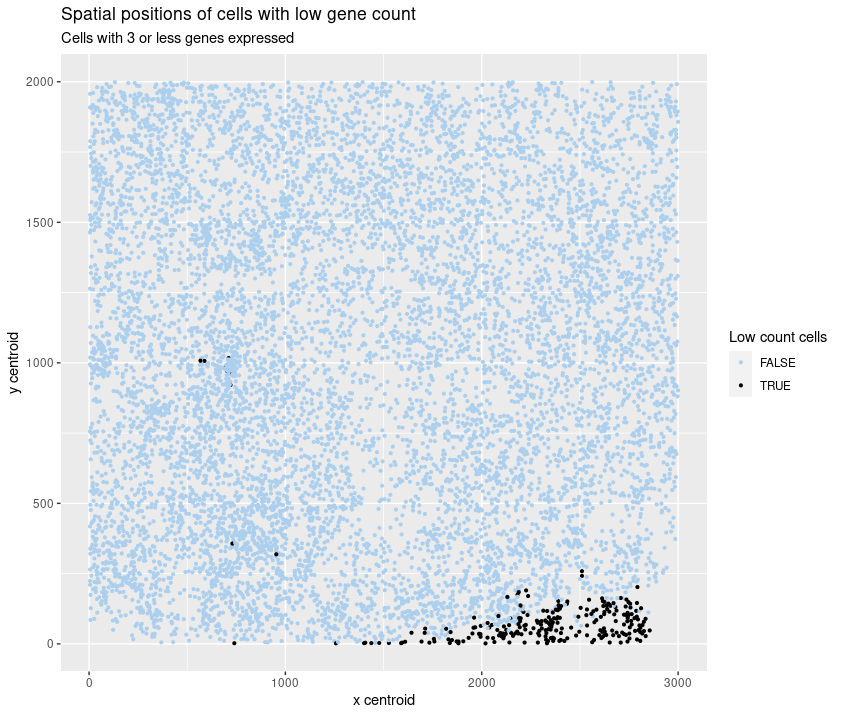
Spatial position of cells with low gene count
What data types are you visualizing? I am visualizing the categorical data of the presence of 3 or fewer genes in a cell together with...

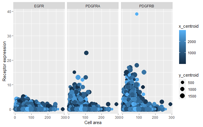
Comparing the relationship between Growth Factor Receptors Expression and Cell Area
What data types are you visualizing? I am visualizing quantitative data of the expression count of the EGFR, PDGFRA and PDGFRB genes for each cell,...

All Visualizations
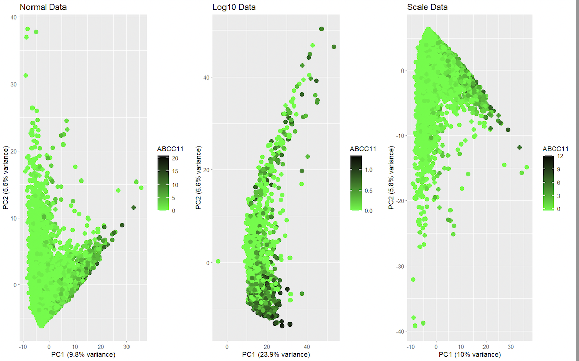
Dimensionality Reduction approach for spatial transcriptomics in genes ZEB1 and ZEB2
1. Should I normalize and/or transform the gene expression data (e.g. log and/or scale) prior to dimensionality reduction? It is recommended to normalize the data with scale to help take...

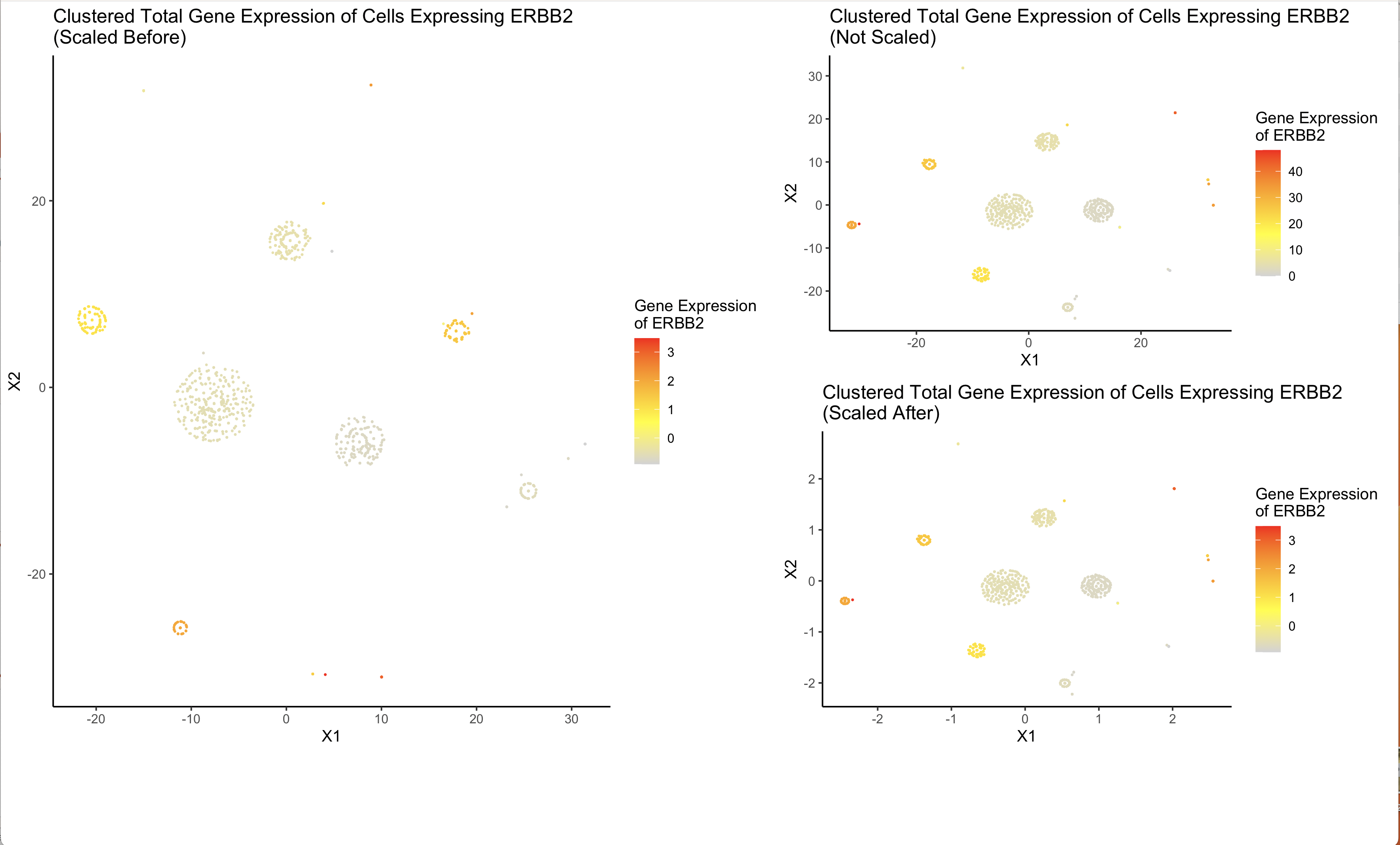
Clusters of Genes Expressing ERBB2 using t-SNE
What data types are you visualizing? I am visualizing the similarities in levels of overall gene expression in cells that have non-zero expression of ERBB2 and the level of expression...

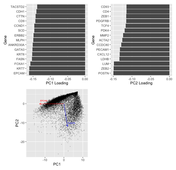
Running tSNE analysis on genes or PCs
What data types are you visualizing? In this multi-panel plot, I am visualizing various quantitative and categorical data. For the PCA plot on the upper left, I am visualizing quantitative...
AQP1 Expression for Contrasting Principle Component Numbers
What data types are you visualizing? I am using categorical data (zero and nonzero expression) as well as quantitative (color gradient of expression).
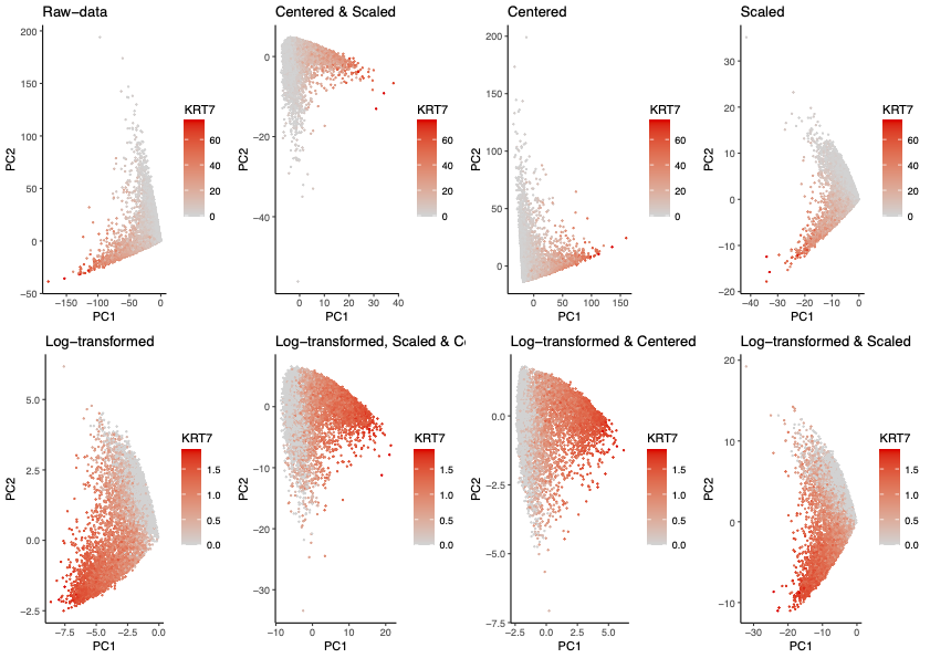
Homework 3 Submission: Comparing Pre-processing Methods Prior to PCA
This series of plots demonstrates the effects of preprocessing steps taken prior to utilizing PCA for dimensionality reduction of multi-dimensional gene expression data. Some pre-processing steps include but is not...

Comparison of Dimensionality Reduction Methods for Representation of Clustered Data
What data are you visualizing
The effect of Count Per Million normalization on Dimensionality Reduction
What data types are you visualizing? I am visualizing quantitative data of cells’ position on tSNE embedded 2-dimensional space. I am also visualizing the total gene count for each individual...
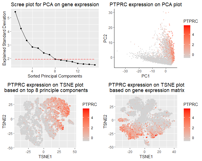
Comparing TSNE on gene expression matrix and top principal components
What data types are you visualizing? I am visualizing the qualitative expression data of PTPRC,the most dominant gene in PCA, with respect to different TSNE reductions upon gene expression or...
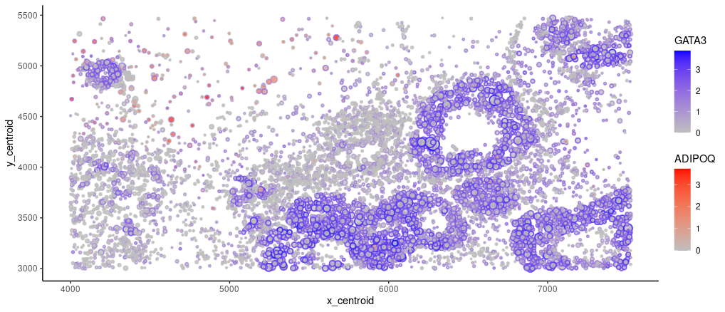
Spatial Distribution of GATA3 and ADIPOQ expressions
What data types are you visualizing? I am visualizing quantitative data of the expression of GATA3 (gene of interest) and ADIPOQ (the most highly variable) gene for cells with at...
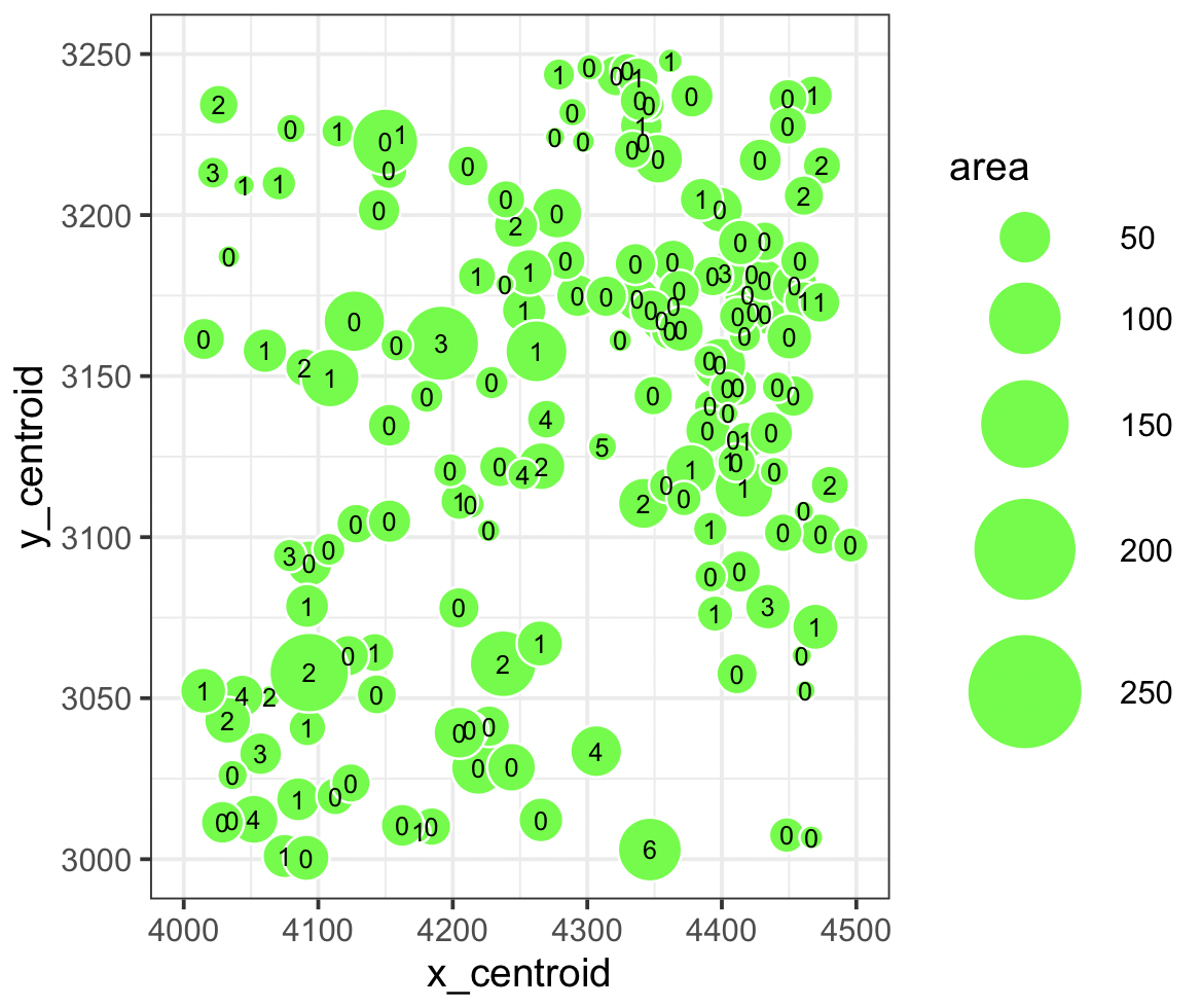
Relationship between the centroid mass, area and its occurrences of ZEB1
What data types are you visualizing? It’s visualizing a quantitative data type of how many ZEB1 genes are found in a specific area given the x_centroid (4000-4500) and y_centroid (3000-3250)....